
Your landing page’s weakest score is Trust.
How Zalos ranks
67Growth scoreupdated
category scores
category scoresShowHide
Score over time
Trust
48PoorProof that the product is real, competent, and safe to try.
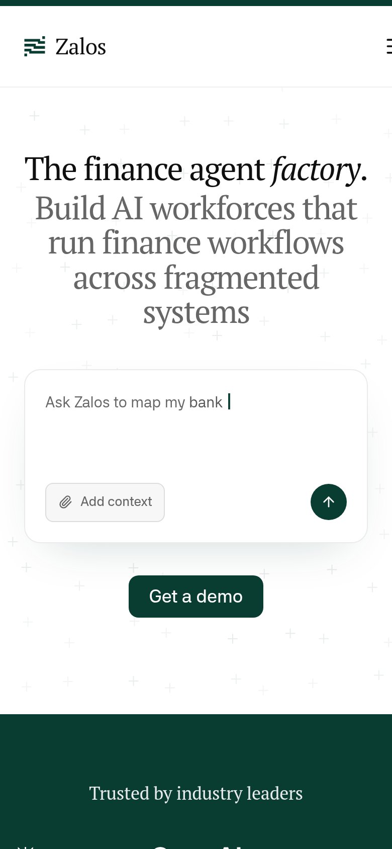
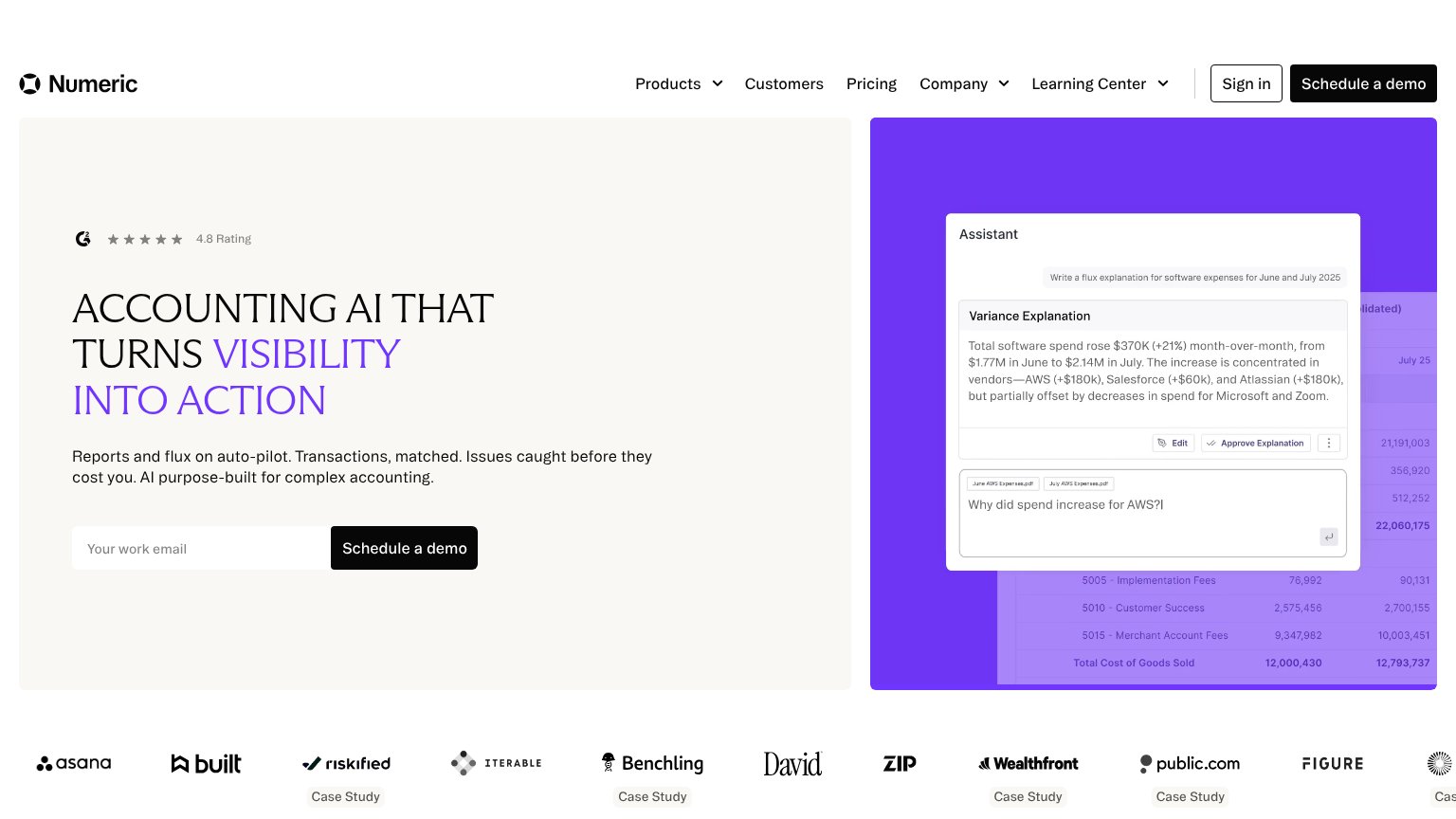

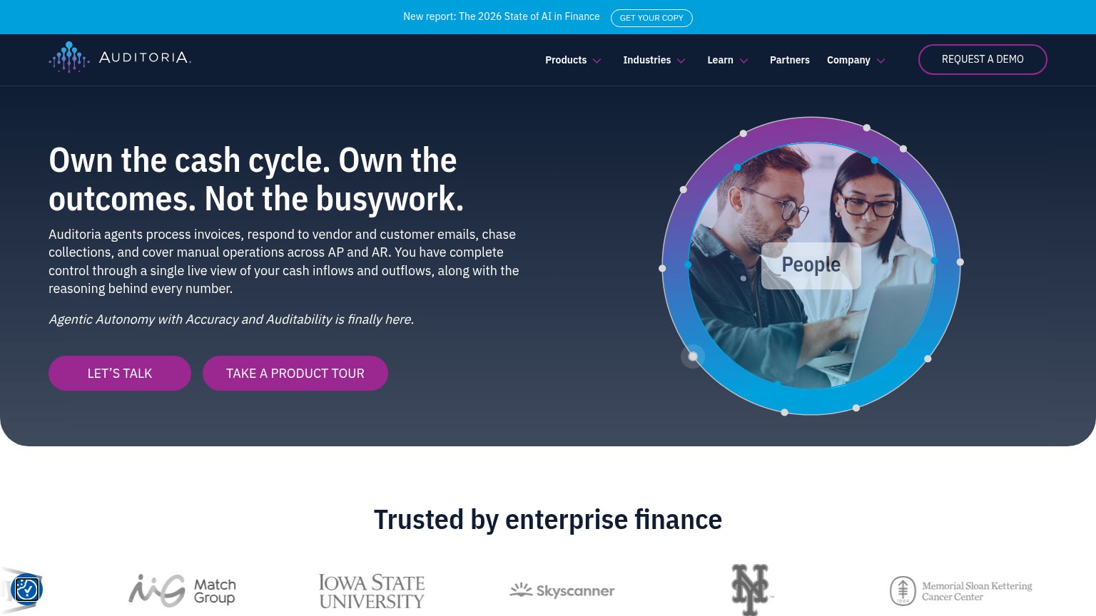

| Trust read | |
|---|---|
| Zalos | "Trusted by industry leaders" logo strip at the bottom of the mobile fold |
| Customer/partner logo strip: Tiger Global, Moelis, Nomura, Société Générale, Rothschild & Co, BNP Paribas, Raymond James | |
| "Trusted by enterprise finance" logo bar with Match Group, Iowa State University, Skyscanner, and Memorial Sloan Ketteri | |
| "WORKING WITH 100+ FINANCE DEPARTMENTS" logo strip (Palo Alto Networks, Tempo, Carrot, Lightmatter) | |
| Customer logo bar with Asana, Riskified, Iterable, Benchling, Wealthfront, Zip and "Case Study" links | |
| No visible trust signal identified. |
CTA
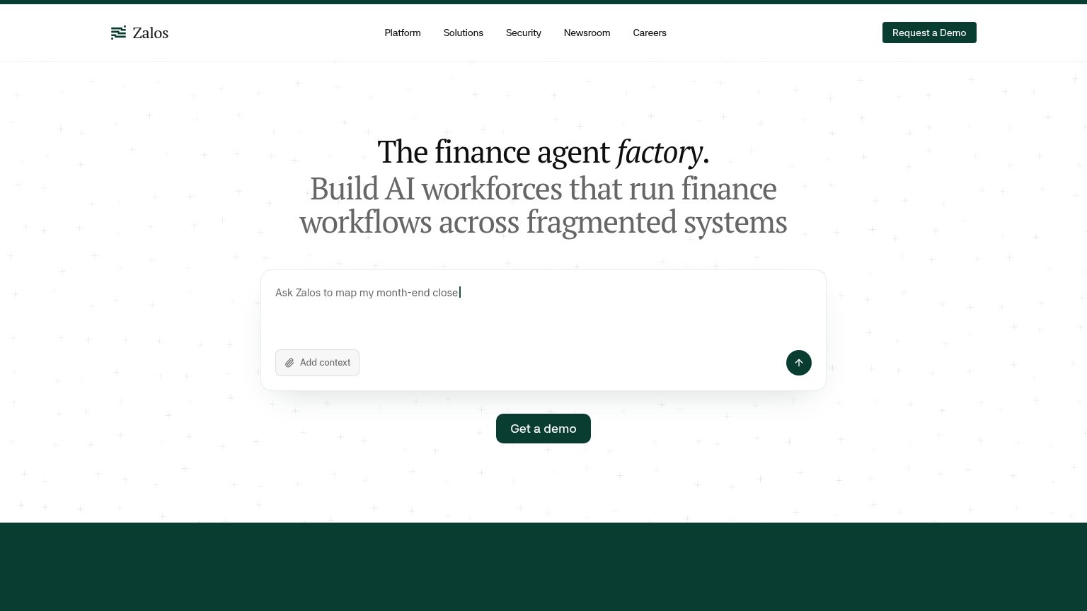
68FairCopy, size, verb, cost-feel — does the primary CTA earn the click?
Problems
- icon-only submit, no payoff label
- demo framing implies sales gate
- "Get a demo" vs "Request a Demo"
- unclear what submitting delivers
Mobile web
68FairThe phone experience as a first-class citizen.
12- Get a demo button — Desktop-proportioned pill floating small in the column instead of a full-width thumb target.
- Five-line subhead — Serif headline barely scales down, wrapping into cramped lines that push the CTA down the fold.
Value props
72FairTitle, subtitle, hero — do they sell the product's true value?
Zalos’s headline undersells
The finance agent factory.
Build AI workforces that run finance workflows across fragmented systems
Working
- 'fragmented systems' names a real finance pain
- Prompt box demos a concrete job: month-end close
- Clear category: AI agents for finance
Could improve
- Zero numbers or measurable outcomes
- 'factory' metaphor needs insider context
- No emotional payoff — relief or time saved
Information hierarchy
78FairDoes the design help or inhibit what the page is trying to say?
1234- Prompt box vs CTA — The interactive prompt with its own submit arrow competes head-on with 'Get a demo' below it, splitting the primary action.
- Duplicate demo CTA — 'Request a Demo' in the nav duplicates 'Get a demo' in the hero with different labels, diluting a single conversion path.
- Careers/Newsroom links — Non-buyer nav items leak first-visit attention away from the demo conversion.
- Add context button — A third styled control inside the fold whose purpose is unclear pre-engagement, adding decision noise.