UplaneYC F25 landing page report.
← Back to YC F25

Your landing page’s weakest score is Value props.

Fix Value props

Score over time

90807060504030Icon 78 on May 9 (Wayback)Icon 79 on Jun 2 (Wayback)Icon 80 on Jun 10 (Wayback)Icon 82 on Jul 29 (Live)Icon 80 on Aug 11 (Wayback)Icon 80 on Aug 29 (Wayback)Icon 78 on Sep 29 (Wayback)AdCreative.ai 80 on Jul 28 (Live)Omneky 69 on Feb 15 (Wayback)Omneky 74 on Mar 23 (Wayback)Omneky 76 on Apr 9 (Wayback)Omneky 73 on Jul 25 (Wayback)Omneky 76 on Jul 28 (Live)Pencil 65 on Mar 23 (Wayback)Pencil 66 on May 1 (Wayback)Pencil 61 on May 14 (Wayback)Pencil 60 on Jun 1 (Wayback)Pencil 58 on Jun 30 (Wayback)Pencil 60 on Jul 27 (Wayback)Pencil 59 on Jul 28 (Live)Albert.ai 53 on May 13 (Wayback)Albert.ai 51 on Aug 5 (Wayback)Albert.ai 52 on Sep 8 (Wayback)Albert.ai 43 on Sep 22 (Live)Uplane 59 on Apr 12 (Wayback)Uplane 58 on Apr 29 (Wayback)Uplane 62 on May 13 (Wayback)Uplane 61 on Jun 17 (Wayback)Uplane 62 on Jul 10 (Wayback)Uplane 72 on Sep 22 (Live)Apr 12Apr 29May 13Jun 17Jul 10Sep 22
Past reportsShow past reportsHide past reports
  1. Sep 22, 202672LiveOverall +10 · Trust +20 · Mobile web +20Viewing
  2. Jul 10, 202662Overall +1 · Information hierarchy +4 · Mobile web −2View →
  3. Jun 17, 202661Overall −1 · Information hierarchy −4 · Trust −4View →
  4. May 13, 202662Overall +4 · Trust +24 · Mobile web −10View →
  5. Apr 29, 202658Overall −1 · CTA −2 · Trust −2View →
  6. Apr 12, 202659First tracked report — strongest Mobile web 76, weakest Trust 30View →

Value props

62Fair

Title, subtitle, hero — do they sell the product's true value?

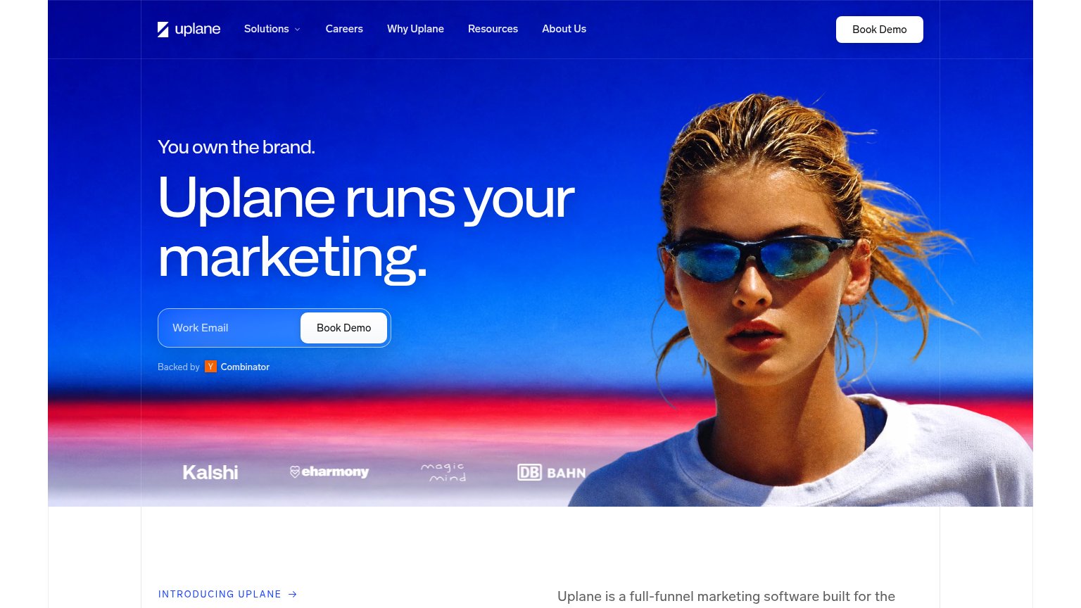
Uplane’s headline vagueUplane runs your marketing.You own the brand.

Working

  • Bold outcome framing: delegation, not features
  • Recognizable logo row (eharmony, DB Bahn) adds proof
  • YC badge lends startup credibility

Could improve

  • No specifics: what marketing, which channels?
  • Hero image decorates, doesn't demonstrate
  • Zero numbers or measurable outcomes in fold

CTA

68Fair

Copy, size, verb, cost-feel — does the primary CTA earn the click?

Uplane
Omneky
Icon
AdCreative.ai
Pencil

Problems

  • 'Book Demo' feels costly — sales call
  • email required before any value
  • no header-echo or payoff in copy

Trust

68Fair

Proof that the product is real, competent, and safe to try.

Uplane
Icon
AdCreative.ai
Trust read
UplaneCustomer logo strip (Kalshi, eharmony, Magic Mind, DB Bahn, Alpecin) beneath the hero CTA
IconNamed customer cards with logos, LinkedIn icons and metrics, e.g. "Daryl Luke, Creative, IM8 Health — $120M ARR in 12 mo
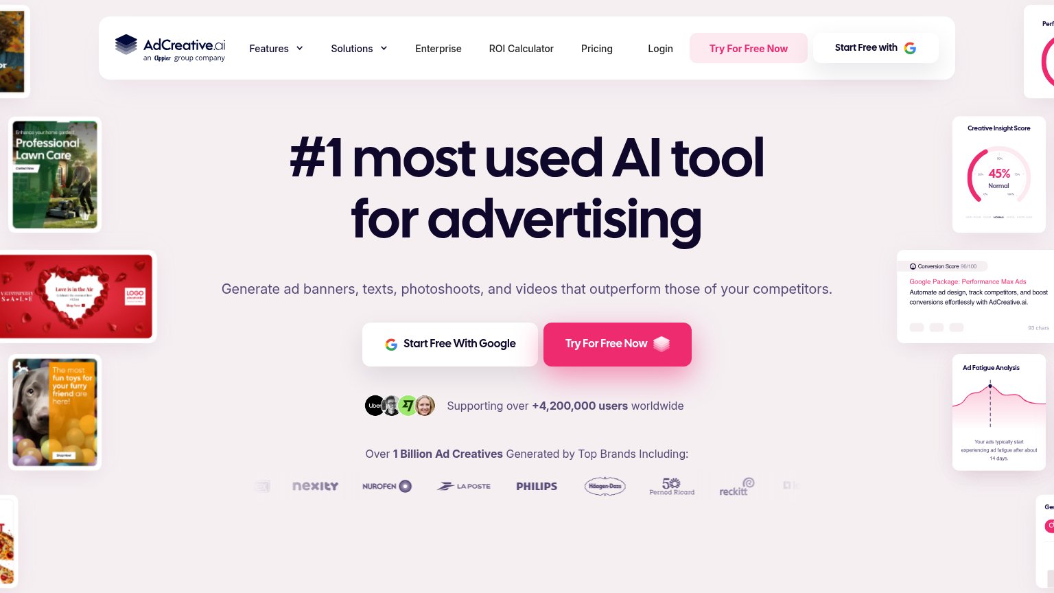
AdCreative.ai"Over 1 Billion Ad Creatives Generated by Top Brands Including:" logo row with Philips, Nurofen, La Poste, Häagen-Dazs,
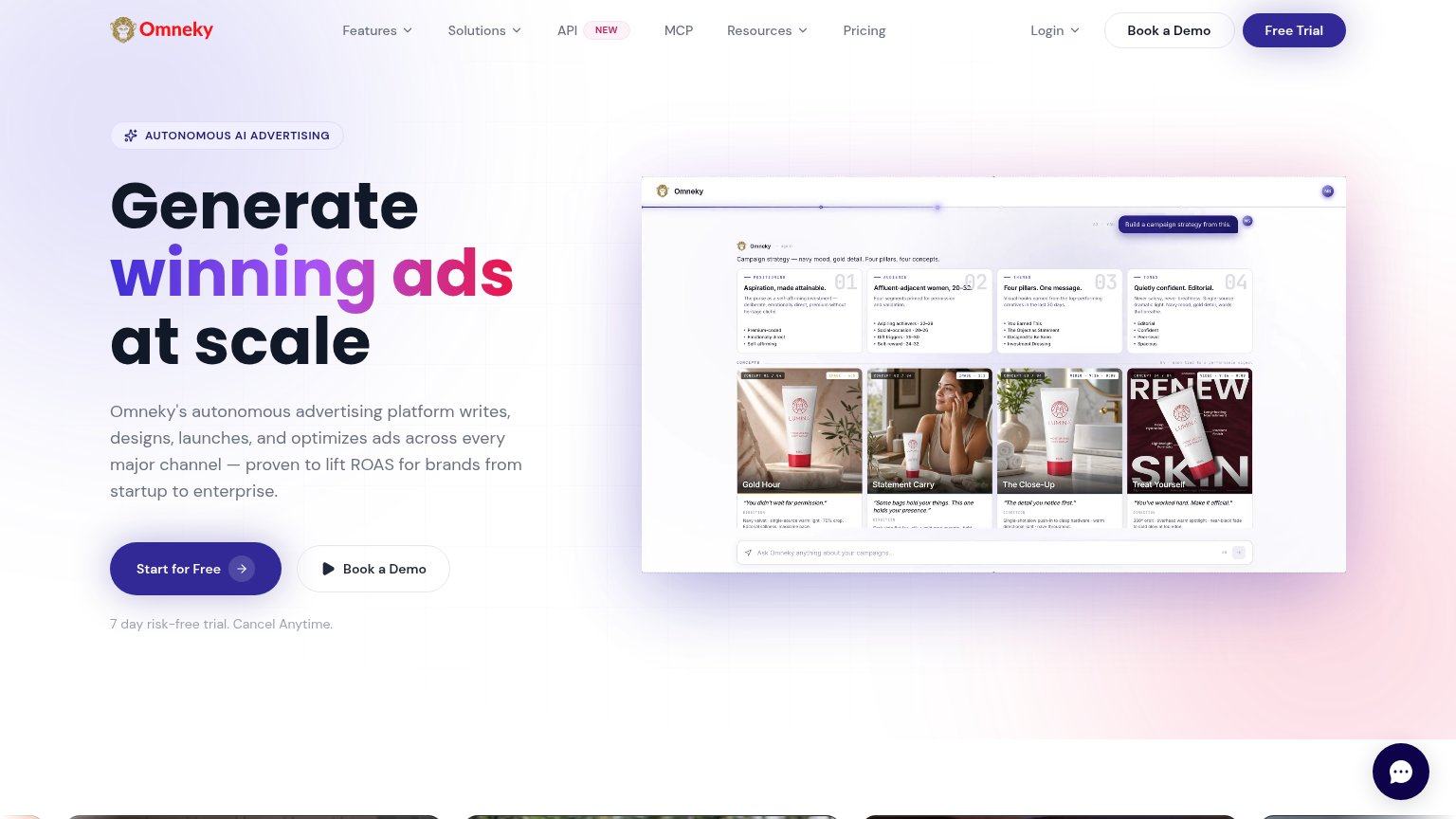
OmnekyNo visible trust signal identified.
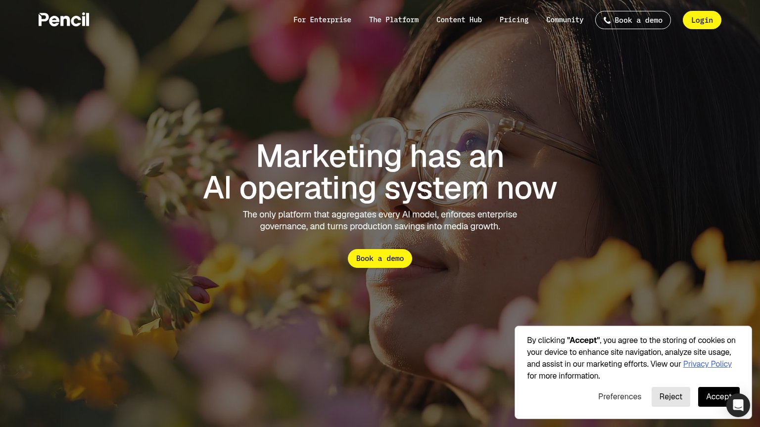
PencilNo visible trust signal identified.
Albert.aiNo visible trust signal identified.

Information hierarchy

78Fair

Does the design help or inhibit what the page is trying to say?

Information hierarchy annotations on the desktop capture1234
  1. Duplicate header Book Demo — Second identically-labeled CTA competes with the hero email form for the same action.
  2. Five-link nav row — Solutions, Careers, Why Uplane, Resources and About Us give attention five exits before the form.
  3. Introducing Uplane link — An extra clickable link creeps into the fold and pulls the scan away from the demo form.
  4. Faint client logo row — Kalshi, eharmony and DB Bahn logos are so low-contrast against the horizon they barely register as proof.

Mobile web

86Strong

The phone experience as a first-class citizen.

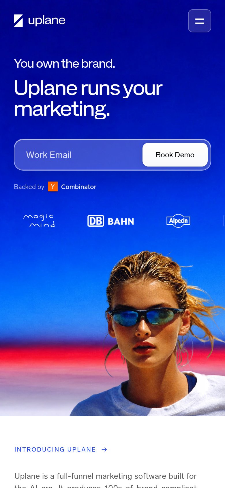
Mobile web mobile capture
No specific callouts

Uplane's mobile fold is close to reference quality: the nav collapses to a logo plus a clean hamburger, the headline "Uplane runs Uplane's marketing." scales down to three comfortable lines, and the "Work Email" field with its "Book Demo" button is full-width and thumb-friendly, well inside the first viewport. Nothing blocks the tap — no cookie banner, chat bubble, or overlay — so a visitor can convert without scrolling. The gaps are minor: the "Book Demo" button consumes the right third of the email field while the placeholder text sits low-contrast on the blue fill, and the logo strip is cropped so the fourth logo is sliced at the right edge. Fixing that clipped logo row is the biggest lever, since a visibly cut-off element signals an unchecked mobile layout right in the trust band.