SelfinYC F25 landing page report.
← Back to YC F25

Your landing page’s weakest score is Trust.

Fix Trust

Score over time

8070605040302010Kalshi 60 on Sep 20 (Live)Polymarket 62 on Apr 11 (Wayback)Polymarket 58 on Sep 22 (Live)Cumberland (DRW) 55 on Apr 22 (Wayback)Cumberland (DRW) 57 on May 15 (Wayback)Cumberland (DRW) 56 on Jun 13 (Wayback)Cumberland (DRW) 24 on Sep 7 (Wayback)Cumberland (DRW) 27 on Sep 22 (Live)Selfin 61 on May 8 (Wayback)Selfin 60 on Jun 16 (Wayback)Selfin 67 on Sep 22 (Live)May 8Jun 16Sep 22
Past reportsShow past reportsHide past reports
  1. Sep 22, 202667LiveOverall +7 · Value props +20 · Trust +10Viewing
  2. Jun 16, 202660Overall −1 · Trust −4View →
  3. May 8, 202661First tracked report — strongest Information hierarchy 78, weakest Value props 48View →

Trust

58Fair

Proof that the product is real, competent, and safe to try.

Selfin
Kalshi
Polymarket
Trust read
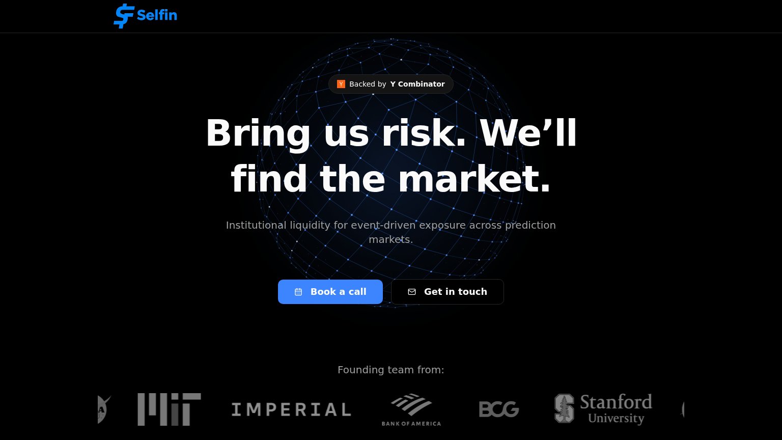
Selfin"Backed by Y Combinator" badge above the headline
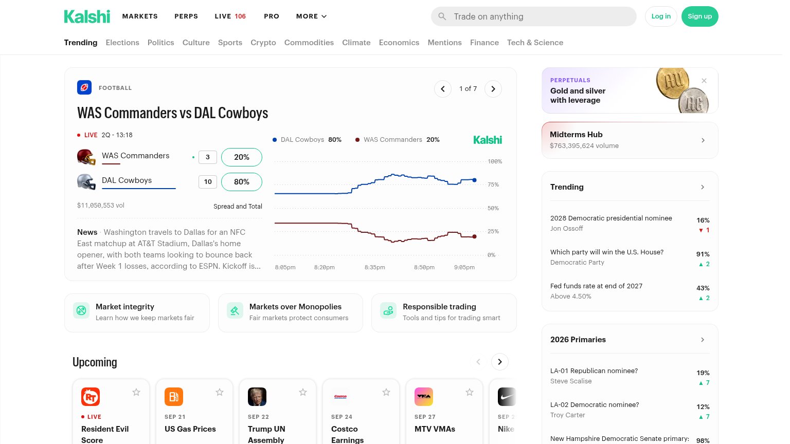
KalshiLive market card showing "$11,050,553 vol" with a real-time price chart for WAS Commanders vs DAL Cowboys
PolymarketLive market volume figures — "$7M Vol." on the NATO x Russia market and Hot Topics showing "$614K today" traded
Cumberland (DRW)No visible trust signal identified.

Mobile web

58Fair

The phone experience as a first-class citizen.

Mobile web annotations on the mobile capture123
  1. Book a call CTA — Sits below the first mobile viewport, so visitors see no tappable action on landing.
  2. Oversized hero headline — Wraps into four tall lines at desktop weight, eating half the screen and pushing the CTA down.
  3. Get in touch button — Low-contrast dark outline button nearly disappears against the black background.

Value props

68Fair

Title, subtitle, hero — do they sell the product's true value?

Selfin’s headline sellsBring us risk. We’ll find the market.Institutional liquidity for event-driven exposure across prediction markets.

Working

  • Bold, memorable two-beat promise
  • Subhead names category and buyer
  • YC badge + team logos add trust

Could improve

  • No numbers, venues, or capacity
  • Globe hero decorates, shows nothing
  • No example risk or quote-turnaround

CTA

70Fair

Copy, size, verb, cost-feel — does the primary CTA earn the click?

Selfin

Problems

  • click feels like a meeting cost
  • no echo of headline promise
  • secondary CTA duplicates intent

Information hierarchy

82Strong

Does the design help or inhibit what the page is trying to say?

Information hierarchy annotations on the desktop capture123
  1. Get in touch button — Secondary CTA sits at near-equal size and weight beside 'Book a call', splitting the single decision into two.
  2. Subheadline gray text — 'Institutional liquidity for event-driven exposure' is set in low-contrast gray over the globe graphic, weakening the only line that explains what Selfin does.
  3. Logo strip edges — Partially cropped logos at the left and right edges make the 'Founding team from' strip look mid-scroll and unfinished.

Competitors

inferred from product, audience, and value prop