
Your landing page’s weakest score is Trust.
How Null Labs ranks
64Growth scoreupdated
category scores
category scoresShowHide
Score over time
Trust
44PoorProof that the product is real, competent, and safe to try.


| Trust read | |
|---|---|
| Null Labs | No visible trust signal identified. |
| "One country. Thousands of autonomous trucks. A new era for intelligent infrastructure begins now." paired with the HUMA | |
| No visible trust signal identified. | |
| No visible trust signal identified. | |
| "Igniting Innovation From Silicon to Systems: Synopsys and Ansys Are Now United" merger banner | |
| No visible trust signal identified. |
Value props
62FairTitle, subtitle, hero — do they sell the product's true value?
Null Labs’s headline undersells
Simulation and testing infrastructure for autonomy
Working
- Names a concrete category, not buzzwords
- Hero video shows simulated environments
- Clear who it's for: autonomy teams
Could improve
- No subhead — zero supporting specifics
- No numbers, proof, or named outcomes
- Flat infrastructure-speak, no emotion
CTA
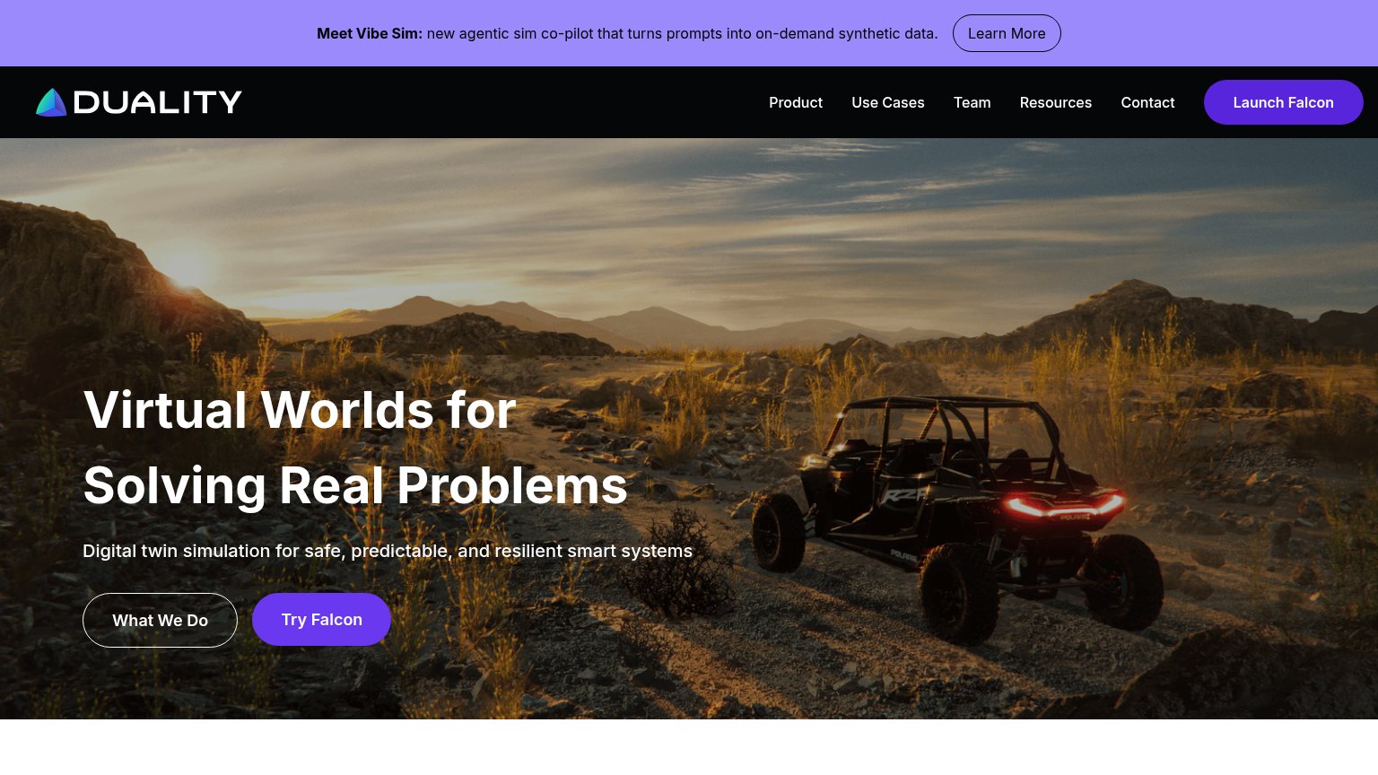
68FairCopy, size, verb, cost-feel — does the primary CTA earn the click?

Problems
- 'Explore' is a browse, not a payoff
- button tiny vs. massive headline
- competes with nav 'Request a demo'
Mobile web
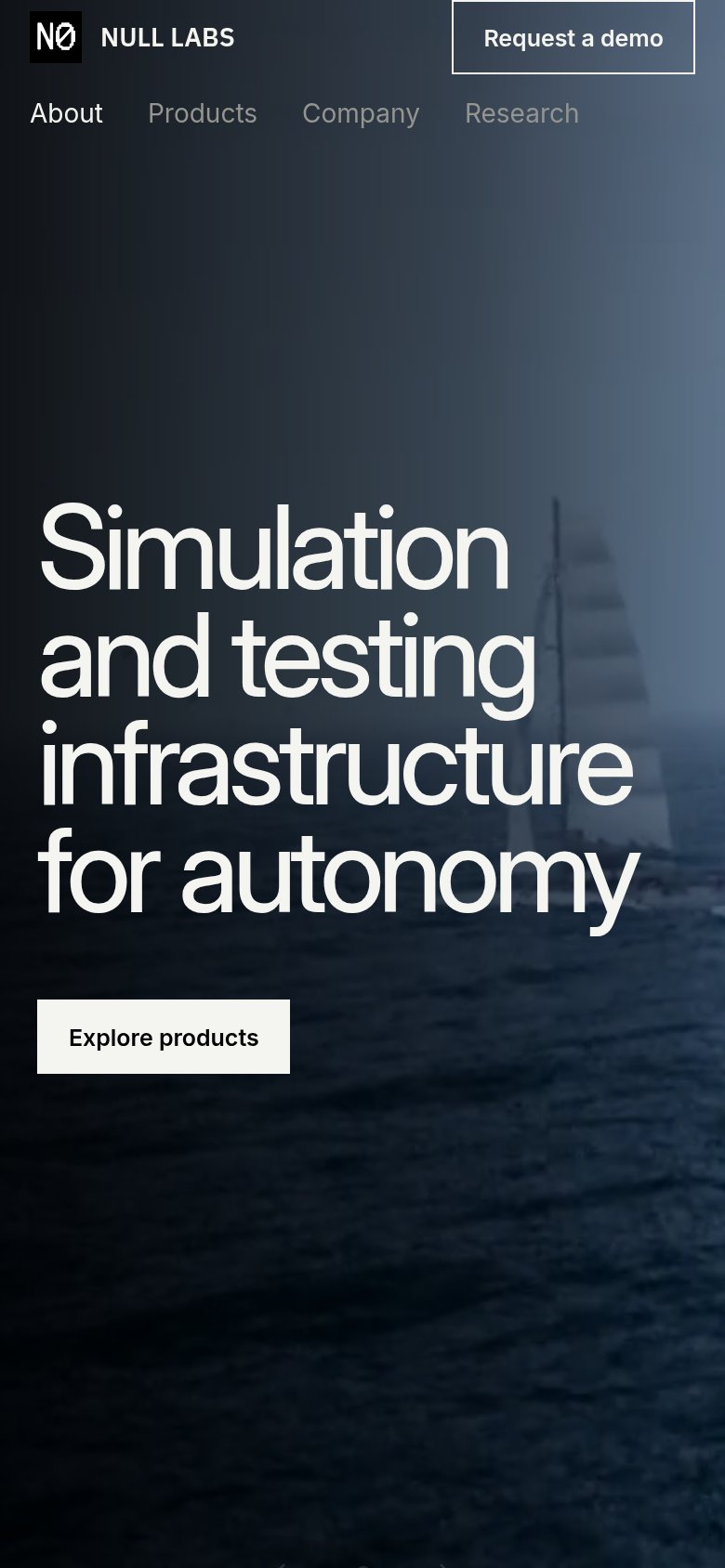
68FairThe phone experience as a first-class citizen.
 12
- Uncollapsed nav link row — Full desktop link row stacks under the logo as a second header deck with cramped tap targets instead of a hamburger.
- Explore products button — Primary CTA keeps desktop proportions, floating small in the column instead of a thumb-friendly near-full-width button.
Information hierarchy
76FairDoes the design help or inhibit what the page is trying to say?
12- Explore products button — Styled at identical weight to Request a demo, splitting the fold's one action into two equal choices.
- Low-contrast nav links — Products, Company, Research render in faded grey that reads as disabled rather than navigable.