
Your landing page’s weakest score is Trust.
How Norra ranks
65Growth scoreupdated
category scores
category scoresShowHide
Score over time
Trust
38PoorProof that the product is real, competent, and safe to try.
| Trust read | |
|---|---|
| Norra | No visible trust signal identified. |
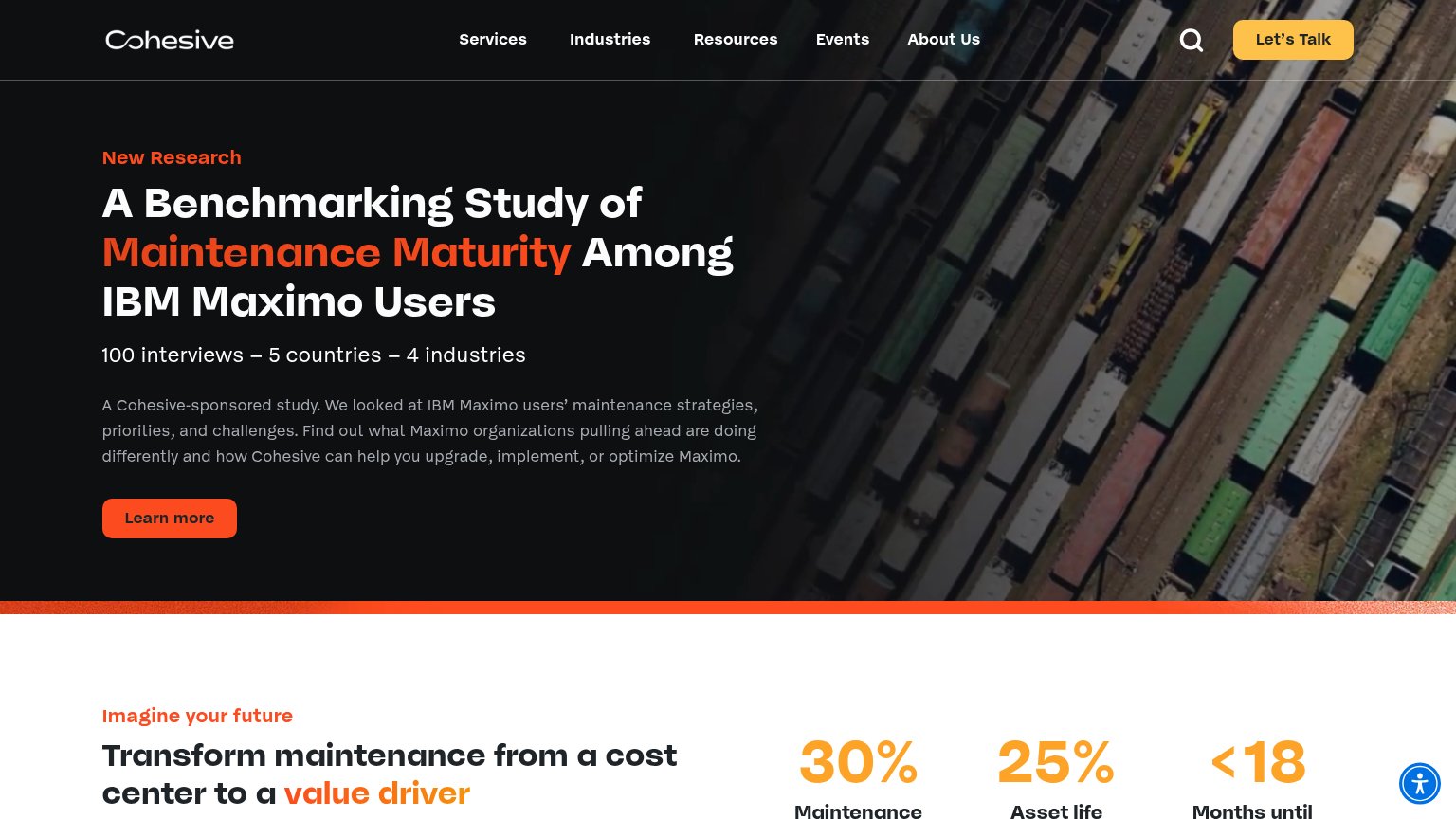
| "100 interviews – 5 countries – 4 industries" research study stat line | |
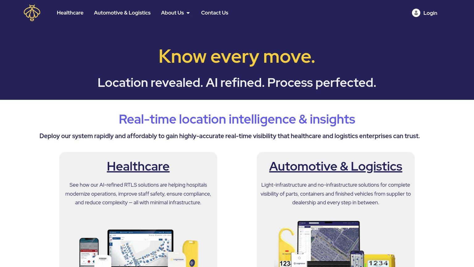
| Real product shots: RTLS dashboard with facility map, mobile app UI, and yellow Cognosos tracking tags in the Healthcare | |
| No visible trust signal identified. | |
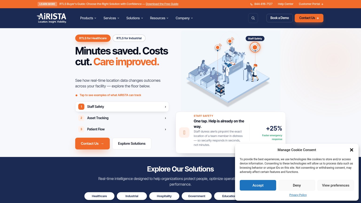
| "+25% Faster emergency response" stat beside the Staff Safety demo card | |
| No visible trust signal identified. |
CTA
63FairCopy, size, verb, cost-feel — does the primary CTA earn the click?
Problems
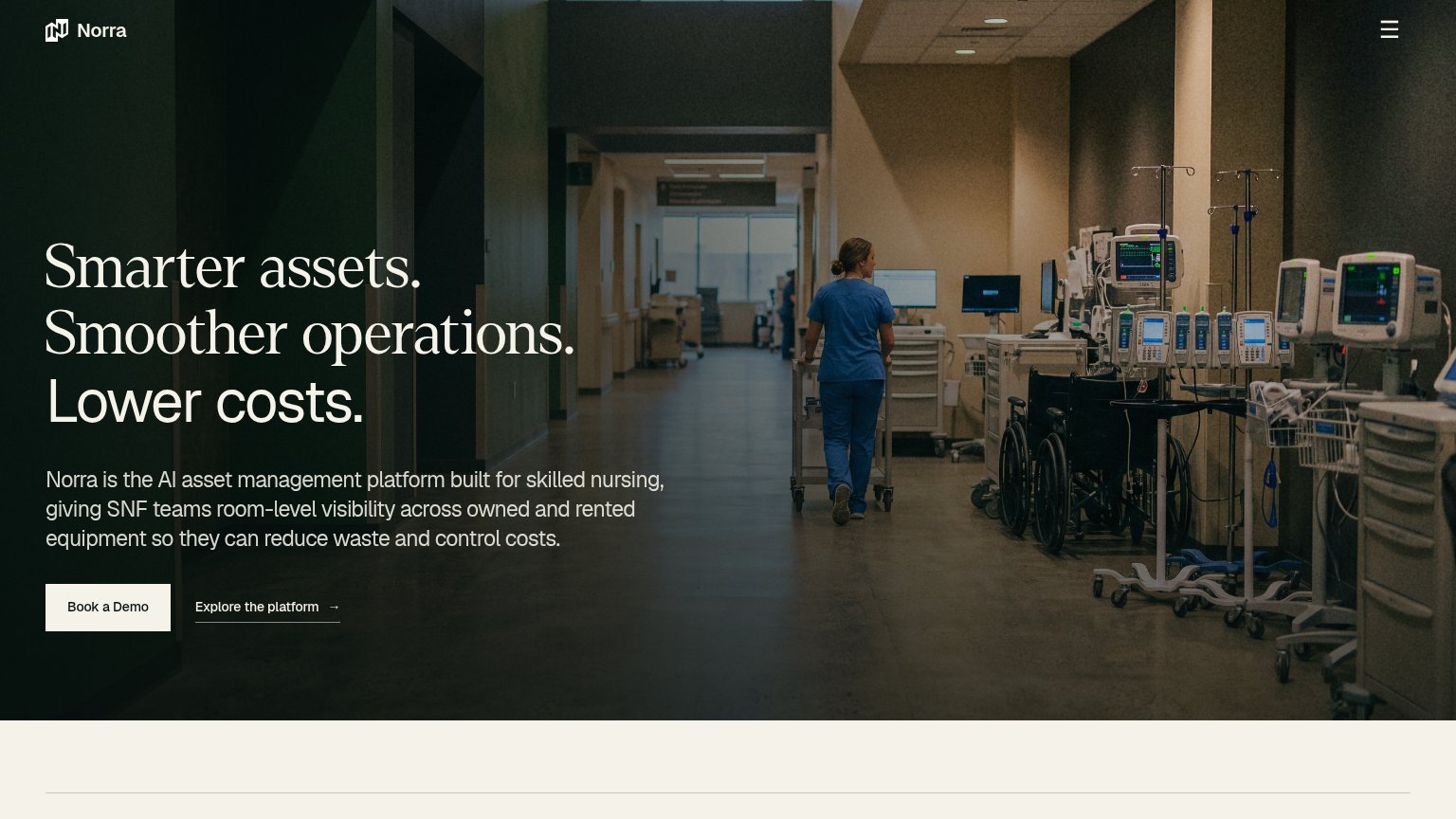
- 'Book a Demo' feels costly/committal
- button small vs. huge headline
- low contrast against cream palette
Value props
72FairTitle, subtitle, hero — do they sell the product's true value?
Norra’s headline undersells
Smarter assets. Smoother operations. Lower costs.
Norra is the AI asset management platform built for skilled nursing, giving SNF teams room-level visibility across owned and rented equipment so they can reduce waste and control costs.
Working
- Subhead names SNF teams precisely
- 'Room-level visibility' is concrete
- Owned vs rented scope is clear
Could improve
- H1 is a generic abstraction stack
- No numbers or proof points in fold
- Hero photo decorates, no product shown
Mobile web
72FairThe phone experience as a first-class citizen.
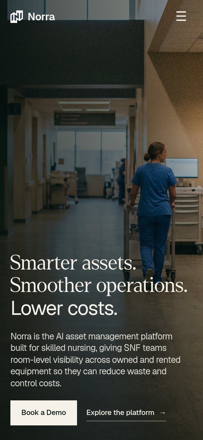 123
- Book a Demo button — Desktop-proportioned button hugging the bottom edge instead of a full-bleed thumb target.
- Hero headline block — Value statement starts two-thirds down the viewport, delaying the message and pushing the CTA to the fold line.
- Body paragraph — Five lines of dense copy stack between headline and CTA, stretching the tap distance.
Information hierarchy
78FairDoes the design help or inhibit what the page is trying to say?
123- Book a Demo button — Cream button is small relative to the fold and sits low-left; its quiet styling makes the one action easy to scan past.
- Explore the platform link — Secondary link sits at nearly equal visual weight beside the primary CTA, splitting the single decision at the point of action.
- Headline over hallway — Serif headline sits directly on mid-tone hallway detail with no scrim, costing legibility on the middle line.