
Your landing page’s weakest score is Value props.
How Expected Parrot ranks
- 1.
Roundtable (by Fairgen)77
- 2.
Viewpoints AI74
- 3.
Expected Parrot73
- 4.
Aaru72
- 5.
Synthetic Users71
73Growth scoreupdated
category scores
category scoresShowHide
Score over time
Value props
68FairTitle, subtitle, hero — do they sell the product's true value?
Expected Parrot’s headline undersells
Simulate your stakeholders.
Design studies, run research with AI personas and human participants, experiment with models and methods, and analyze the results in one open-source platform.
Working
- Memorable, distinctive headline
- Subhead names the real capability
- Elite university + YC proof strip
Could improve
- Headline unclear to newcomers
- No numbers or concrete outcomes
- No product visual demonstrating value
Trust
72FairProof that the product is real, competent, and safe to try.
| Trust read | |
|---|---|
| Expected Parrot | Logo row of MIT, Harvard, Stanford, Berkeley, Oxford, Columbia, and Yale under "ACCELERATING RESEARCH AT LEADING INSTITU |
| "The AI feedback lined up with human feedback over 95% of the time." — Adam King, Behavioural Scientist | |
| 'TRUSTED BY LEADING ORGANIZATIONS' logo strip including Stanford University, C+R Research, and Institute for Futures Stu | |
| Matched a live mock jury — Published head-to-head in DRI's For The Defense, May 2026 | |
| Logo strip with EY, Bayer, IPG, Omnicom Group and claim "Six months of global wealth research in one day. 0.90 median co |
Mobile web
72FairThe phone experience as a first-class citizen.
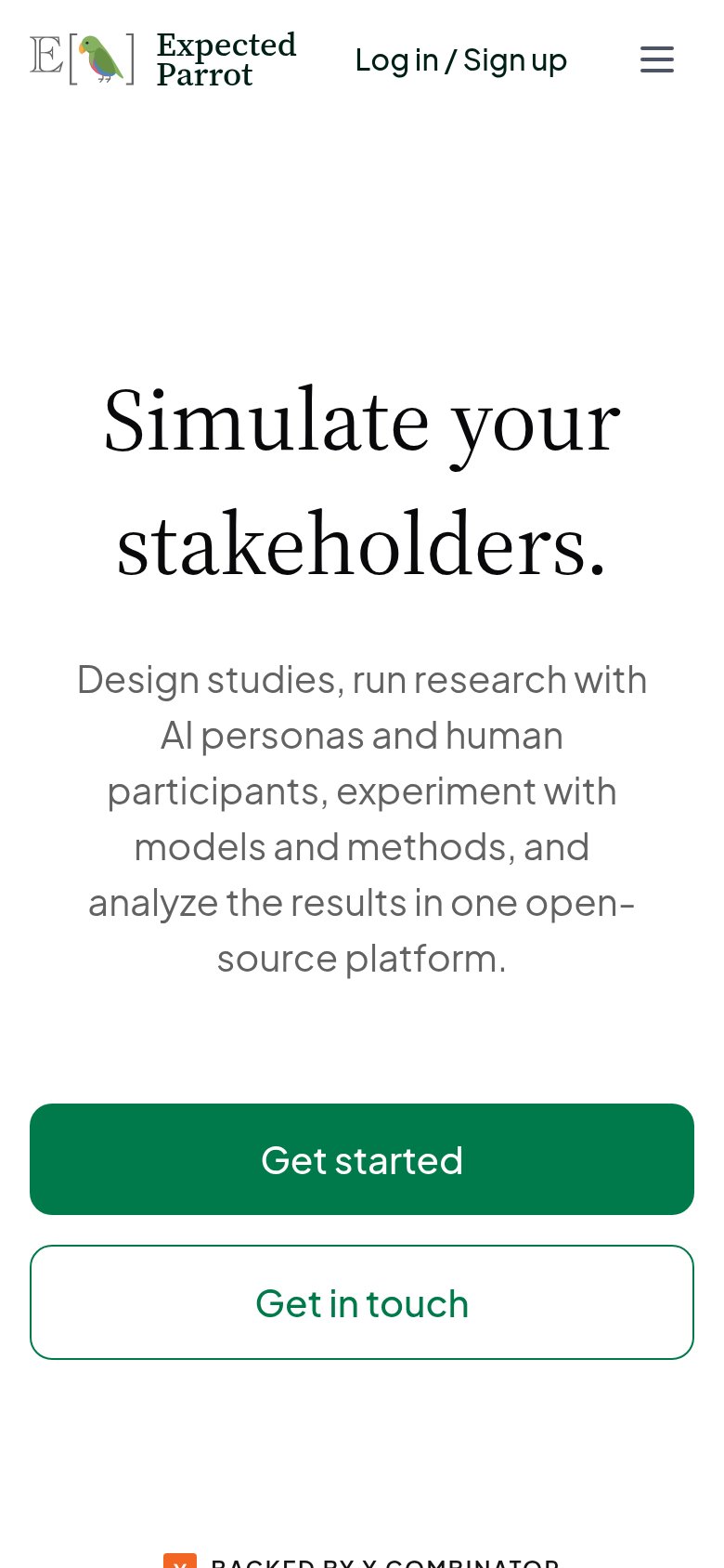 123
- Oversized wrapping headline — Headline barely scaled down from desktop, eating half the viewport and pushing the CTA off-screen.
- Seven-line subheadline — Long paragraph-length subhead crowds the fold and displaces both CTA buttons below the first viewport.
- Get started button — Primary CTA lands below the first viewport; visitors must scroll before any tap target appears.
CTA
76FairCopy, size, verb, cost-feel — does the primary CTA earn the click?
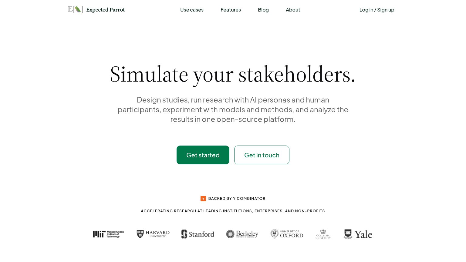
Problems
- generic label, no product hook
- no echo of headline promise
- payoff of click unstated
Information hierarchy
78FairDoes the design help or inhibit what the page is trying to say?
123- Get in touch button — Outlined button nearly matches the primary CTA's size and shape, splitting the action decision.
- Nav link row — Five links (Use cases, Features, Blog, About, Log in) offer exits before the visitor reaches the CTA.
- Subheadline paragraph — Six clauses packed into one sentence blur the single benefit the headline sets up.