Past reportsShow past reportsHide past reports
- Sep 22, 202670LiveOverall +2 · CTA −12 · Information hierarchy +10Viewing
- Jul 20, 202668First tracked report — strongest Mobile web 82, weakest Trust 48View →

Your landing page’s weakest score is Trust.
How Clicks Health ranks
category scores
Proof that the product is real, competent, and safe to try.
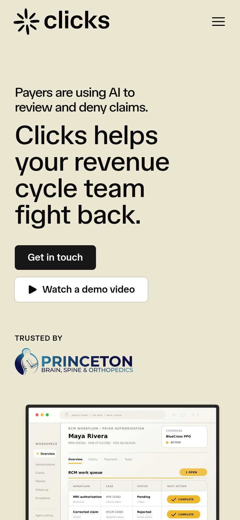
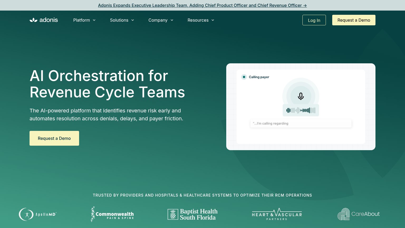
| Trust read | |
|---|---|
| Clicks Health | Detailed RCM work-queue product UI showing prior authorization, corrected claim, and denial follow-up cases with agent a |
| No visible trust signal identified. | |
| Customer logo bar (ApolloMD, Commonwealth Pain & Spine, Baptist Health South Florida, Heart & Vascular Partners, CareAbo | |
| ">90% positive ratings from patients" metric strip beneath the hero CTA | |
| No visible trust signal identified. |
Copy, size, verb, cost-feel — does the primary CTA earn the click?
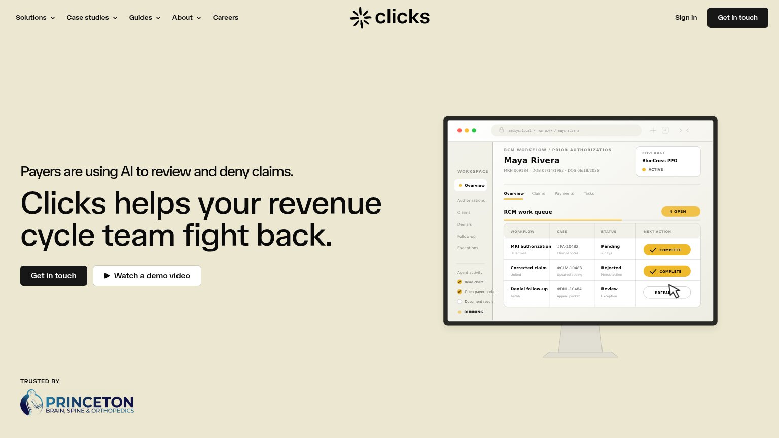

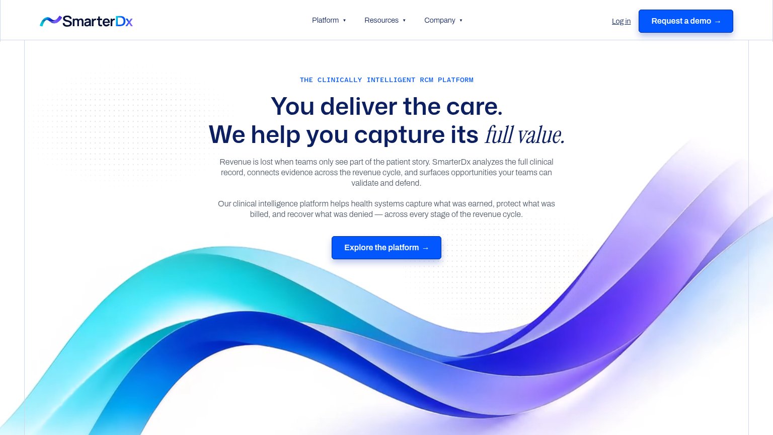
Problems
Title, subtitle, hero — do they sell the product's true value?
Clicks helps your revenue cycle team fight back.
Payers are using AI to review and deny claims.
Working
Could improve
The phone experience as a first-class citizen.
12Does the design help or inhibit what the page is trying to say?
1234You need a lazyweb account to add your product, do a growth audit, create backlog and more
Sign me in to my Lazyweb report hub. Fetch https://www.lazyweb.com/hub/agent/sign-in.md and follow its instructions exactly. If you can't fetch URLs, tell me and I'll paste the instructions instead.
Lazyweb MCP
Step 1 of 2 · your login
Where should we send your reports? This email becomes your login on lazyweb.com — everything your agent makes lands in your workspace.
That doesn't look like an email — check it and try again.
No password, no spam — one workspace link now, then your agent command.
Step 2 of 2 · your agent
Paste this into your agent. Claude Code, Codex, Cursor, or another MCP-capable agent opens the link and sets itself up. Data access is plan-dependent.
Generating your agent command...
Free account
We’ll add Clicks Health as your product and bring this score into your workspace. You can change it later in Settings.