What Do Apps Change When They A/B Test Their Signup and Login Screens?
Lazyweb Research detected 347 before/after auth-screen experiments across 85 companies.[1] The recurring changes cluster around swapping modal logins for full-screen branded ones, adding concrete incentives to the signup form, and simplifying provider choosers — though these are observed changes with inferred rationale, not measured lift.
Lazyweb Research detected 347 signup/login-screen experiments across 85 companies (July 2026).

The finding
347 detected auth-screen experiments span 85 companies — an average of roughly 4 tracked auth changes per experimenting company.[1][2] These are before/after UI diffs on signup/login screens; the direction of each change is observed, but the rationale is LLM-inferred and no conversion lift is measured.[3]
Recurring change patterns
Common observed moves on auth screens include:
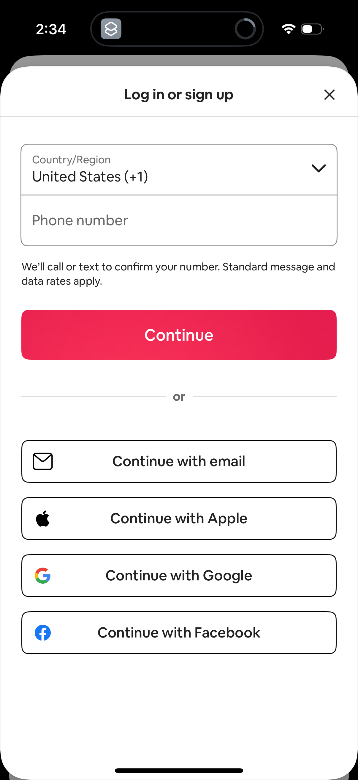
- Modal to full-screen login. Capcut replaced a modal sign-in (TikTok/Google/Facebook) with a full-screen branded login adding phone/email/Apple; the inferred rationale is that a native-feeling full-screen flow with familiar entry points increases completion.[4]
- Incentive on the signup form. DoorDash swapped a marketing carousel 'Sign Up' button for a full signup form offering 'up to 40% off your first order' with name/email/mobile fields — inferred: a concrete discount on the form lowers friction versus a carousel.[5]
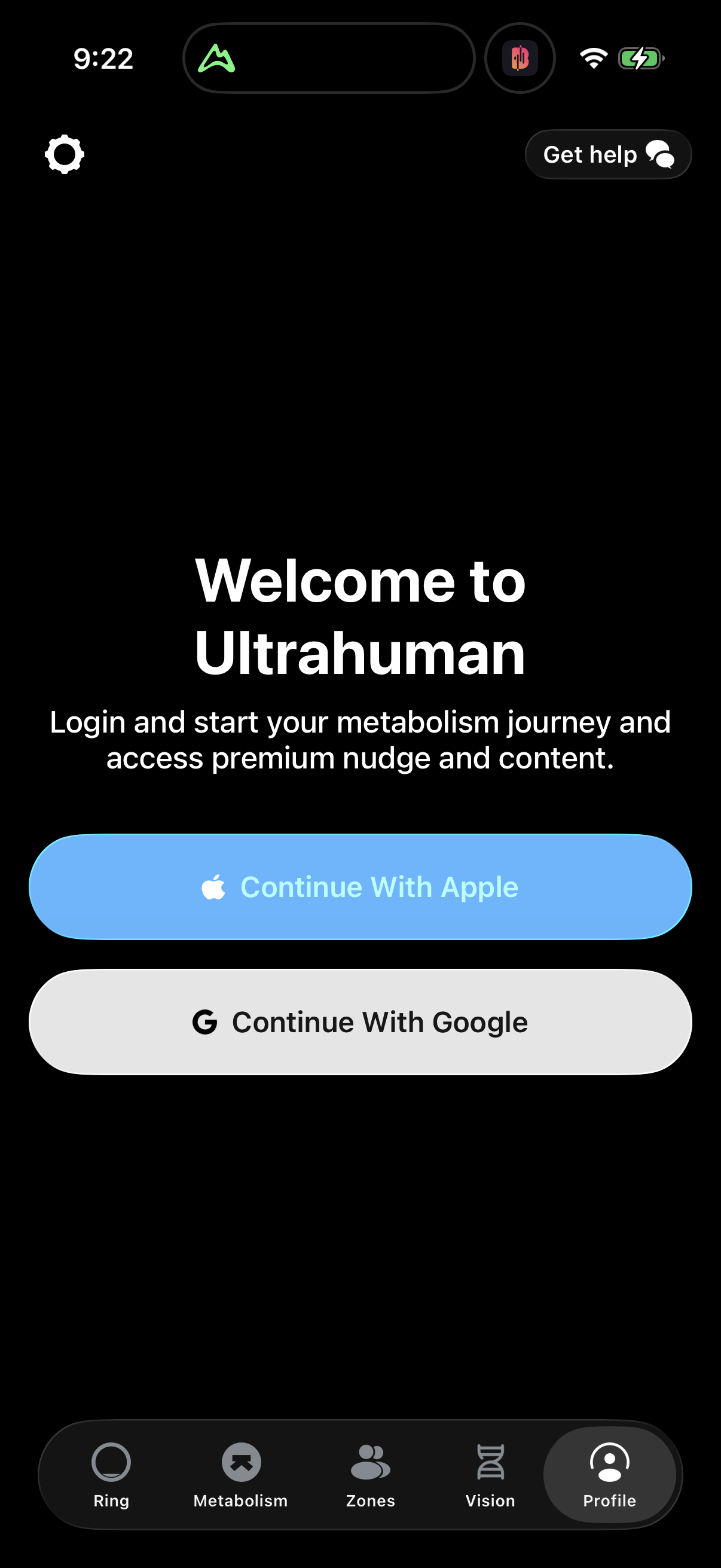
- Fewer decisions. YouTube Music replaced an account-selection UI ('Continue as' + avatar) with a single 'Sign in' button, on the inferred logic that one primary action reduces decision friction.[6]
- Brand-first welcome. Yelp replaced a profile-avatar card with a centered-logo welcome showing Google/Apple buttons and a prominent 'Continue with email' CTA — inferred to cut clutter and decision time.[7]
How to apply it
If you are prioritizing an auth-screen test, the tracked field gravitates toward three levers: reduce choices to one clear primary action, make the flow full-screen and on-brand rather than a bare modal, and put a concrete incentive on the form itself.[4][5][6][7] These are the changes real apps ship most — a reasonable menu of hypotheses to test on your own screen.
Caveats
These are observed before/after changes with inferred rationale, never measured lift — do not read them as proven wins.[3] The 347-experiment count is detection-based across 85 companies and reflects what the diff pipeline caught, not every test those apps ran.[1]
The numbers
| Stat | Computed from |
|---|---|
| 347 experiments | auth_experiments_count: 347 detected auth-screen experiments |
| 85 companies (~4 per company) | auth_experiments_count: across 85 companies; 347/85≈4.1 |
| observed change + inferred rationale (no measured lift) | smallSampleWarnings: experiment learnings are LLM-inferred rationales, never measured lift |
| Capcut: modal login -> full-screen branded login | qualitative: capcut account login |
| DoorDash: carousel button -> signup form with 'up to 40% off first order' | qualitative: doordash sign up |
| YouTube Music: account-selection UI -> single 'Sign in' button | qualitative: youtube-music account login |
| Yelp: avatar card -> brand-first welcome with Google/Apple + email CTA | qualitative: yelp account login |
Sources & citations
- [1] Lazyweb Research analysis of 347 auth-screen experiments (before/after signup/login UI diffs across 85 companies), July 2026. Detected before/after UI changes on signup/login canonical screens; each has an observed change and an LLM-inferred rationale, never a measured conversion lift. ↩
Source: Lazyweb Research — proprietary analysis of real, in-market app screens. Cite as Lazyweb Research, 2026-07-07.