
Your landing page’s weakest score is Value props.
How Zenarate ranks
38Growth scoreupdated
category scores
category scoresShowHide
Value props
18PoorTitle, subtitle, hero — do they sell the product's true value?
Working
- Nationwide logo lends enterprise credibility
- Trust strip is legible and prominent
Could improve
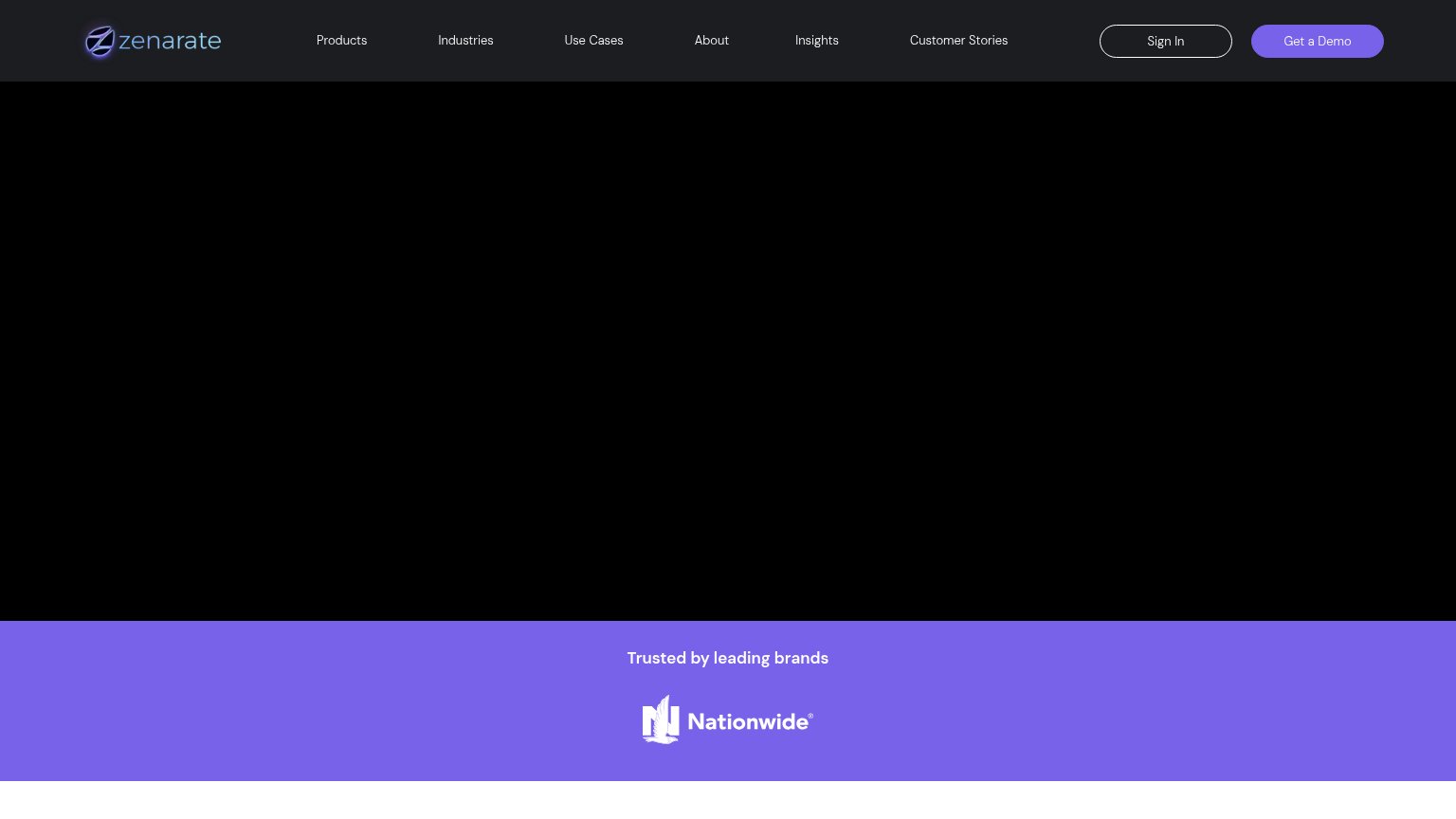
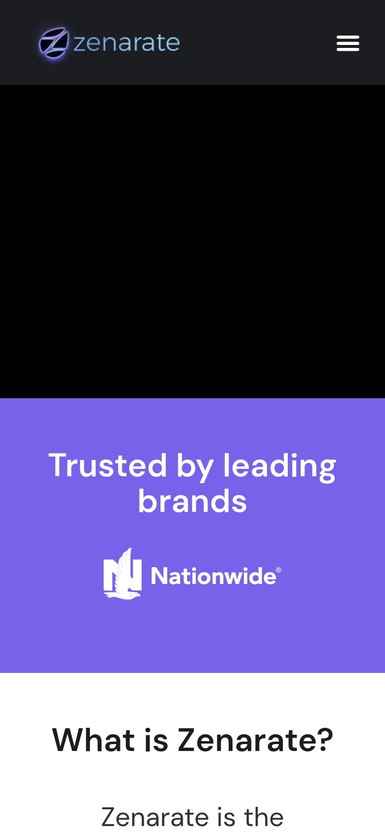
- Hero is a black void with no copy
- No headline or subhead visible at all
- No product visual demonstrates value
Information hierarchy
32PoorDoes the design help or inhibit what the page is trying to say?
 123
- Get a Demo button — Primary CTA is small, tucked in the corner, and visually matched by the adjacent Sign In button.
- Six-link nav row — Seven exit paths (nav plus Sign In) all outweigh the single conversion action in scan priority.
- Trust strip single logo — "Trusted by leading brands" shows only one logo, undercutting the plural claim it makes.
Mobile web
38PoorThe phone experience as a first-class citizen.
What works
What to improve
Trust
42PoorProof that the product is real, competent, and safe to try.
How Zenarate compares
Trust read
CTA
58FairCopy, size, verb, cost-feel — does the primary CTA earn the click?
How Zenarate compares
Recommended rewrites