
Your landing page’s weakest score is Trust.
How Zenadrone ranks
59Growth scoreupdated
category scores
category scoresShowHide
Trust
48PoorProof that the product is real, competent, and safe to try.
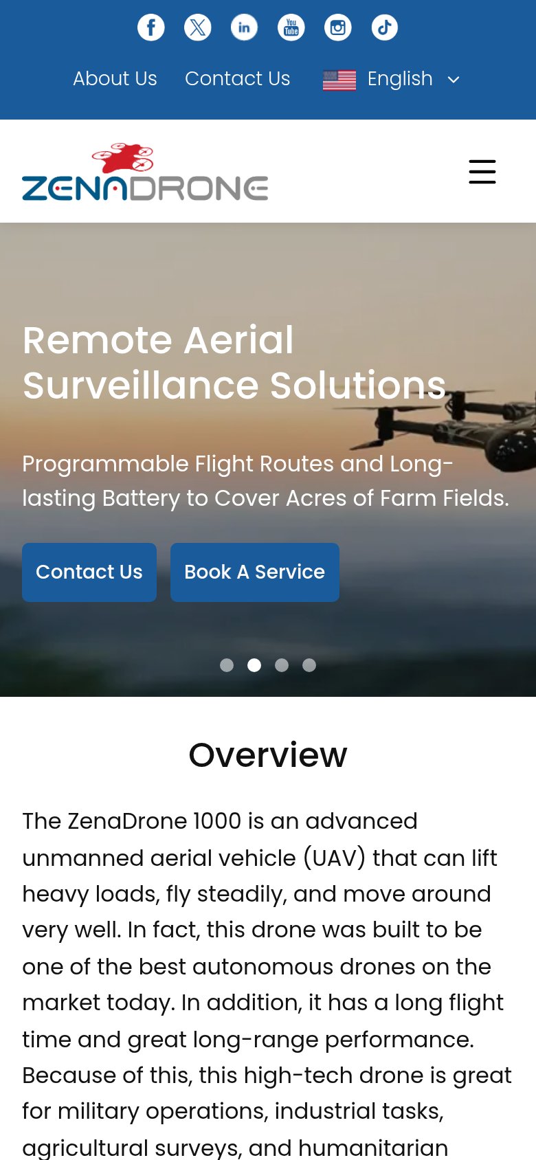
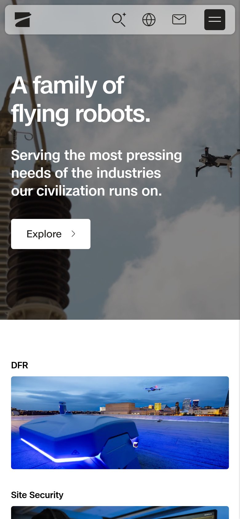
| Trust read | |
|---|---|
| Zenadrone | Hero photo of the real ZenaDrone 1000 drone in flight |
| "Engineered, manufactured, and deployed in America" badge with US flag | |
| implicit context Zipline may benefit from pre-existing familiarity among its target audience. | |
| Real product footage: Skydio drone in flight over a city skyline (desktop hero) and dock station with drone airborne (mo | |
| No visible trust signal identified. | |
| No visible trust signal identified. |
Information hierarchy
58FairDoes the design help or inhibit what the page is trying to say?
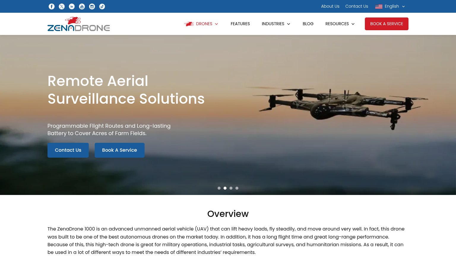 1234
- Twin hero buttons — "Contact Us" and "Book A Service" share identical blue styling, so neither reads as the primary action.
- Social icon row — Six social exits occupy the highest-attention strip on the page before any value is communicated.
- Carousel dot indicators — Four rotating slides mean the value proposition cycles away instead of staying anchored.
- Nav BOOK A SERVICE — Red nav button duplicates the hero CTA, splitting attention across three booking/contact actions.
Value props
58FairTitle, subtitle, hero — do they sell the product's true value?
Zenadrone’s headline
Remote Aerial Surveillance Solutions
Programmable Flight Routes and Long-lasting Battery to Cover Acres of Farm Fields.
Working
Could improve
CTA
64FairCopy, size, verb, cost-feel — does the primary CTA earn the click?
How Zenadrone compares
Recommended rewrites
Mobile web
68FairThe phone experience as a first-class citizen.
What works
What to improve