
Your landing page’s weakest score is Mobile web.
How Writer ranks
Mobile web
42PoorThe phone experience as a first-class citizen.
 1234
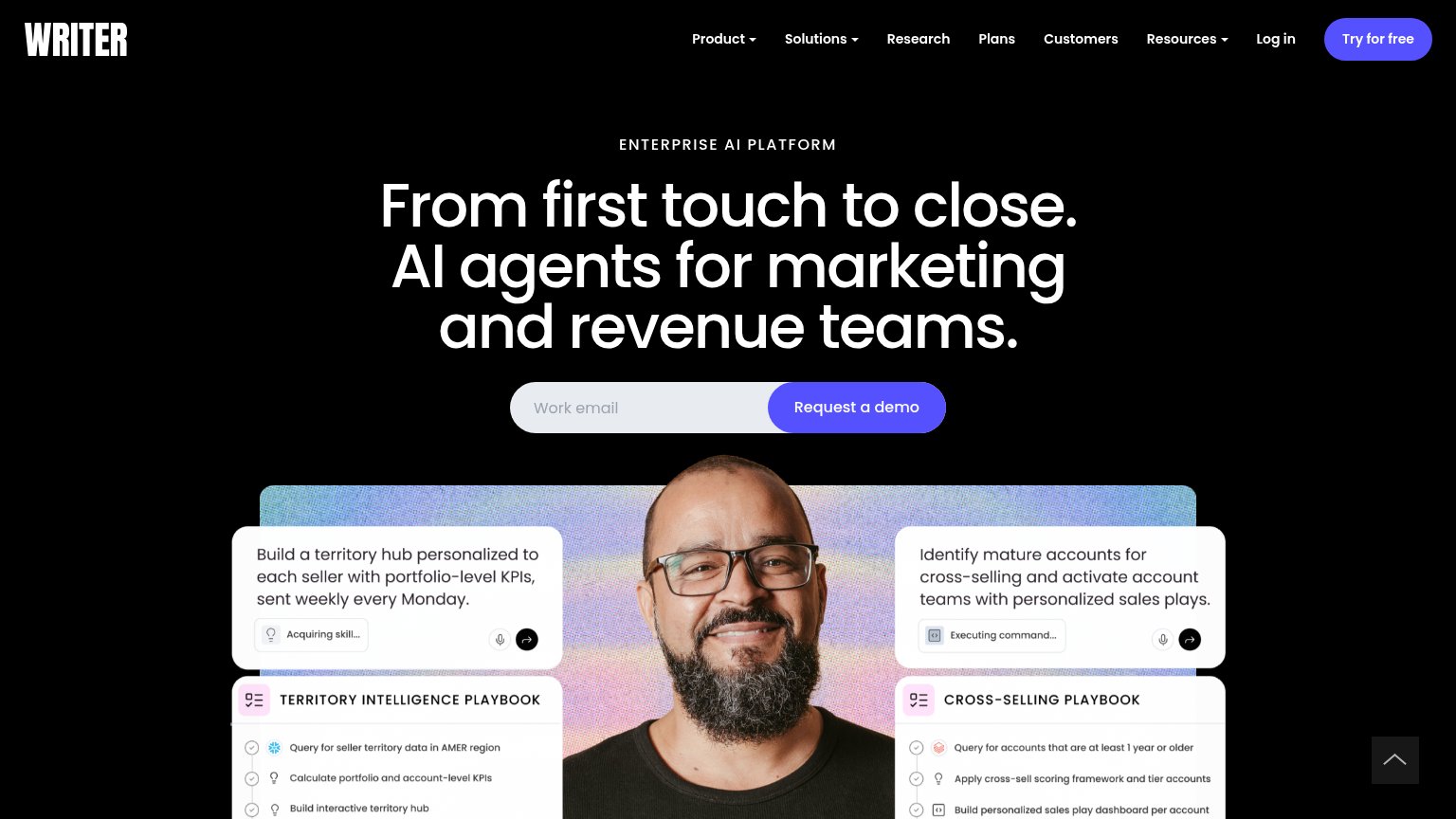
- Oversized hero image — Consumes most of the fold and pushes the headline and demo CTA entirely off-screen.
- Clipped headline text — The value statement is cut to a fragment below the eyebrow, so the fold makes no pitch.
- Tiny playbook cards — Desktop-sized UI cards scale down to illegible type inside the hero image.
- Scroll button overlaps logos — Floating scroll-to-top control covers the trust-bar logo, which is also clipped at the edge.
CTA
55FairCopy, size, verb, cost-feel — does the primary CTA earn the click?
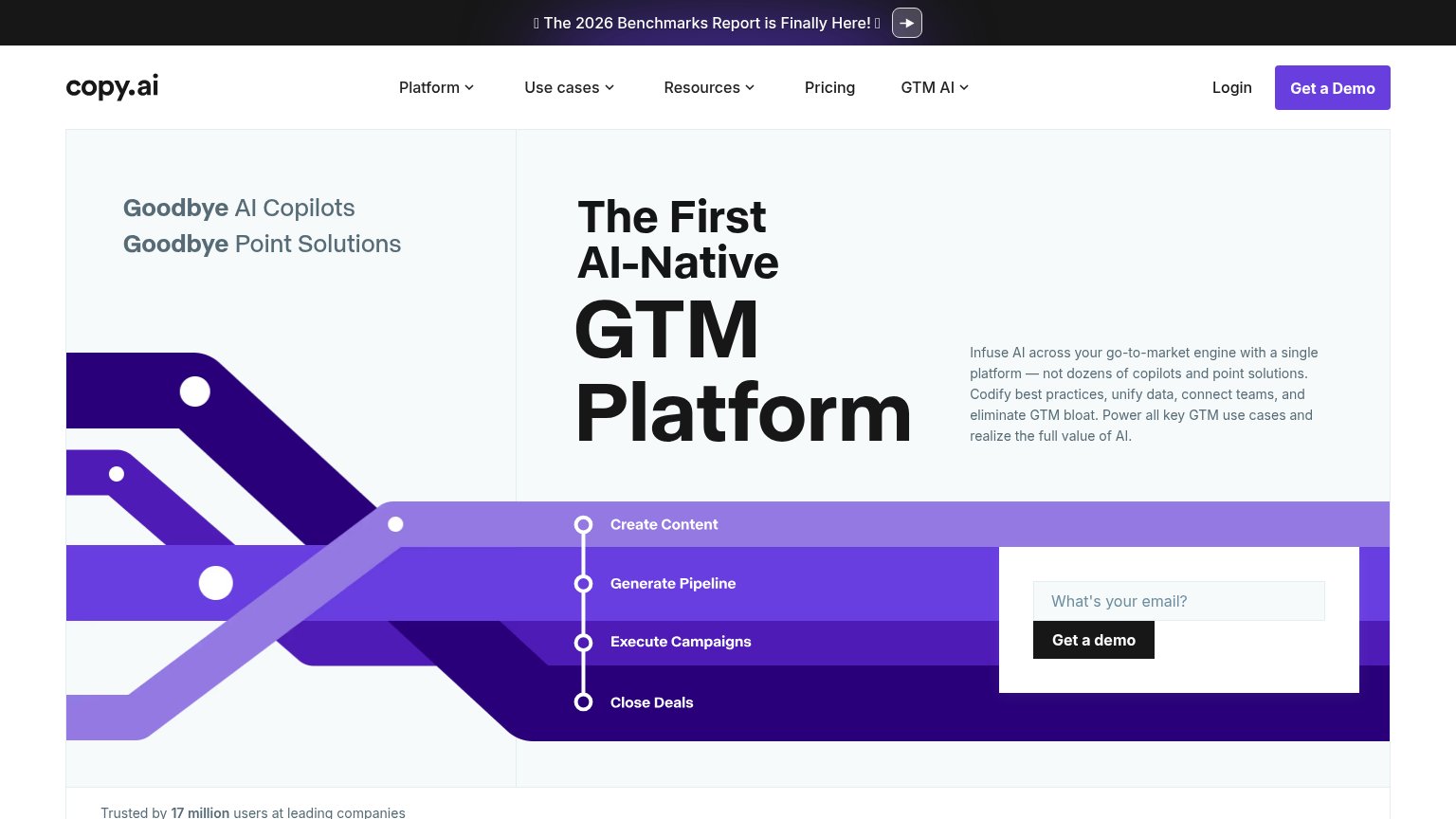
Problems
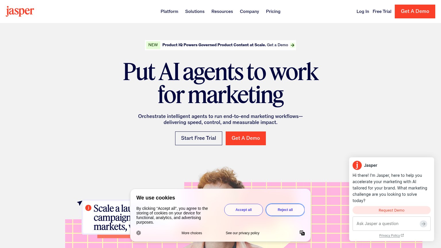
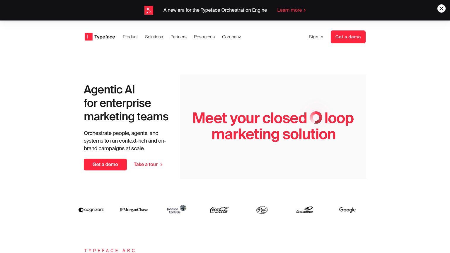
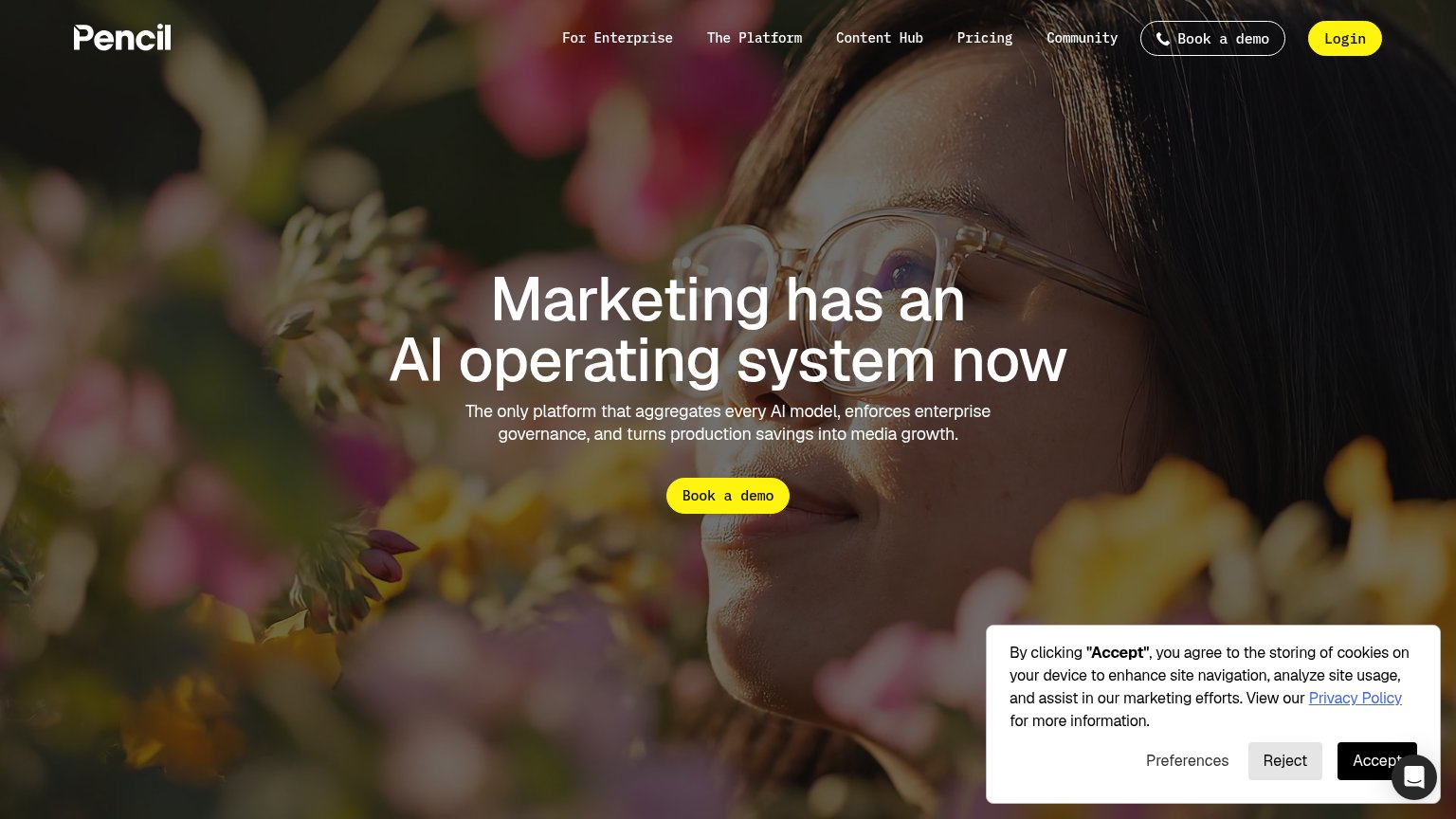
- demo request feels costly
- 'free' offer buried in nav
- conflicting labels split intent
- no CTA above mobile fold
Trust
58FairProof that the product is real, competent, and safe to try.
How Writer compares
Trust read
Information hierarchy
72FairDoes the design help or inhibit what the page is trying to say?
What works
What to improve
Value props
72FairTitle, subtitle, hero — do they sell the product's true value?
Writer’s headline
From first touch to close. AI agents for marketing and revenue teams.
Working
Could improve