
Your landing page’s weakest score is Value props.
How Typeface ranks
70Growth scoreupdated
category scores
category scoresShowHide
Value props
62FairTitle, subtitle, hero — do they sell the product's true value?
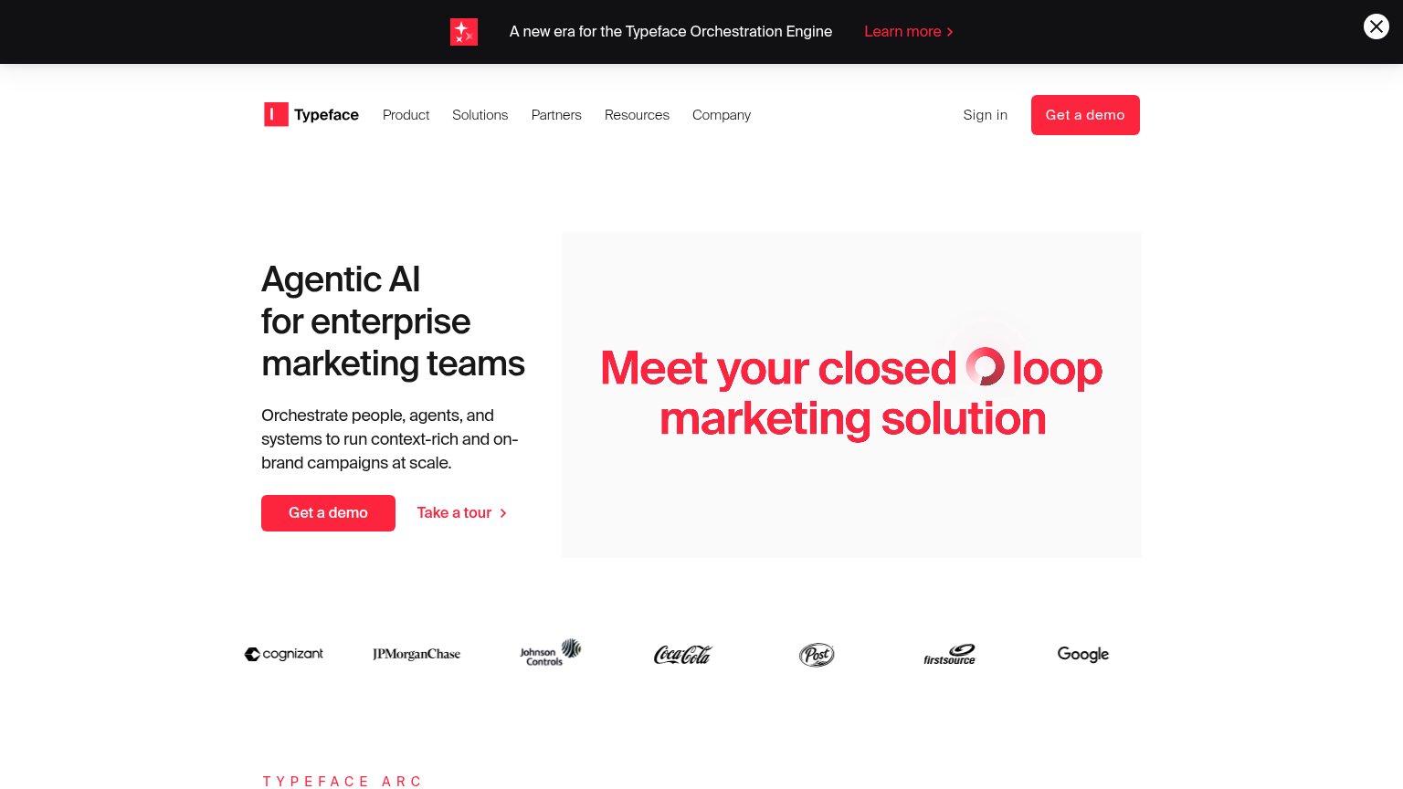
Typeface’s headline vague
Agentic AI for enterprise marketing teams
Orchestrate people, agents, and systems to run context-rich and on-brand campaigns at scale.
Working
- Names the exact buyer: enterprise marketing
- Strong logo proof: Coca-Cola, Google, JPMC
- Subhead hints at real orchestration value
Could improve
- 'Agentic AI' is category jargon, not outcome
- No numbers or concrete results anywhere
- Hero visual is a slogan, not the product
Information hierarchy
68FairDoes the design help or inhibit what the page is trying to say?
 123
- Red hero panel headline — "Meet Typeface's closed loop marketing solution" is set larger and bolder than the actual H1, splitting the fold into two competing headlines.
- Announcement banner — Black bar with red "Learn more" link is the first element in the scan path and routes attention away before the hero loads.
- Duplicate demo CTAs — Nav "Get a demo" repeats the hero button at identical weight and color, diluting a single focal action.
CTA
72FairCopy, size, verb, cost-feel — does the primary CTA earn the click?
How Typeface compares
Recommended rewrites
Trust
72FairProof that the product is real, competent, and safe to try.
How Typeface compares
Trust read
Mobile web
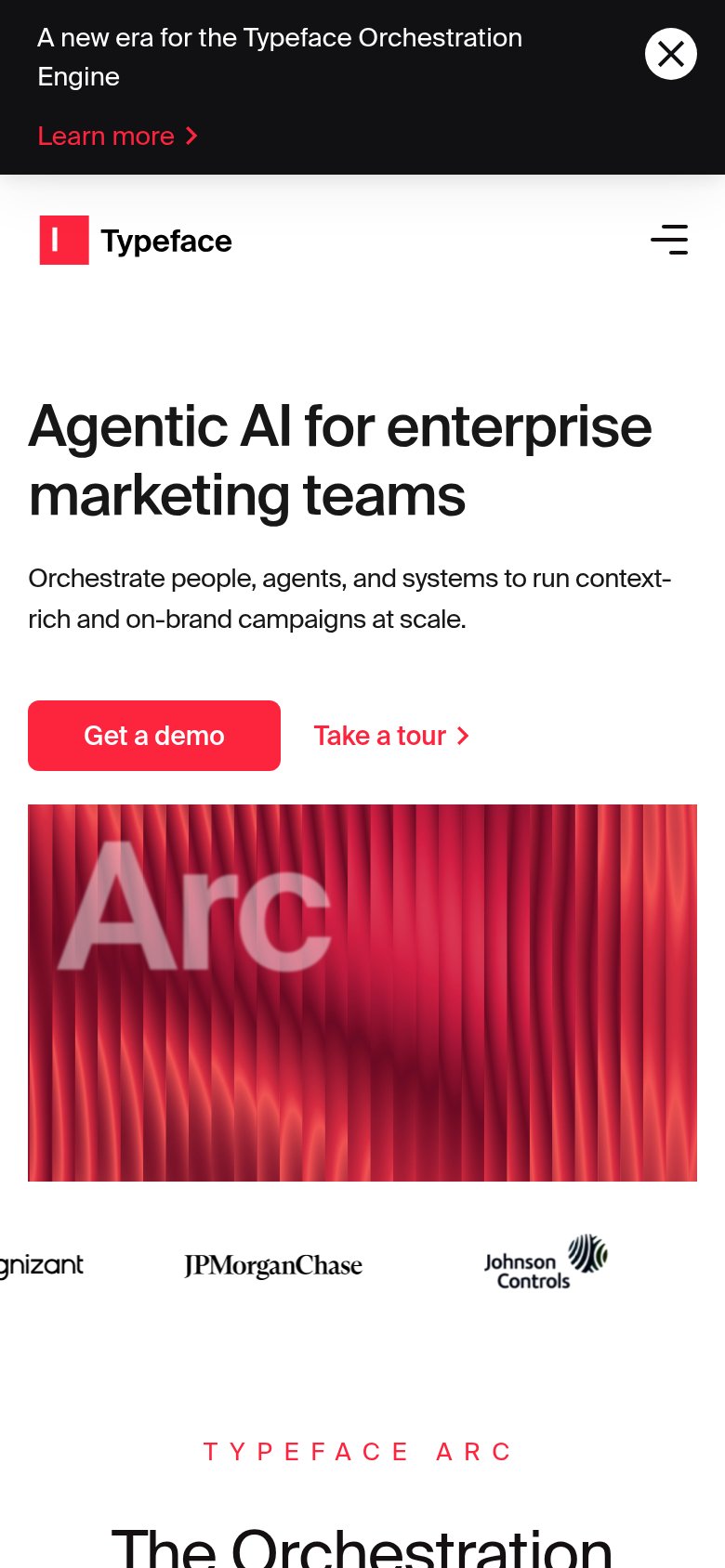
76FairThe phone experience as a first-class citizen.
What works
What to improve