
Your landing page’s weakest score is Information hierarchy.
How Wonik Robotics ranks
43Growth scoreupdated
category scores
category scoresShowHide
Information hierarchy
38PoorDoes the design help or inhibit what the page is trying to say?
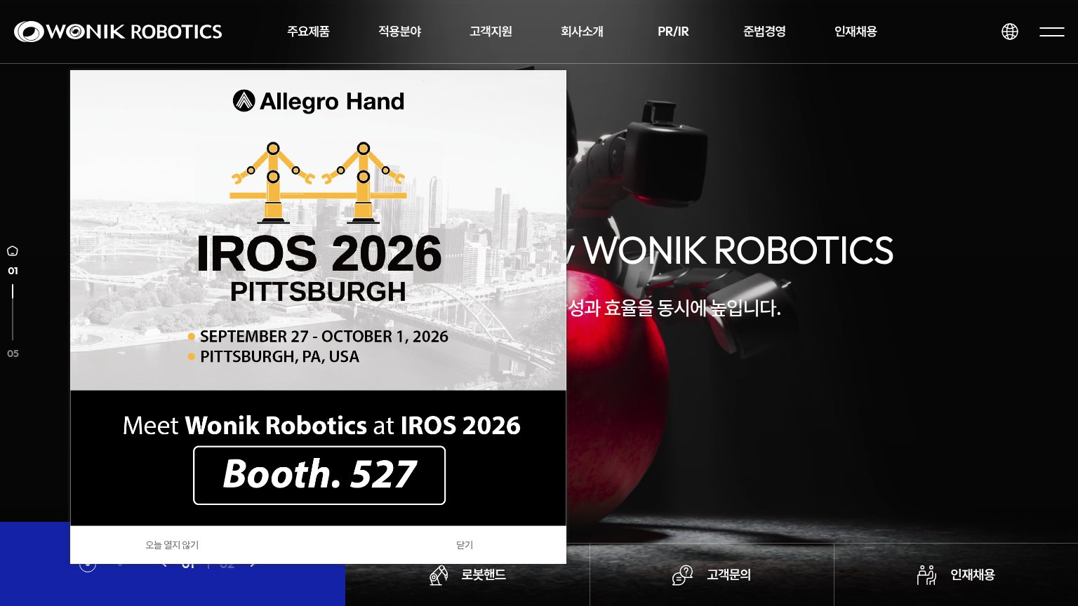 1234
- IROS 2026 popup — Covers the hero headline and subtitle, hiding the value proposition on first load.
- Obscured hero headline — Headline and Korean subtitle are cut off behind the modal, leaving the promise half-readable.
- Seven-item nav bar — Seven equal-weight links plus globe and hamburger leak attention with no primary CTA to compete.
- Bottom quick-link tabs — Three same-weight exits (로봇핸드, 고객문의, 인재채용) split the fold's only actionable focus three ways.
Mobile web
38PoorThe phone experience as a first-class citizen.
 123
- IROS 2026 pop-up — Event interstitial fills the entire first viewport and buries the hero and any primary CTA below the fold.
- Booth. 527 badge — Styled like a button but does no conversion work — it is not a tappable action, just static promo text.
- Dismiss text links — "오늘 열지 않기" and "닫기" are small, plain text taps — the mandatory exit from the overlay is easy to miss.
CTA
42PoorCopy, size, verb, cost-feel — does the primary CTA earn the click?
How Wonik Robotics compares
Recommended rewrites
Value props
42PoorTitle, subtitle, hero — do they sell the product's true value?
Wonik Robotics’s headline
WONIK ROBOTICS
성과 효율을 동시에 높입니다.
Working
Could improve
Trust
56FairProof that the product is real, competent, and safe to try.
How Wonik Robotics compares
Trust read