
Your landing page’s weakest score is Information hierarchy.
How Shadow Robot ranks
47Growth scoreupdated
category scores
category scoresShowHide
Information hierarchy
28PoorDoes the design help or inhibit what the page is trying to say?
 1234
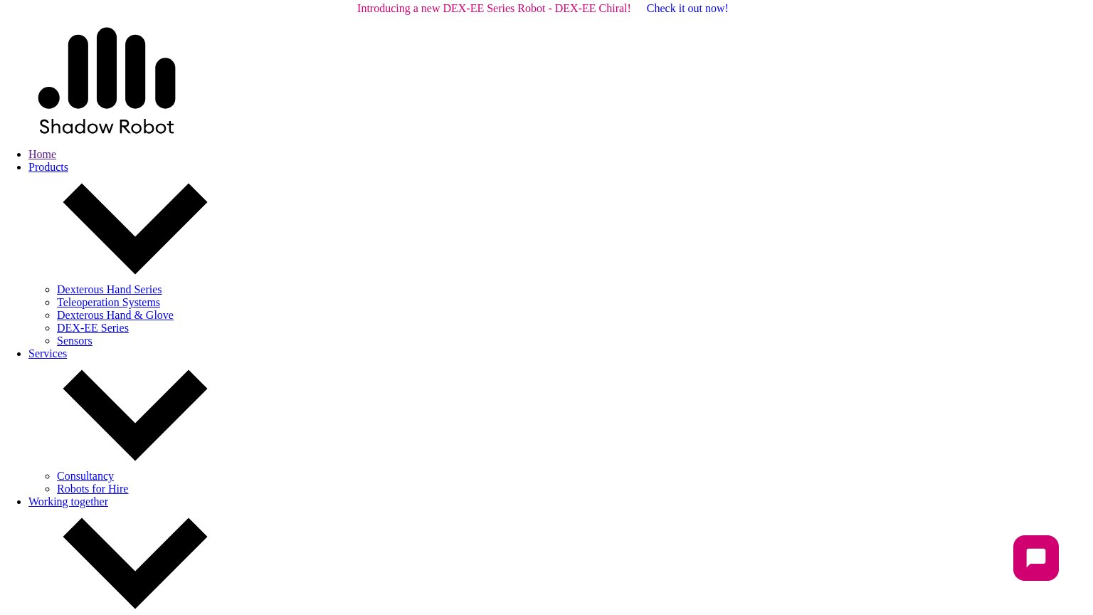
- Unstyled nav list — The entire desktop fold is a raw unstyled link list — the hero, headline, and CTA never render.
- Giant chevron glyphs — Dropdown carets render at hundreds of pixels, dominating the viewport with meaningless black shapes.
- Oversized logo block — The logo renders at raw asset size, pushing all content down and signaling a broken page.
- Announcement banner link — "Check it out now!" is the only styled CTA visible and it routes attention away from the missing hero.
Value props
42PoorTitle, subtitle, hero — do they sell the product's true value?
Shadow Robot’s headline undersells
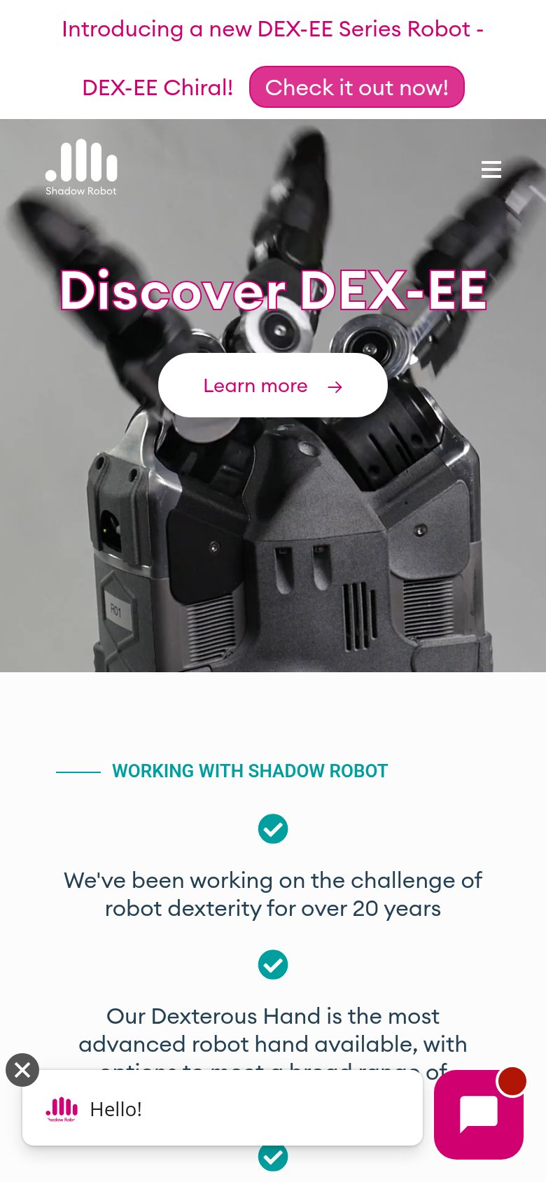
Discover DEX-EE
Working
- Hero image shows the real robot hand
- 'Most advanced robot hand' claim below fold
- '20 years' credibility marker on page
Could improve
- Headline names a SKU, not a value
- No subhead to explain what DEX-EE is
- Best proof points buried below hero
Trust
48PoorProof that the product is real, competent, and safe to try.
How Shadow Robot compares
Trust read
CTA
58FairCopy, size, verb, cost-feel — does the primary CTA earn the click?
How Shadow Robot compares
Recommended rewrites
Mobile web
58FairThe phone experience as a first-class citizen.
What works
What to improve