
Your landing page’s weakest score is Mobile web.
How Wing Assistant ranks
- 1.
Duckbill74
- 2.
Ohai.ai74
- 3.
Wing Assistant73
- 4.
Magic61
- 5.
Fancy Hands56
- 6.
faff32
Mobile web
58FairThe phone experience as a first-class citizen.
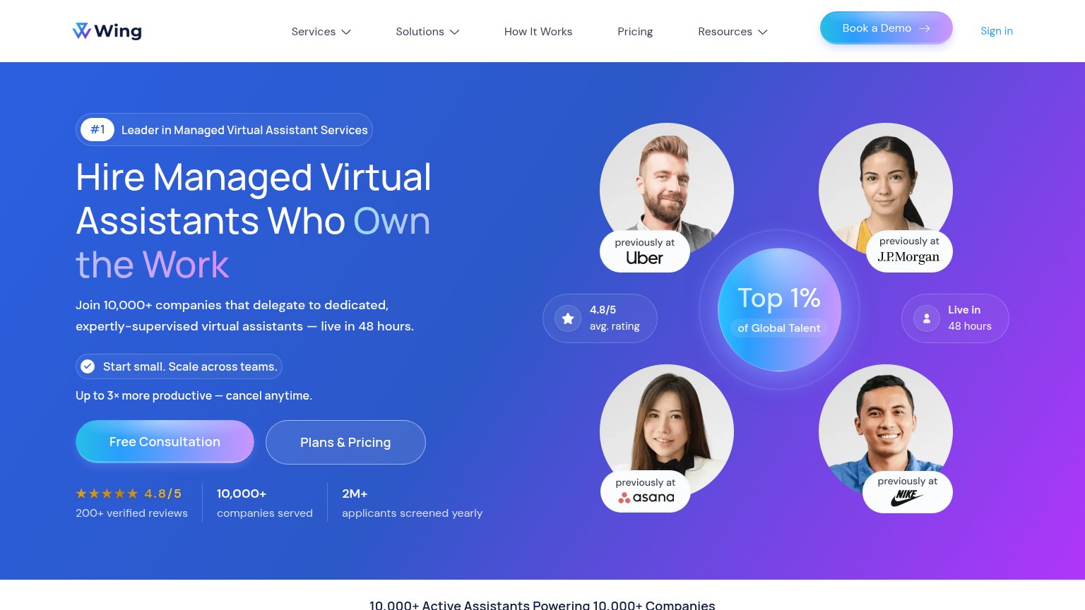
The mobile capture for Wing Assistant failed, so this grade comes from responsive signals in the desktop fold only and is capped per the rubric. The desktop capture shows encouraging raw material — a single-column text block with the "Free Consultation" primary CTA, no cookie banner, chat bubble, or pop-up visible — but the fold stacks a badge, a three-line headline, a subhead, a "Start small. Scale across teams." pill, a productivity line, two CTAs, and a three-stat row, which is a lot to compress into a phone column without burying the button. Whether the six-item nav with "Services" and "Solutions" dropdowns collapses to a clean hamburger cannot be verified. The biggest lever is restoring a mobile capture and confirming "Free Consultation" stays tappable in the first phone viewport.
CTA
66FairCopy, size, verb, cost-feel — does the primary CTA earn the click?
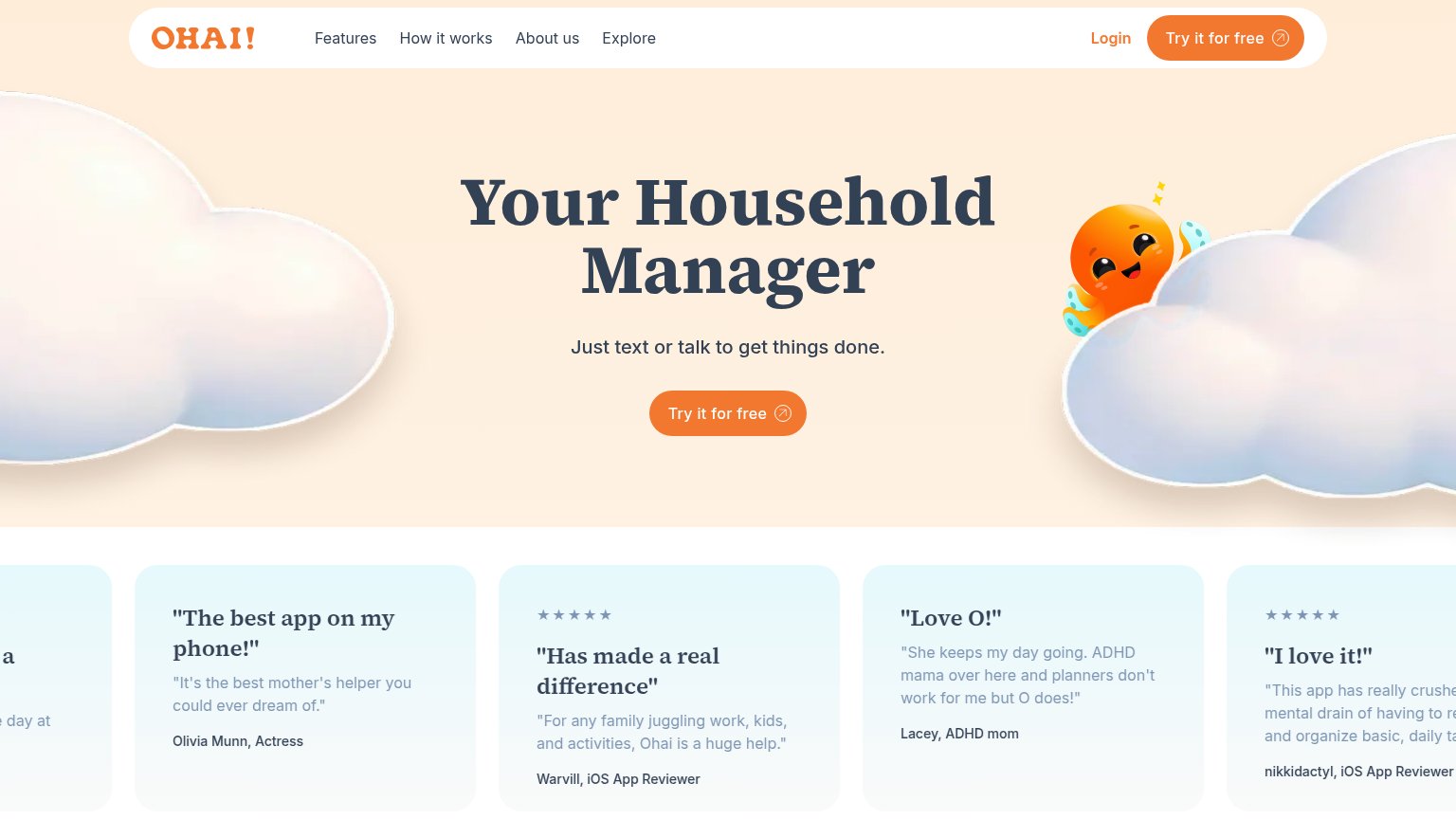
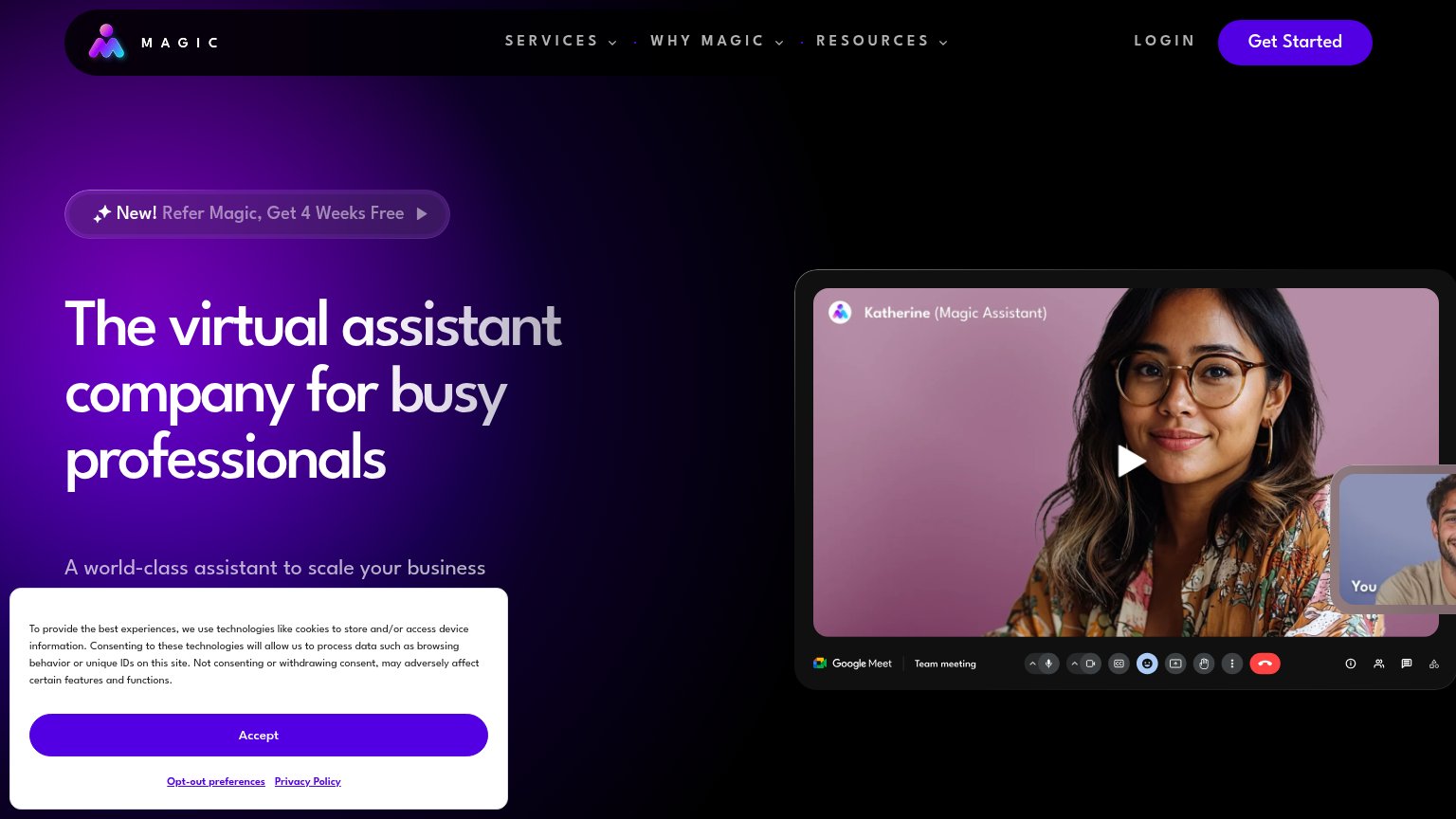
Problems
- no action verb — reads as a label
- 'Consultation' feels like a sales call
- competes with nav's 'Book a Demo'
Information hierarchy
76FairDoes the design help or inhibit what the page is trying to say?
What works
What to improve
Trust
78FairProof that the product is real, competent, and safe to try.
How Wing Assistant compares
Trust read
Value props
86StrongTitle, subtitle, hero — do they sell the product's true value?
Hire Managed Virtual Assistants Who Own the Work
Join 10,000+ companies that delegate to dedicated, expertly-supervised virtual assistants — live in 48 hours.
Working
Could improve