
Your landing page’s weakest score is Value props.
How WinFactor ranks
58Growth scoreupdated
category scores
category scoresShowHide
Value props
52FairTitle, subtitle, hero — do they sell the product's true value?
WinFactor’s headline vague
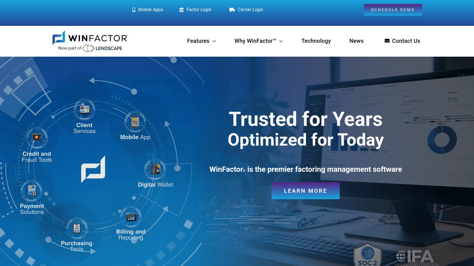
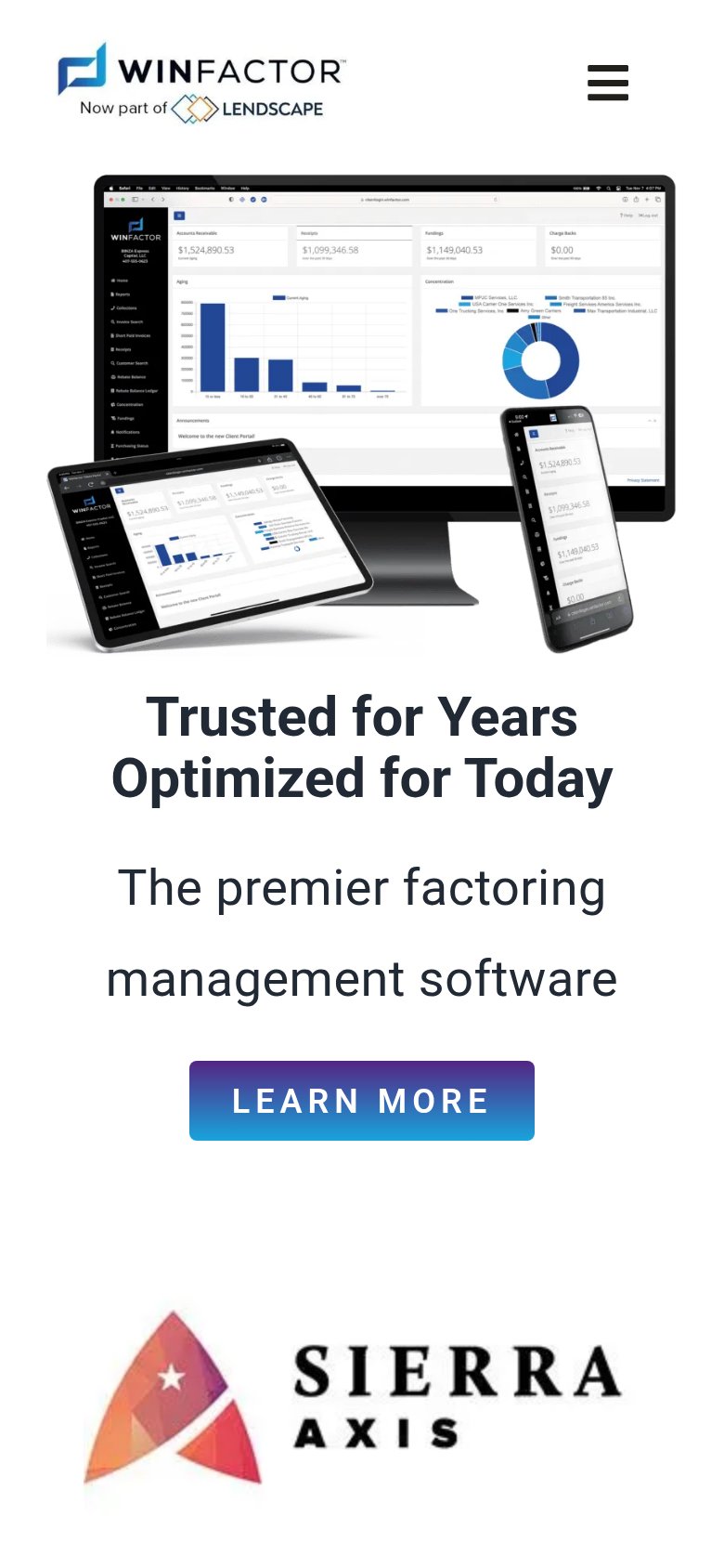
Trusted for Years Optimized for Today
WinFactor® is the premier factoring management software
Working
- Subhead names the category clearly
- Hero shows real product dashboard
- SOC 2 and IFA badges add trust
Could improve
- Headline is a genericslogan, no outcome
- No numbers or proof points in copy
- 'Premier' claim is unsupported
Information hierarchy
58FairDoes the design help or inhibit what the page is trying to say?
 1234
- Dual competing CTAs — "SCHEDULE DEMO" in the top bar and "LEARN MORE" in the hero share the same gradient style and weight, splitting the visitor's one action into two.
- Vague hero CTA — "LEARN MORE" is the largest button in the scan path but commits to nothing, while the real conversion ("SCHEDULE DEMO") is smaller and stranded in the top-left utility bar's opposite corner.
- Feature-orbit diagram — Seven equal-weight labeled icons (Client Services, Mobile App, Digital Wallet, etc.) compete with the headline for first fixation instead of supporting one message.
- Double-decker navigation — Two stacked nav bars (utility row with three login links plus six-item main nav) put nine exits above the headline before the pitch begins.
CTA
58FairCopy, size, verb, cost-feel — does the primary CTA earn the click?
How WinFactor compares
Recommended rewrites
Trust
62FairProof that the product is real, competent, and safe to try.
How WinFactor compares
Trust read
Mobile web
62FairThe phone experience as a first-class citizen.
What works
What to improve