
Your landing page’s weakest score is Information hierarchy.
How Volaren Inc. ranks
- 1.
Delta Investment Tracker79
- 2.
Kubera76
- 3.
Sharesight75
- 4.
Getquin70
- 5.
Volaren Inc.62
62Growth scoreupdated
category scores
category scoresShowHide
Information hierarchy
48PoorDoes the design help or inhibit what the page is trying to say?
 123
- Welcome tour popup — The 'Next' button is the most prominent action in the fold, outranking 'Sign up' as the visual priority.
- Connect Broker column — Sixteen identical 'NOT PLACED / CONNECT BROKER' rows repeat the same competing link and add noise without information.
- Left nav rail — Nine equal-weight links (Screener, Data library, Comparisons...) leak attention before any conversion action.
Trust
48PoorProof that the product is real, competent, and safe to try.
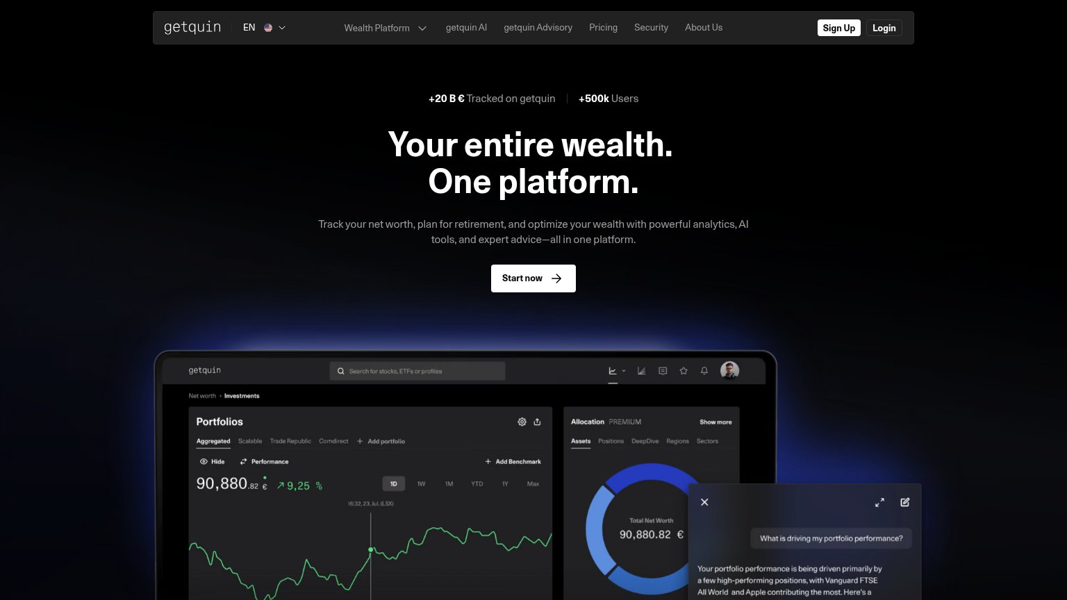
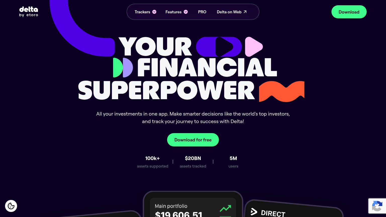
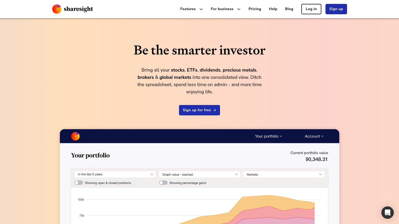
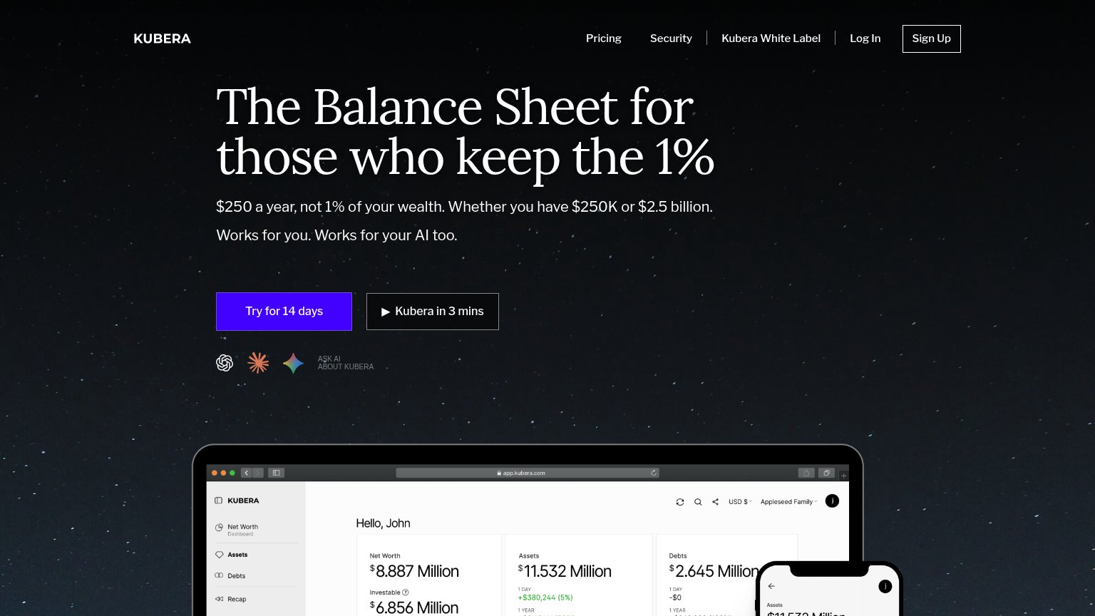
| Trust read | |
|---|---|
| Volaren Inc. | No visible trust signal identified. |
| "100k+ assets supported | $20BN assets tracked | 5M users" stat bar under the CTA | |
| "+20 B € Tracked on getquin | +500k Users" stat bar above the headline | |
| Realistic portfolio dashboard screenshot showing "Current portfolio value 90,348.31" with a stacked performance chart an | |
| Realistic dashboard product shot at app.kubera.com showing "Net Worth $8.887 Million" with assets, debts, and CAGR detai |
Value props
58FairTitle, subtitle, hero — do they sell the product's true value?
Volaren Inc.’s headline
Convert any view into a portfolio.
Volaren is the AI investing terminal. Research like an institution, build strategies around what you believe, and invest like a team of twenty, from any device.
Working
Could improve
CTA
68FairCopy, size, verb, cost-feel — does the primary CTA earn the click?
How Volaren Inc. compares
Recommended rewrites
Mobile web
86StrongThe phone experience as a first-class citizen.

What works
What to improve