
Your landing page’s weakest score is Mobile web.
How Getquin ranks
Mobile web
58FairThe phone experience as a first-class citizen.
 1234
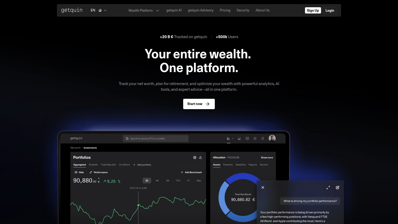
- App Store badge — The only CTA sits far below the fold and routes to the app store instead of the desktop's 'Start now' signup.
- Phone mockup hero — The tall product mockup consumes the scroll path and pushes the sole CTA well past the first viewport.
- Featured-on logo row — Press logos are clipped at the edges ('sblatt', 'FINANC…') and render half-cropped, undermining the trust signal.
- Chat bubble — A floating chat widget overlaps the FinanceFWD logo, crowding the trust strip.
CTA
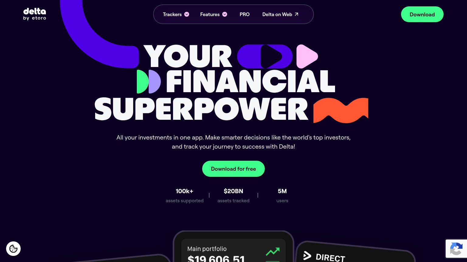
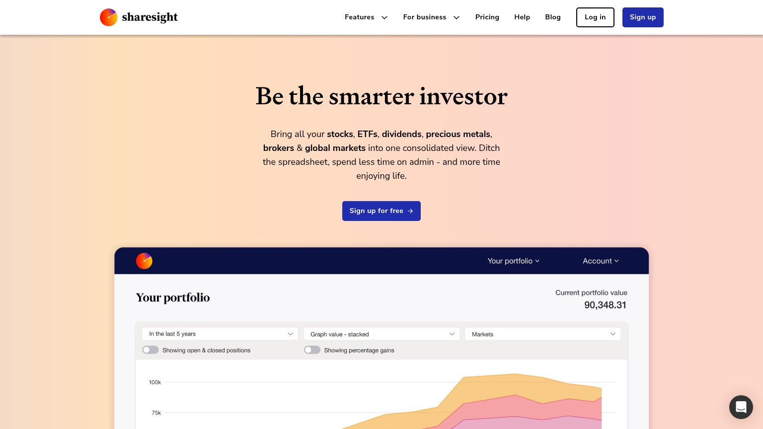
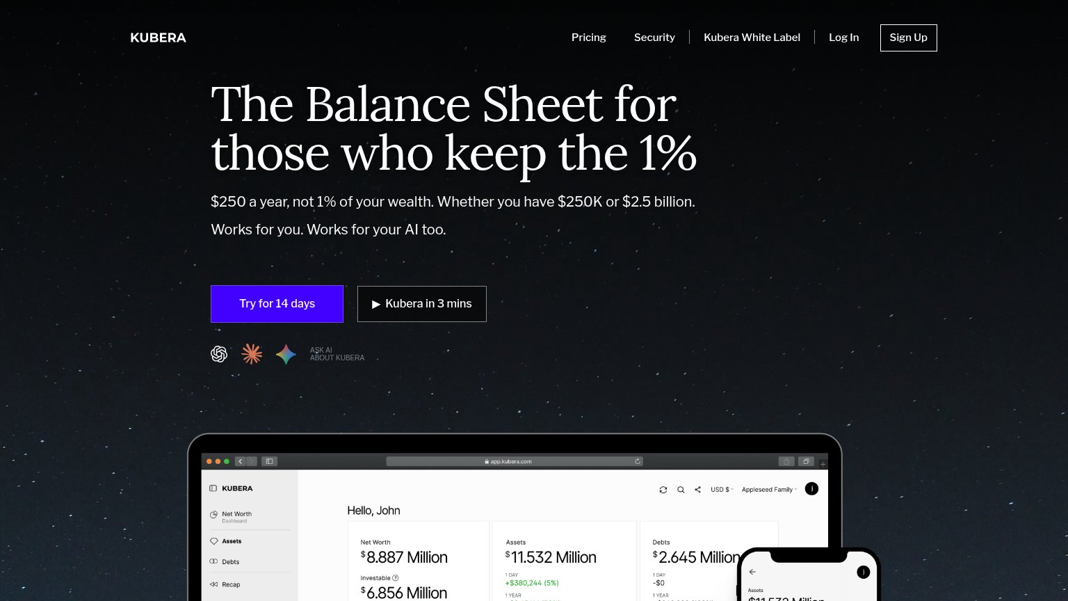
66FairCopy, size, verb, cost-feel — does the primary CTA earn the click?
Problems
- vague — no object or payoff named
- mobile fold swaps to App Store badge
- three labels: Start now/Sign Up/badge
- small footprint vs. huge headline
Information hierarchy
72FairDoes the design help or inhibit what the page is trying to say?
What works
What to improve
Trust
76FairProof that the product is real, competent, and safe to try.
How Getquin compares
Trust read
Value props
78FairTitle, subtitle, hero — do they sell the product's true value?
Getquin’s headline
Your entire wealth. One platform.
Track your net worth, plan for retirement, and optimize your wealth with powerful analytics, AI tools, and expert advice—all in one platform.
Working
Could improve