
Your landing page’s weakest score is Trust.
How Golpo ranks
Trust
44PoorProof that the product is real, competent, and safe to try.
| Trust read | |
|---|---|
| Golpo | No visible trust signal identified. |
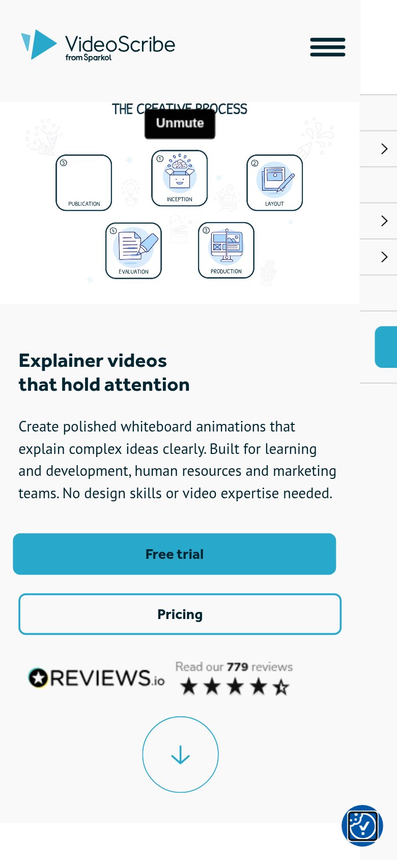
| REVIEWS.io badge: "Read our 779 reviews" with 4.5-star rating (mobile fold) | |
| Embedded demo video previewing a hand drawing a whiteboard animation (the product's actual output) | |
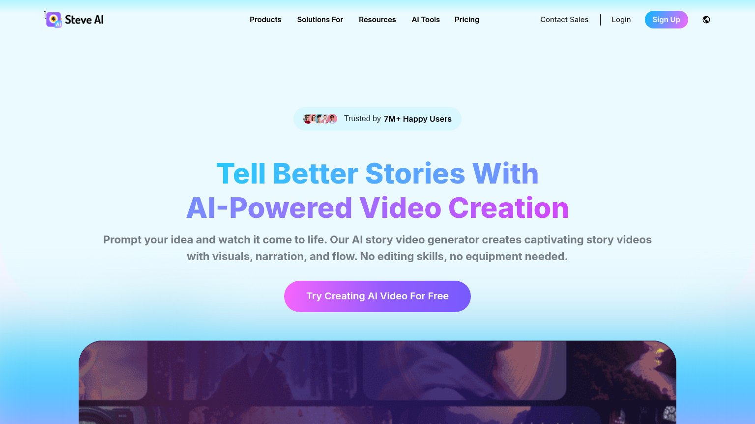
| "Trusted by 7M+ Happy Users" badge above the desktop headline | |
| "See what creators make with Fliki" gallery of real output videos with the claim "Real videos made with our text-to-vide | |
| "Now part of D-iD" badge under the simpleshow logo |
Mobile web
58FairThe phone experience as a first-class citizen.
 123
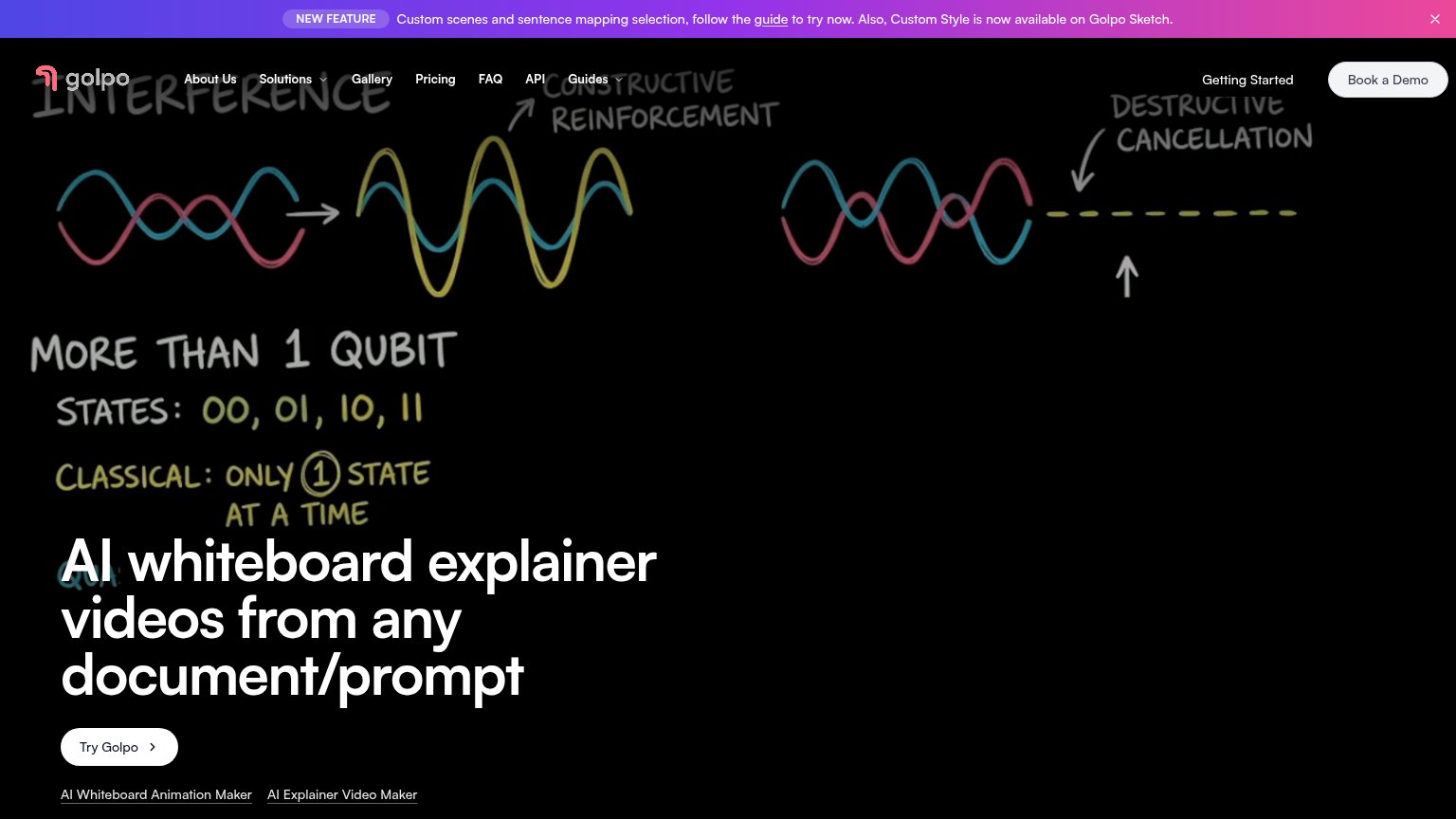
- Four-line promo banner — Wraps to four cramped lines and eats the top of the fold with no conversion CTA.
- Try Golpo button — Desktop-sized pill at the bottom edge of the viewport instead of a full-width thumb target.
- Logo over sketch text — Golpo wordmark overlaps the 'CONSTRUCTIVE' sketch lettering, muddying the header.
Information hierarchy
68FairDoes the design help or inhibit what the page is trying to say?
What works
What to improve
Value props
68FairTitle, subtitle, hero — do they sell the product's true value?
Golpo’s headline
AI whiteboard explainer videos from any document/prompt
Working
Could improve
CTA
72FairCopy, size, verb, cost-feel — does the primary CTA earn the click?
How Golpo compares
Recommended rewrites