
Your landing page’s weakest score is Information hierarchy.
How Simpleshow ranks
- 1.
Doodly70
- 2.
Steve AI70
- 3.
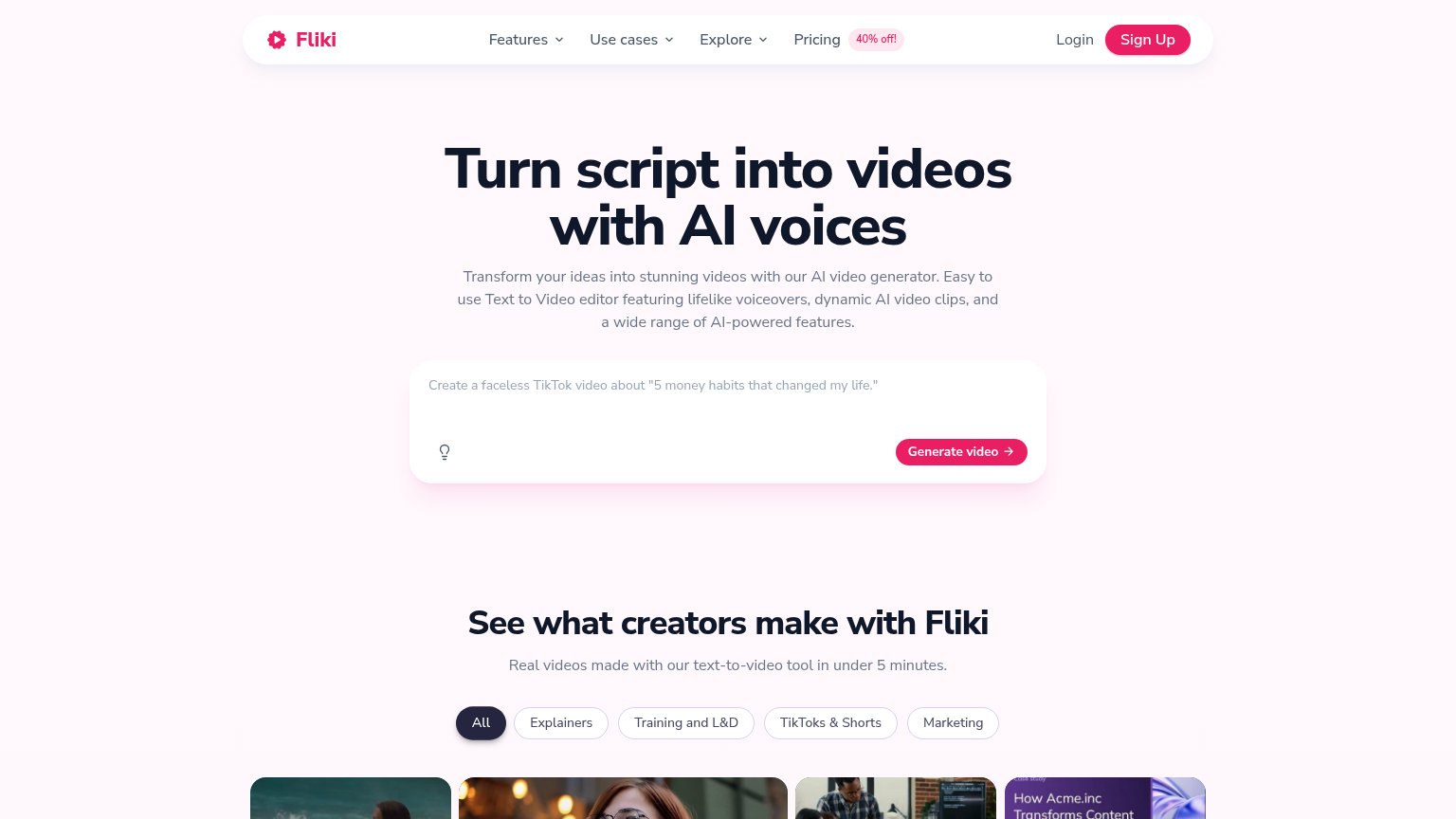
Fliki70
- 4.
VideoScribe66
- 5.
Golpo62
- 6.
Simpleshow50
50Growth scoreupdated
category scores
category scoresShowHide
Information hierarchy
38PoorDoes the design help or inhibit what the page is trying to say?
 1234
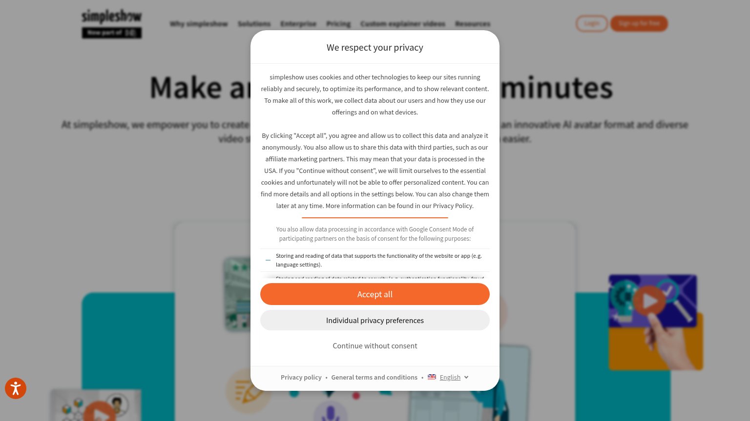
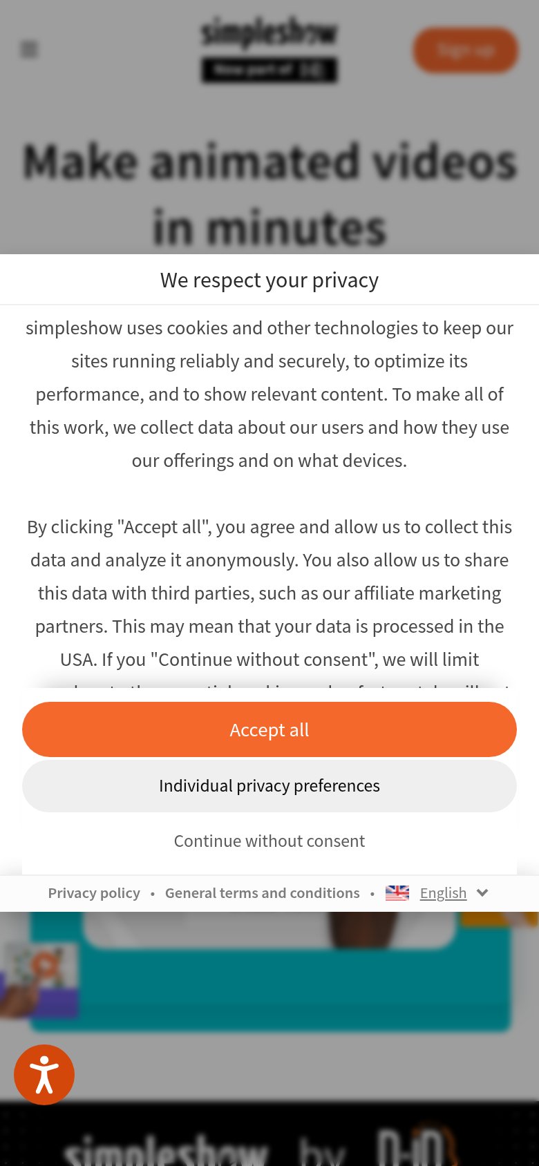
- Cookie consent modal — A dense, full-height consent wall blocks the headline, hero, and any CTA before the visitor sees the page.
- Truncated headline text — The core promise 'Make animated videos in minutes' is cut off behind the modal, so the value prop never lands.
- Accept all button — The strongest orange button in the fold belongs to the cookie dialog, not the product's conversion action.
- Header nav row — Seven nav items plus Login compete with the small 'Sign up for free' button once the modal clears.
Trust
38PoorProof that the product is real, competent, and safe to try.
| Trust read | |
|---|---|
| Simpleshow | "Now part of D-iD" badge under the simpleshow logo |
| No visible trust signal identified. | |
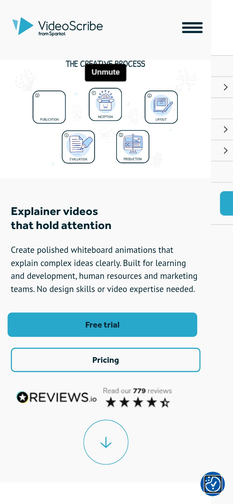
| REVIEWS.io badge: "Read our 779 reviews" with 4.5-star rating (mobile fold) | |
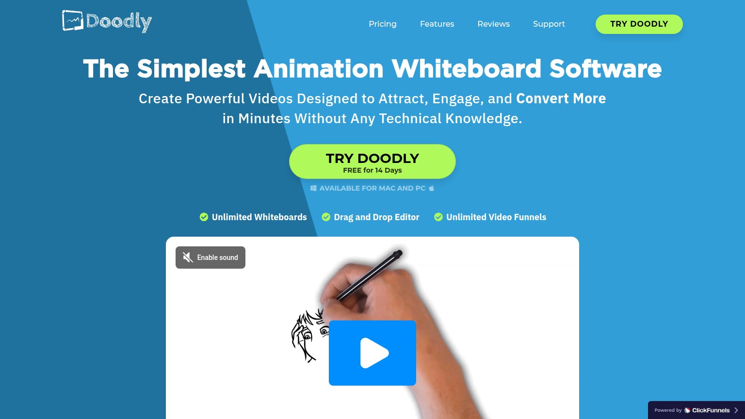
| Embedded demo video previewing a hand drawing a whiteboard animation (the product's actual output) | |
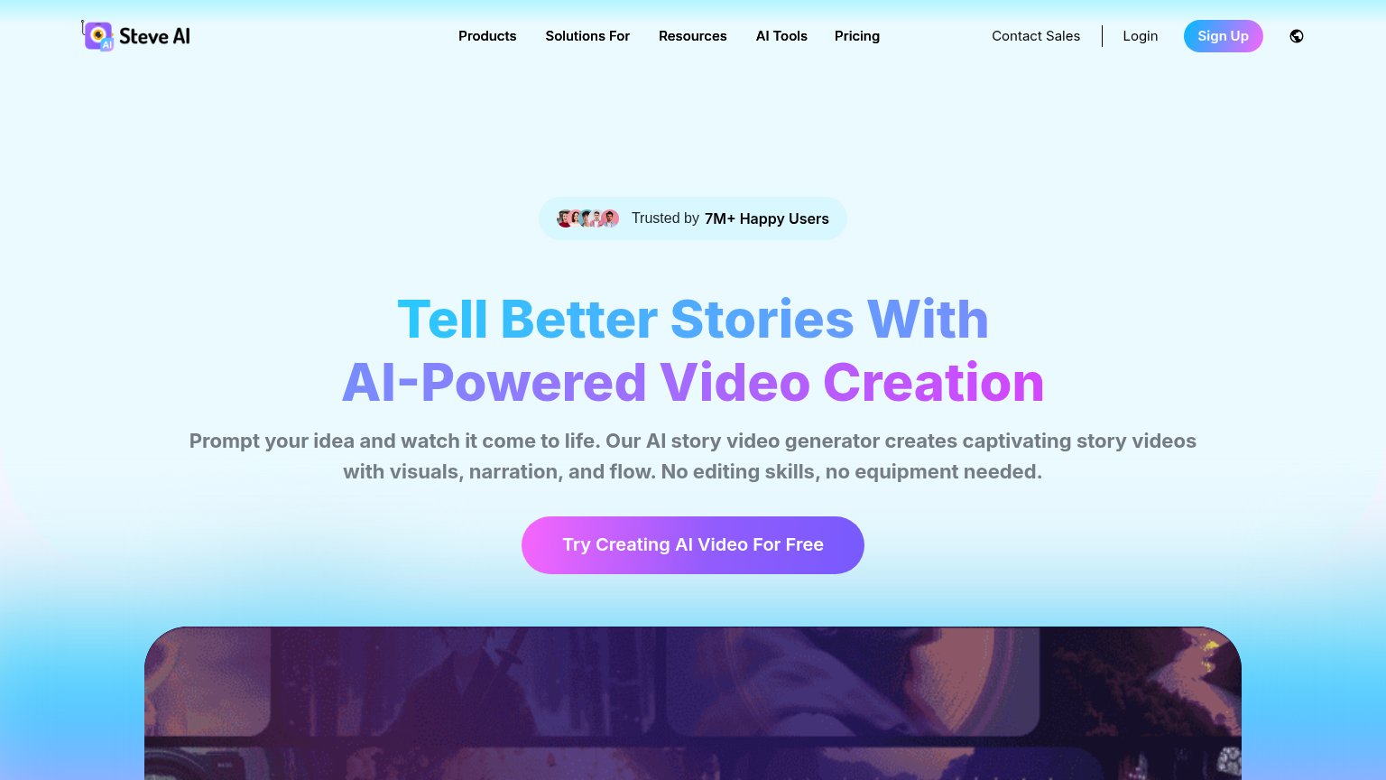
| "Trusted by 7M+ Happy Users" badge above the desktop headline | |
| "See what creators make with Fliki" gallery of real output videos with the claim "Real videos made with our text-to-vide |
Mobile web
42PoorThe phone experience as a first-class citizen.
What works
What to improve
CTA
58FairCopy, size, verb, cost-feel — does the primary CTA earn the click?
How Simpleshow compares
Recommended rewrites
Value props
72FairTitle, subtitle, hero — do they sell the product's true value?
Simpleshow’s headline
Make animated videos in minutes
At simpleshow, we empower you to create [...] an innovative AI avatar format and diverse video styles [...] easier.
Working
Could improve