
Your landing page’s weakest score is Value props.
How UFACTORY ranks
55Growth scoreupdated
category scores
category scoresShowHide
Value props
32PoorTitle, subtitle, hero — do they sell the product's true value?
Working
- Video shows the robot arm in action
- Mobile lists real prices and specs
- Clear demo path via Book Demo CTA
Could improve
- No headline or subhead in the fold
- Value depends on prior brand knowledge
- Strong price/spec proof buried below hero
Information hierarchy
48PoorDoes the design help or inhibit what the page is trying to say?
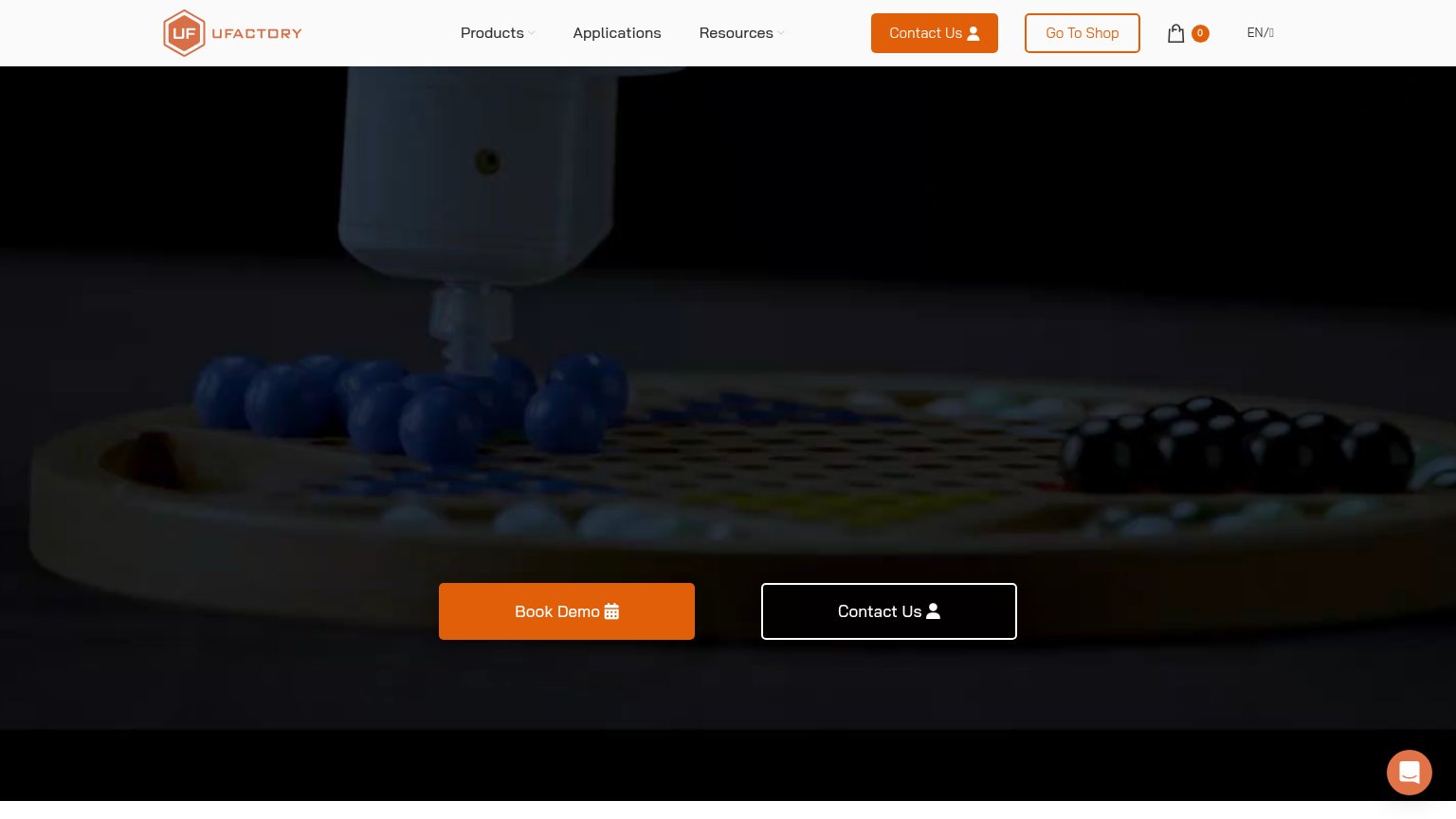 12
- Contact Us outline button — Duplicates the nav's orange Contact Us and sits at equal size to Book Demo, splitting the primary action three ways.
- Go To Shop button — Outlined at near-equal weight to the Contact Us pill, pulling attention to a third path before the hero CTA is even seen.
Trust
54FairProof that the product is real, competent, and safe to try.
How UFACTORY compares
Trust read
CTA
68FairCopy, size, verb, cost-feel — does the primary CTA earn the click?
How UFACTORY compares
Recommended rewrites
Mobile web
72FairThe phone experience as a first-class citizen.
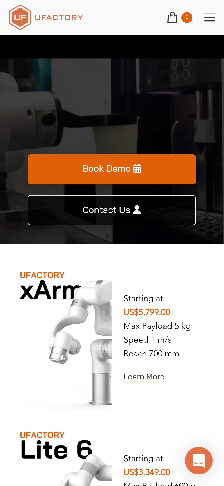
What works
What to improve