
Your landing page’s weakest score is Information hierarchy.
How AgileX Robotics ranks
46Growth scoreupdated
category scores
category scoresShowHide
Information hierarchy
42PoorDoes the design help or inhibit what the page is trying to say?
 123
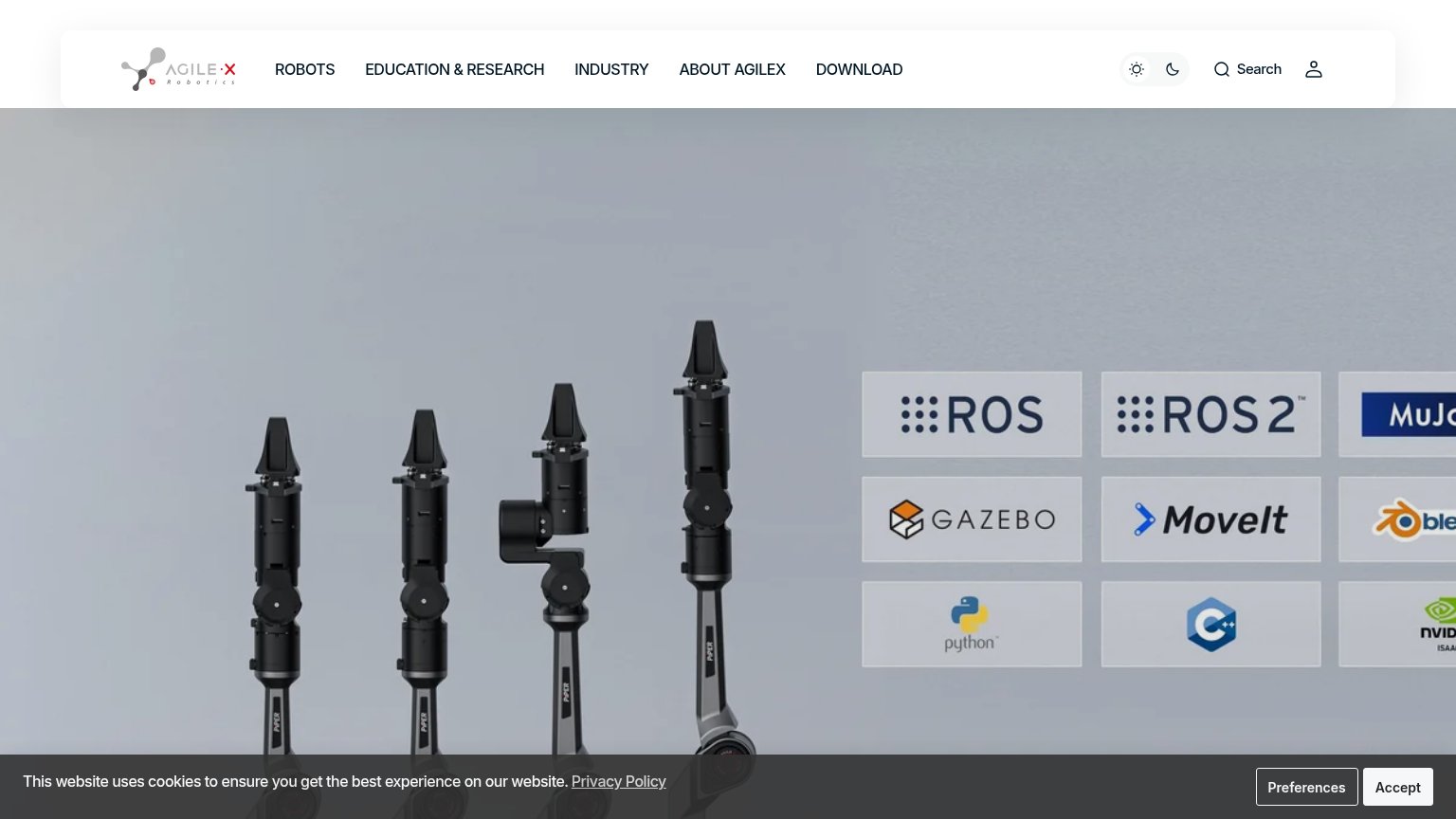
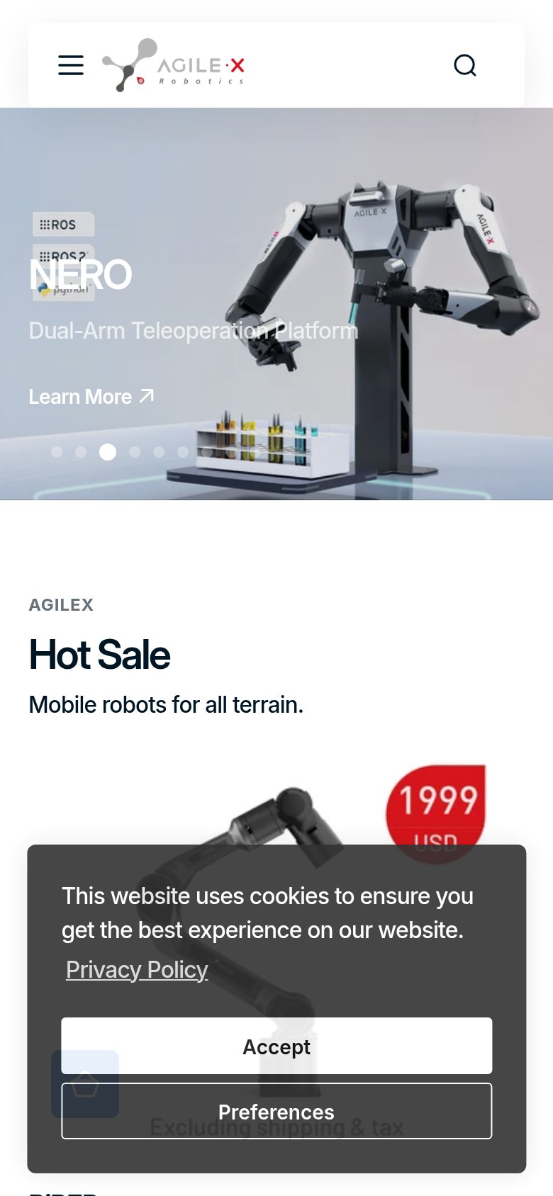
- Cookie consent banner — The dark full-width banner covers the bottom of the hero on desktop and blocks half the mobile viewport, hiding product content behind two consent buttons.
- Cropped logo grid — MuJoCo, Blender, and NVIDIA tiles run off the right edge, making the framework panel read as broken rather than a compatibility proof point.
- Six-item nav row — ROBOTS through DOWNLOAD plus search and account icons offer eight equal-weight exits when the fold contains no primary CTA to outrank them.
CTA
42PoorCopy, size, verb, cost-feel — does the primary CTA earn the click?
Problems
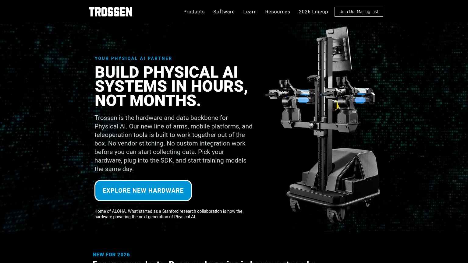
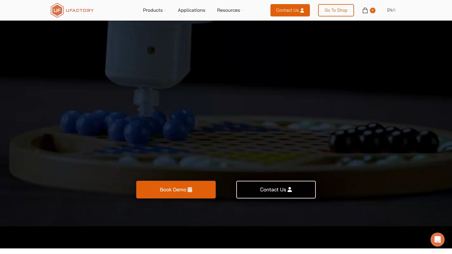
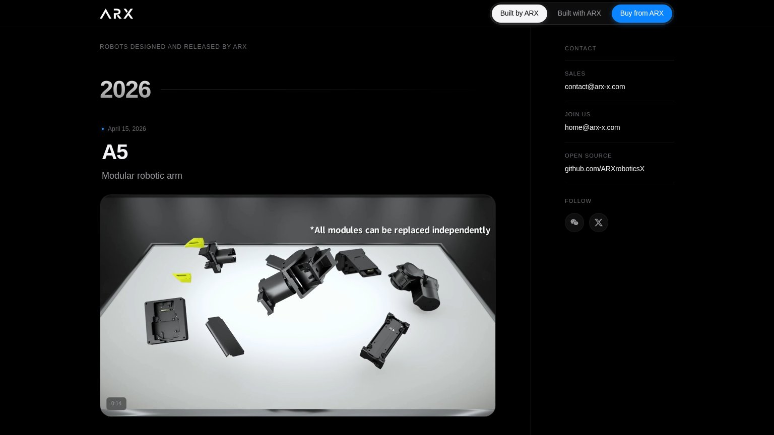
- no CTA visible on desktop fold
- 'Learn More' is generic, no payoff
- low-contrast text link, tiny footprint
- cookie 'Accept' outshines the CTA
Value props
42PoorTitle, subtitle, hero — do they sell the product's true value?
AgileX Robotics’s headline
NERO
Dual-Arm Teleoperation Platform
Working
Could improve
Mobile web
48PoorThe phone experience as a first-class citizen.
What works
What to improve
Trust
56FairProof that the product is real, competent, and safe to try.
How AgileX Robotics compares
Trust read