
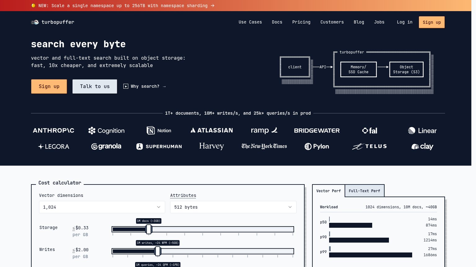
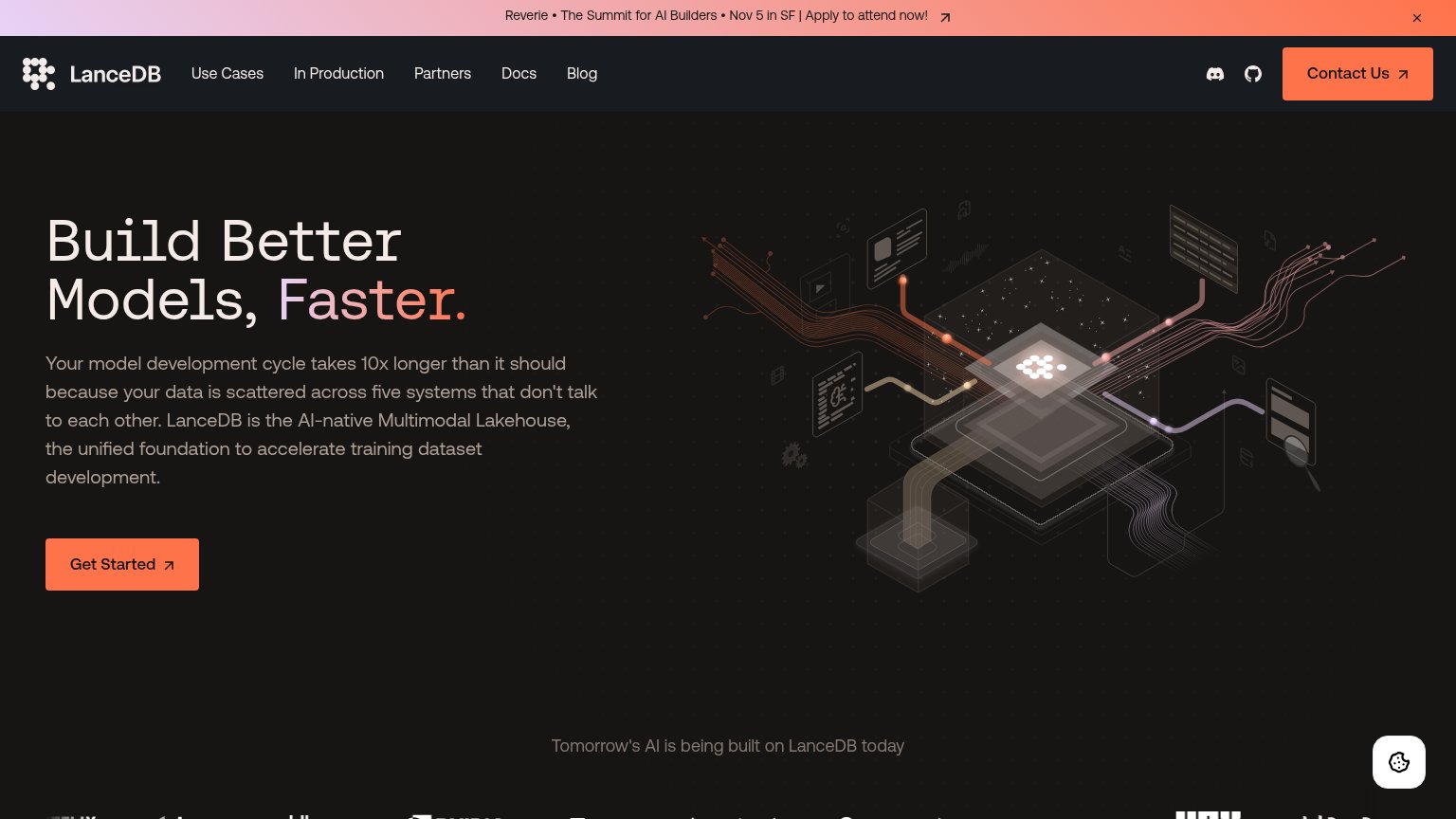
Your landing page’s weakest score is CTA.
How Turbopuffer ranks
81Growth scoreupdated
category scores
category scoresShowHide
CTA
66FairCopy, size, verb, cost-feel — does the primary CTA earn the click?

Problems
- 'Sign up' promises a form, not value
- no echo of headline or 10x-cheaper hook
- generic label, zero differentiation
Information hierarchy
78FairDoes the design help or inhibit what the page is trying to say?
1234- Eight-link navigation row — Use Cases through Log in gives eleven-plus exits above the fold, all competing with the hero Sign up.
- Header Sign up button — Duplicates the hero CTA at nearly equal orange weight, splitting the one action across two targets.
- Announcement banner — Bright orange bar outshouts the headline and links away to sharding docs before the value prop is read.
- Cost calculator creep — A dense sliders-and-tabs panel enters the fold before the hero argument closes, adding a second beat too early.
Value props
86StrongTitle, subtitle, hero — do they sell the product's true value?
Turbopuffer’s headline
search every byte
vector and full-text search built on object storage: fast, 10x cheaper, and extremely scalable
Working
Could improve
Mobile web
86StrongThe phone experience as a first-class citizen.
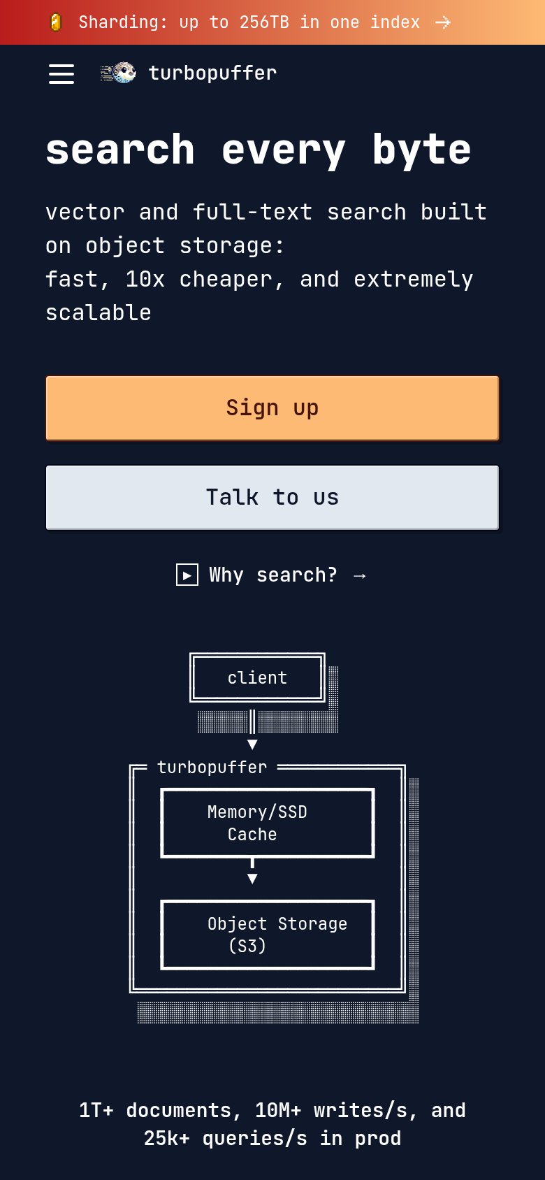
What works
What to improve
Trust
88StrongProof that the product is real, competent, and safe to try.
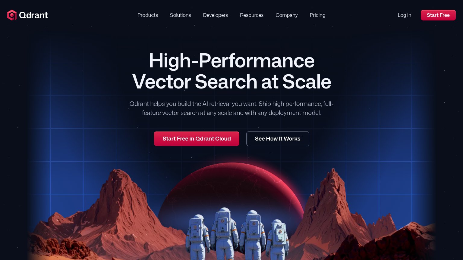
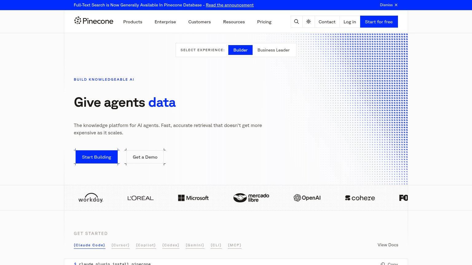
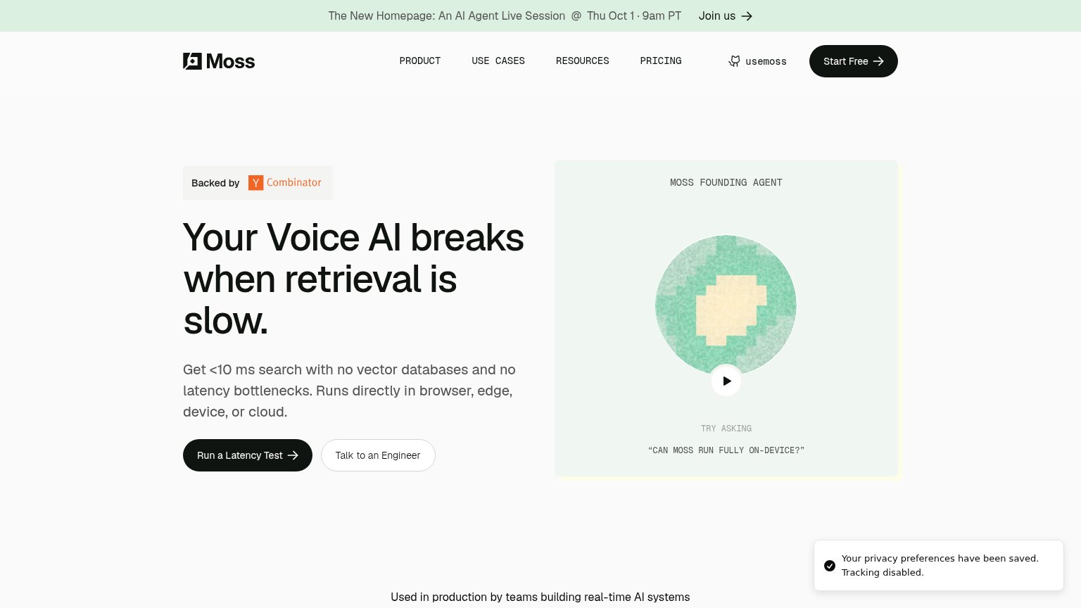
How Turbopuffer compares
Trust read