
Your landing page’s weakest score is Information hierarchy.
How Pinecone ranks
73Growth scoreupdated
category scores
category scoresShowHide
Information hierarchy
68FairDoes the design help or inhibit what the page is trying to say?
 1234
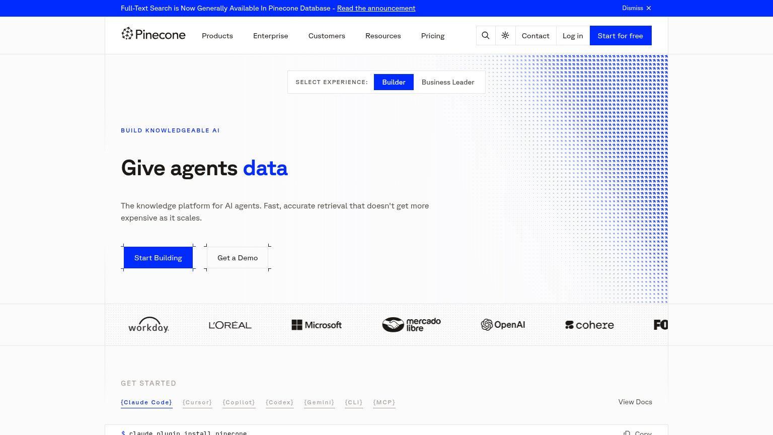
- Announcement banner — Full-width blue bar is the highest-contrast element on the page, outranking the hero and pulling first attention to an exit link.
- Experience toggle — Builder/Business Leader switch sits directly above the headline and uses the same blue as the primary CTA, competing before the value prop is read.
- Start for free button — Nav CTA duplicates the hero's 'Start Building' action in identical blue, splitting the primary conversion across two equal-weight buttons.
- Get Started code block — Install-command section creeps into the fold half-cut, adding a third same-weight action zone below the CTAs.
Trust
72FairProof that the product is real, competent, and safe to try.
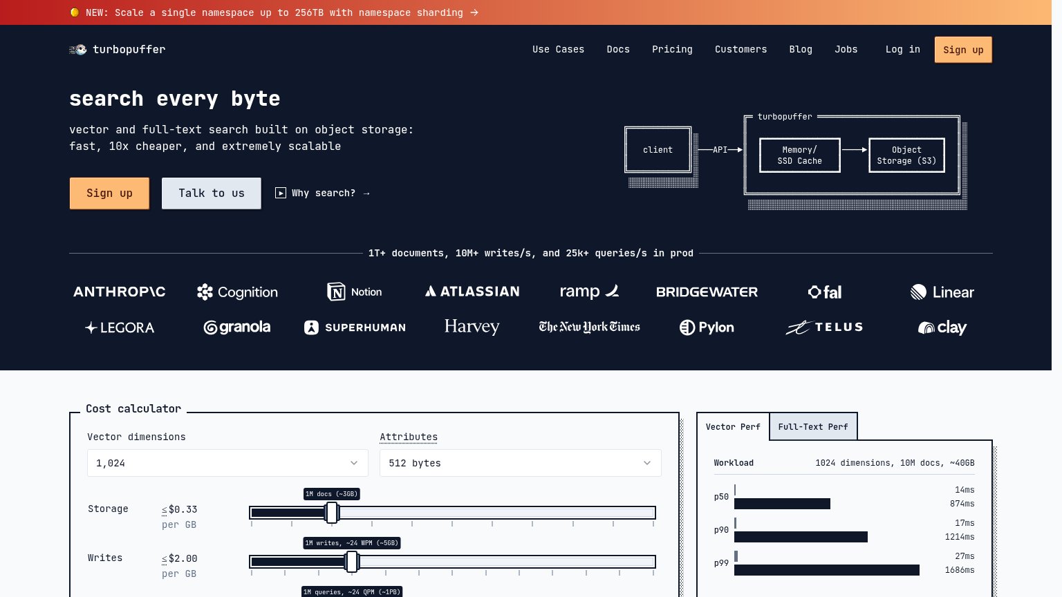
| Trust read | |
|---|---|
| Pinecone | Customer logo strip: Workday, L'Oréal, Microsoft, Mercado Libre, OpenAI, cohere |
| "Backed by Y Combinator" badge above the hero headline | |
| Customer logo wall (Anthropic, Notion, Atlassian, NYT, Linear) headed "1T+ documents, 10M+ writes/s, and 25k+ queries/s | |
| "Tomorrow's AI is being built on LanceDB today" logo strip at the fold's bottom edge | |
| Headline claim "Everything we learned from powering 20% of the Internet" | |
| "30k+ GitHub Stars" badge on the mobile fold |
Mobile web
72FairThe phone experience as a first-class citizen.
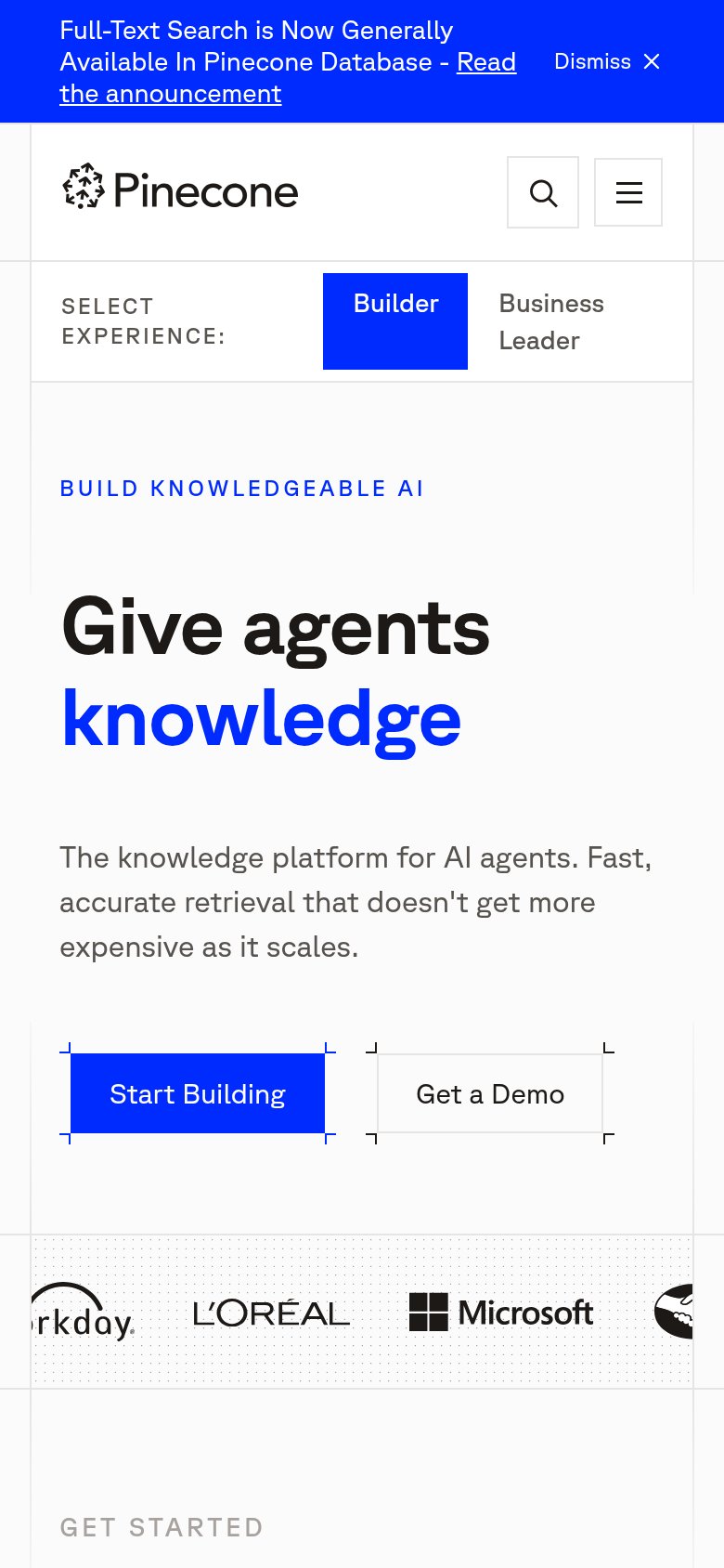
What works
What to improve
Value props
76FairTitle, subtitle, hero — do they sell the product's true value?
Pinecone’s headline
Give agents data
The knowledge platform for AI agents. Fast, accurate retrieval that doesn't get more expensive as it scales.
Working
Could improve
CTA
78FairCopy, size, verb, cost-feel — does the primary CTA earn the click?
How Pinecone compares
Recommended rewrites