
Your landing page’s weakest score is Trust.
How OpenTag ranks
78Growth scoreupdated
category scores
category scoresShowHide
Trust
72FairProof that the product is real, competent, and safe to try.
| Trust read | |
|---|---|
| OpenTag | "Backed by Y Combinator" badge above the headline |
| Slack · Microsoft Teams · 2,000+ tools connected | |
| Detailed trading terminal screenshot (NVDA-USDC chart, order book, indicators) | |
| G2 badge with 4.9 star rating below the "Try for free" CTA | |
| No visible trust signal identified. | |
| No visible trust signal identified. |
Information hierarchy
76FairDoes the design help or inhibit what the page is trying to say?
 123
- Duplicate CTA pairs — "Book a demo" + "Get started free" repeat in nav and hero at equal prominence, splitting the visitor across four buttons in one fold.
- News announcement banner — The topmost element is an outbound "Read the announcement" link that pulls first attention away from the conversion path.
- Carousel pagination dots — Nine slide dots plus arrows signal hidden content in the hero demo, inviting exploration instead of the CTA click.
Mobile web
76FairThe phone experience as a first-class citizen.
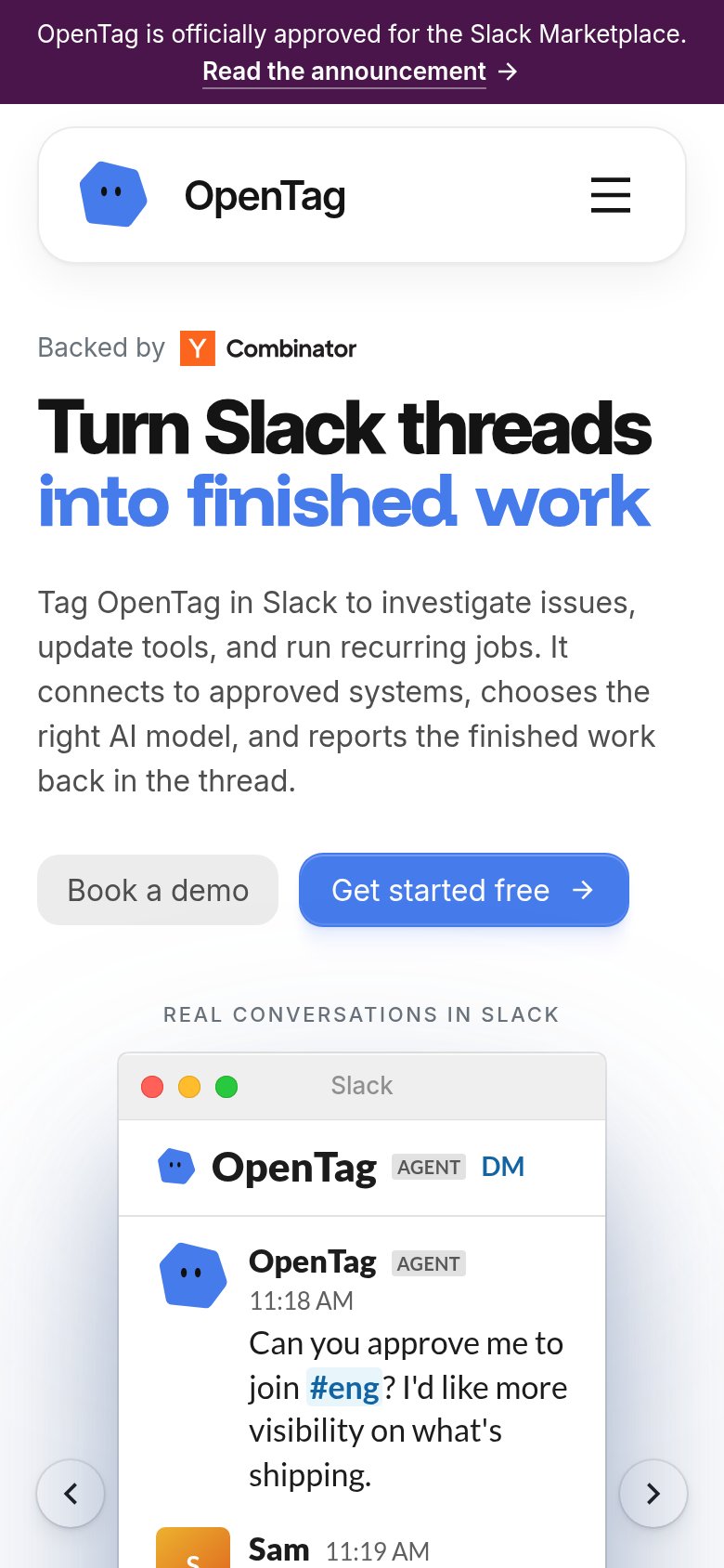
What works
What to improve
Value props
82StrongTitle, subtitle, hero — do they sell the product's true value?
OpenTag’s headline
Turn Slack threads into finished work
Tag OpenTag in Slack to investigate issues, update tools, and run recurring jobs. It connects to approved systems, chooses the right AI model, and reports the finished work back in the thread.
Working
Could improve
CTA
86StrongCopy, size, verb, cost-feel — does the primary CTA earn the click?
How OpenTag compares
Recommended rewrites