
Your landing page’s weakest score is Trust.
How Runbear ranks
Trust
55FairProof that the product is real, competent, and safe to try.

| Trust read | |
|---|---|
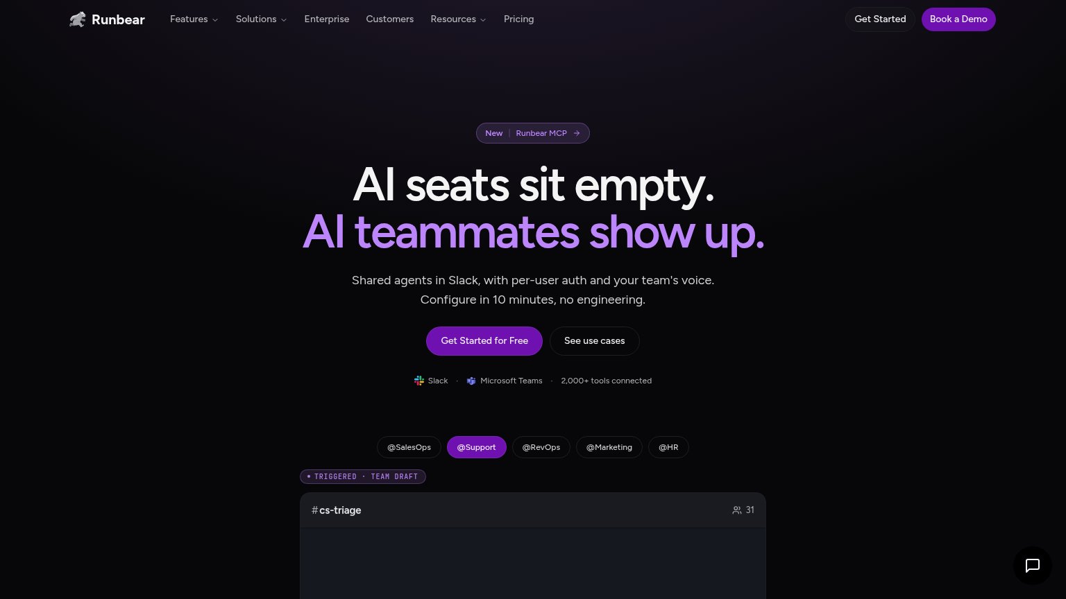
| Runbear | Slack · Microsoft Teams · 2,000+ tools connected |
| "Backed by Y Combinator" badge above the headline | |
| Detailed trading terminal screenshot (NVDA-USDC chart, order book, indicators) | |
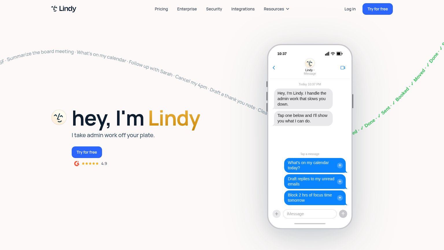
| G2 badge with 4.9 star rating below the "Try for free" CTA | |
| No visible trust signal identified. | |
| No visible trust signal identified. |
Mobile web
68FairThe phone experience as a first-class citizen.
 1234
- Primary CTA row — "Get Started for Free" sits roughly 900px down, below the badge, three-line headline, and three-line subcopy — a scroll away for many devices.
- Chat bubble — Oversized dark chat launcher overlaps the #sales-ae demo panel and covers its member-count icon in the bottom-right.
- Header CTA pair — Two competing header buttons ("Get Started" and "Book a Demo") duplicate the hero CTAs and crowd the collapsed nav row.
- Get Started button — Primary button is roughly half the column width instead of near-full-bleed, sharing the row with "See use cases".
Information hierarchy
74FairDoes the design help or inhibit what the page is trying to say?
What works
What to improve
Value props
76FairTitle, subtitle, hero — do they sell the product's true value?
Runbear’s headline
AI seats sit empty. AI teammates show up.
Shared agents in Slack, with per-user auth and your team's voice. Configure in 10 minutes, no engineering.
Working
Could improve
CTA
82StrongCopy, size, verb, cost-feel — does the primary CTA earn the click?
How Runbear compares
Recommended rewrites