
Your landing page’s weakest score is Information hierarchy.
How Fondo ranks
78Growth scoreupdated
category scores
category scoresShowHide
Information hierarchy
72FairDoes the design help or inhibit what the page is trying to say?
 1234
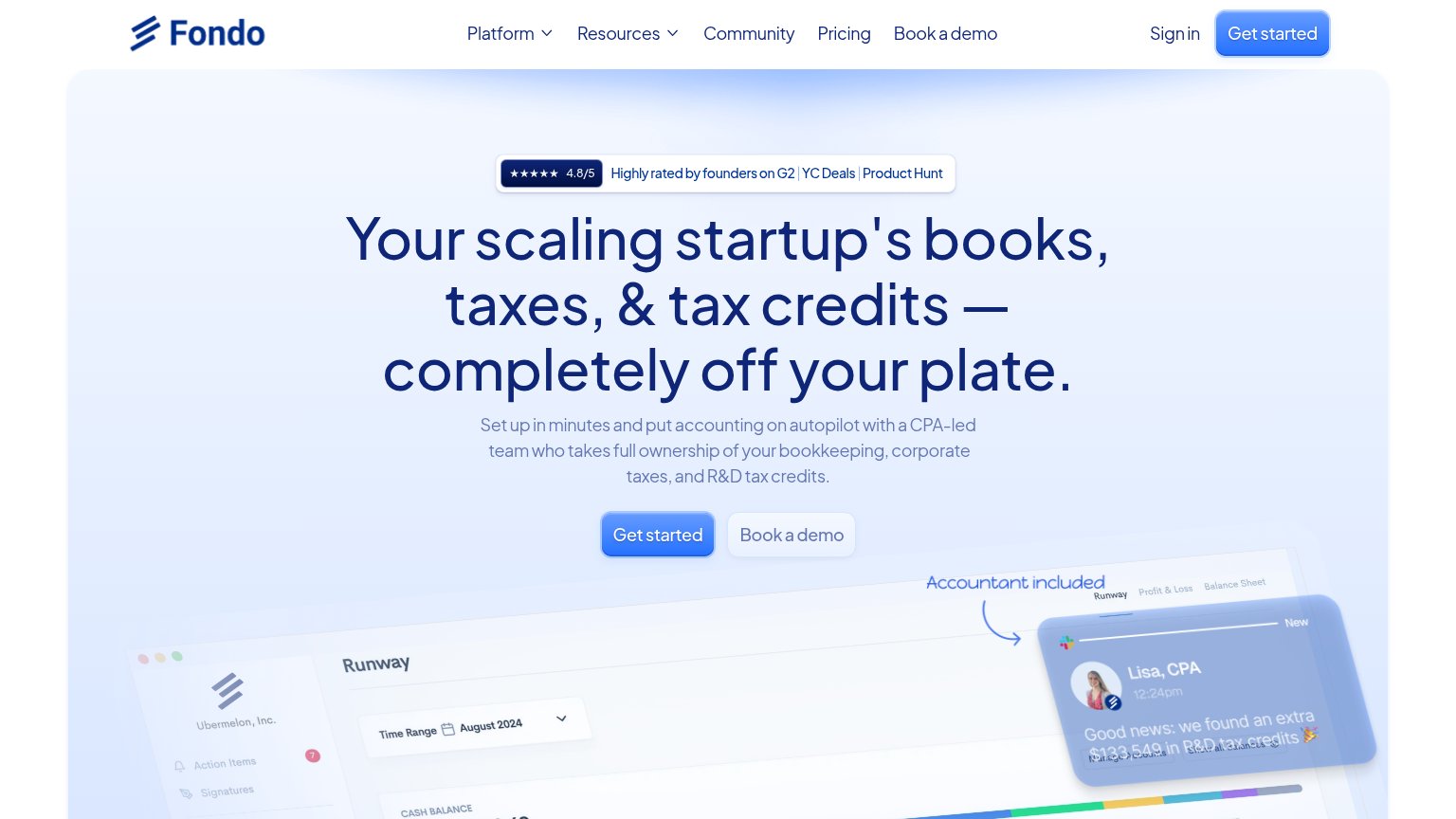
- Duplicate Get started CTA — Nav 'Get started' mirrors the hero CTA at identical blue weight, splitting the scan path between two targets.
- Book a demo nav link — 'Book a demo' appears in the nav and again beside the hero CTA, adding a redundant exit path above the fold.
- Rating badge review links — G2, YC Deals, and Product Hunt links sit directly above the headline, inviting three outbound exits before the pitch is read.
- Book a demo secondary — Low-contrast styling is right, but pairing it flush at the same size next to 'Get started' halves the primary CTA's dominance.
CTA
76FairCopy, size, verb, cost-feel — does the primary CTA earn the click?
Problems
- generic label, no payoff named
- no headline echo
- small vs. huge desktop headline
Trust
78FairProof that the product is real, competent, and safe to try.
How Fondo compares
Trust read
Mobile web
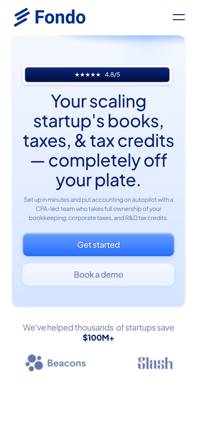
78FairThe phone experience as a first-class citizen.
What works
What to improve
Value props
84StrongTitle, subtitle, hero — do they sell the product's true value?
Fondo’s headline
Your scaling startup's books, taxes, & tax credits — completely off your plate.
Set up in minutes and put accounting on autopilot with a CPA-led team who takes full ownership of your bookkeeping, corporate taxes, and R&D tax credits.
Working
Could improve