
Your landing page’s weakest score is Value props.
How Finom ranks
26Growth scoreupdated
category scores
category scoresShowHide
Value props
15PoorTitle, subtitle, hero — do they sell the product's true value?
Finom’s headline vague
Please, select the country where your business is registered
Working
- Country gate hints at localized offering
- Copy is plain and readable
Could improve
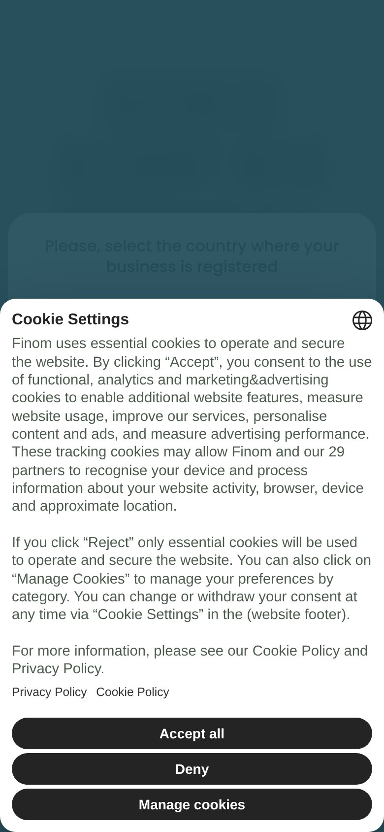
- Cookie modal hides the entire hero
- No value proposition visible in fold
- No numbers, outcomes, or proof points
Information hierarchy
18PoorDoes the design help or inhibit what the page is trying to say?
 1234
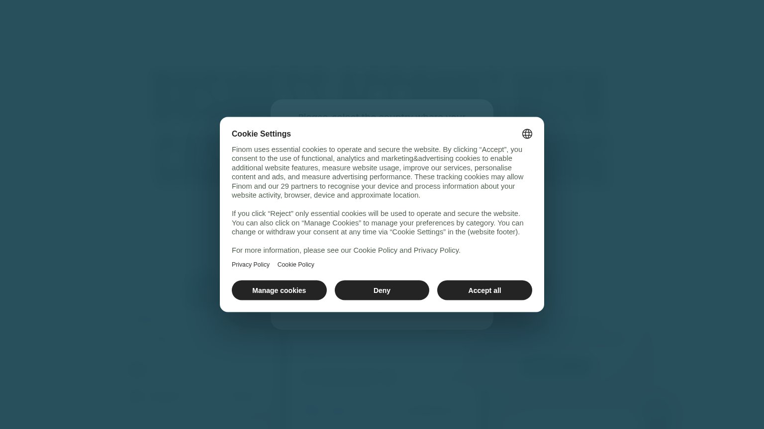
- Cookie consent modal — Full-screen overlay blocks the hero entirely; the value prop and CTA are unreadable until dismissed.
- Three equal-weight buttons — "Manage cookies", "Deny" and "Accept all" share identical dark styling, so no path is visually preferred.
- Cookie policy text wall — Two dense paragraphs of legal copy are the first thing a visitor must process.
- Dimmed country selector — The underlying page is a gated country-selection step, so no product headline or CTA exists on the fold at all.
Trust
25PoorProof that the product is real, competent, and safe to try.
How Finom compares
Trust read
Mobile web
32PoorThe phone experience as a first-class citizen.
What works
What to improve
CTA
42PoorCopy, size, verb, cost-feel — does the primary CTA earn the click?
How Finom compares
Recommended rewrites