
Your landing page’s weakest score is Trust.
How Channel3 ranks
- 1.
Rye70
- 2.
Channel366
- 3.
Firmly.ai60
Trust
52FairProof that the product is real, competent, and safe to try.
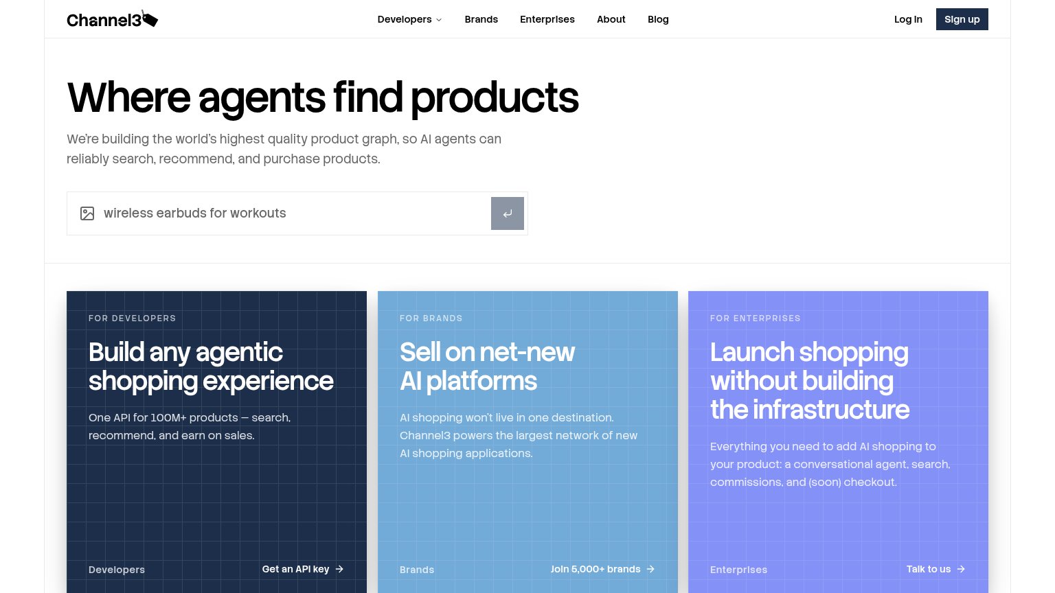
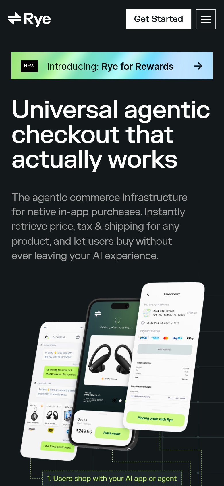
| Trust read | |
|---|---|
| Channel3 | "Join 5,000+ brands" CTA |
| No visible trust signal identified. | |
| Annotated three-phone product demo showing the agentic checkout flow ("1. Users shop with your AI app or agent" → "3. Ry |
Mobile web
62FairThe phone experience as a first-class citizen.
 123
- Return-arrow submit key — The only fold action is an unlabeled gray arrow key — no explicit, thumb-friendly CTA button.
- Truncated search placeholder — Placeholder cuts to just 'wireless', losing the example query that explains what the box does.
- Brands card sliver — A thin blue strip of the next card bleeds in, signaling a broken card layout instead of a clean stack.
Information hierarchy
64FairDoes the design help or inhibit what the page is trying to say?
What works
What to improve
CTA
72FairCopy, size, verb, cost-feel — does the primary CTA earn the click?
How Channel3 compares
Recommended rewrites
Value props
82StrongTitle, subtitle, hero — do they sell the product's true value?
Working
Could improve