
Your landing page’s weakest score is Trust.
How Rye ranks
- 1.
Rye70
- 2.
Channel366
- 3.
Firmly.ai60
Trust
58FairProof that the product is real, competent, and safe to try.
| Trust read | |
|---|---|
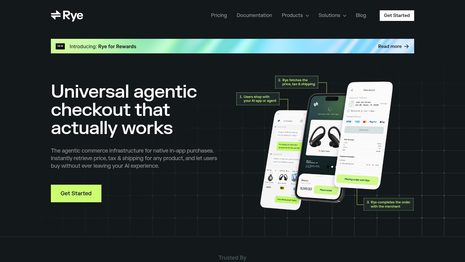
| Rye | Annotated three-phone product demo showing the agentic checkout flow ("1. Users shop with your AI app or agent" → "3. Ry |
| "Join 5,000+ brands" CTA | |
| No visible trust signal identified. |
Mobile web
64FairThe phone experience as a first-class citizen.
 123
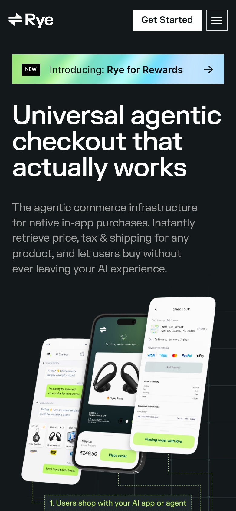
- Headline wraps three lines — 'Universal agentic checkout that actually works' scales down too little, filling nearly a third of the viewport in oversized type.
- Six-line body paragraph — The full desktop subhead wraps into six lines, pushing the phone mockups and any CTA far down the page.
- Header Get Started button — Desktop-proportioned pill floating in the header instead of a full-width thumb-friendly button in the hero.
CTA
72FairCopy, size, verb, cost-feel — does the primary CTA earn the click?
How Rye compares
Recommended rewrites
Information hierarchy
78FairDoes the design help or inhibit what the page is trying to say?
What works
What to improve
Value props
78FairTitle, subtitle, hero — do they sell the product's true value?
Rye’s headline
Universal agentic checkout that actually works
The agentic commerce infrastructure for native in-app purchases. Instantly retrieve price, tax & shipping for any product, and let users buy without ever leaving your AI experience.
Working
Could improve