
Your landing page’s weakest score is Information hierarchy.
How Ardent ranks
76Growth scoreupdated
category scores
category scoresShowHide
Information hierarchy
72FairDoes the design help or inhibit what the page is trying to say?
 123
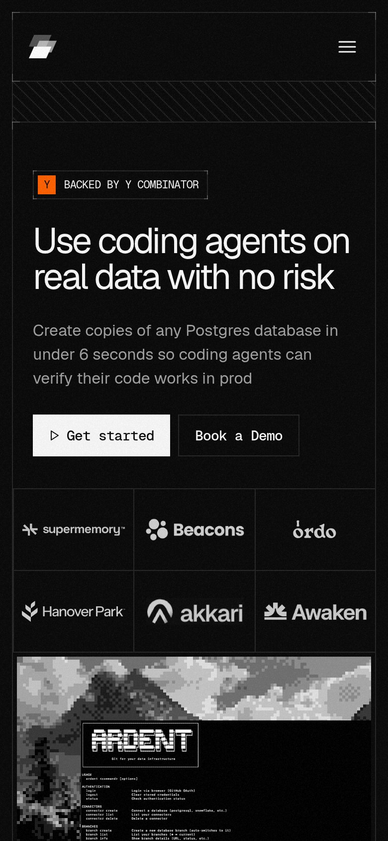
- Book a Demo pair — Two 'Book a Demo' buttons in one fold — the nav version competes with the hero pair and splits the primary action.
- Terminal screenshot panel — Dense CLI help text is unreadable at this size, adding cognitive load without communicating the 6-second-branch outcome.
- Get started CTA — Terminal-style low-key styling and small footprint keep the primary CTA visually near-equal to the outlined 'Book a Demo' beside it.
CTA
72FairCopy, size, verb, cost-feel — does the primary CTA earn the click?
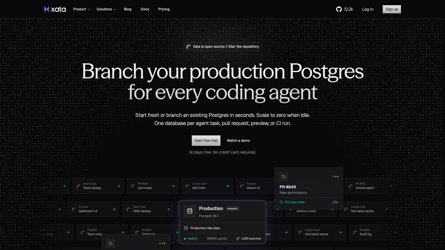
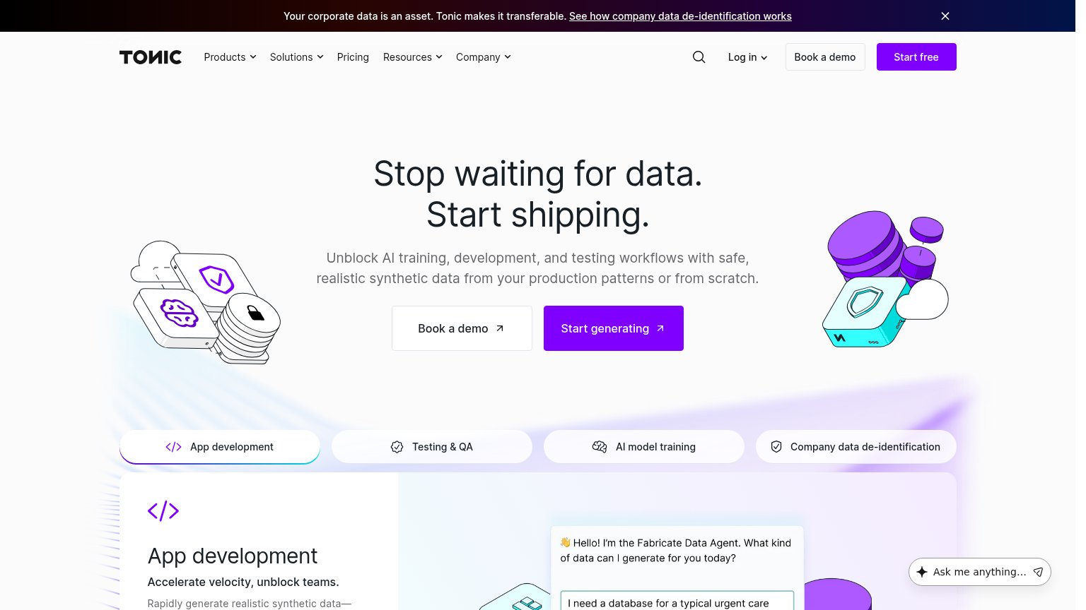


Problems
- generic label, no payoff
- same size as secondary CTA
- nav pushes 'Book a Demo' instead
Trust
72FairProof that the product is real, competent, and safe to try.
How Ardent compares
Trust read
Mobile web
78FairThe phone experience as a first-class citizen.
What works
What to improve
Value props
84StrongTitle, subtitle, hero — do they sell the product's true value?
Ardent’s headline
Use coding agents on real data with no risk
Create copies of any Postgres database in under 6 seconds so coding agents can verify their code works in prod
Working
Could improve