
Your landing page’s weakest score is Trust.
How Tonic.ai ranks
Trust
48PoorProof that the product is real, competent, and safe to try.


| Trust read | |
|---|---|
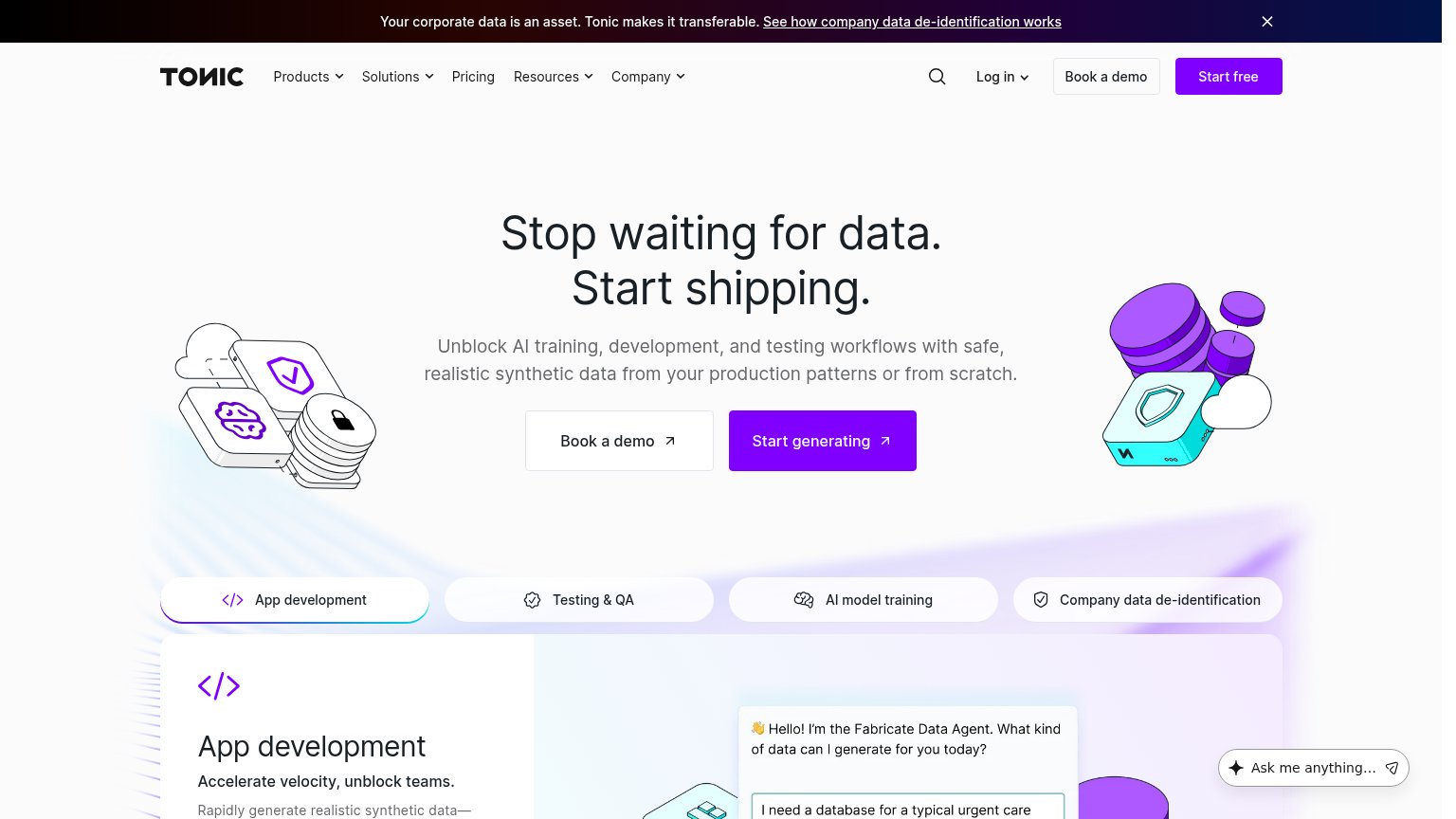
| Tonic.ai | Fabricate Data Agent chat UI showing "I need a database for a typical urgent care" prompt |
| "BACKED BY Y COMBINATOR" badge above the headline | |
| Customer logo wall (DoorDash, Meta, Retool, BCG, Bitso, Framer) below the hero CTA | |
| Embedded YouTube video "PostgresAI demo 2" by PostgresTV | |
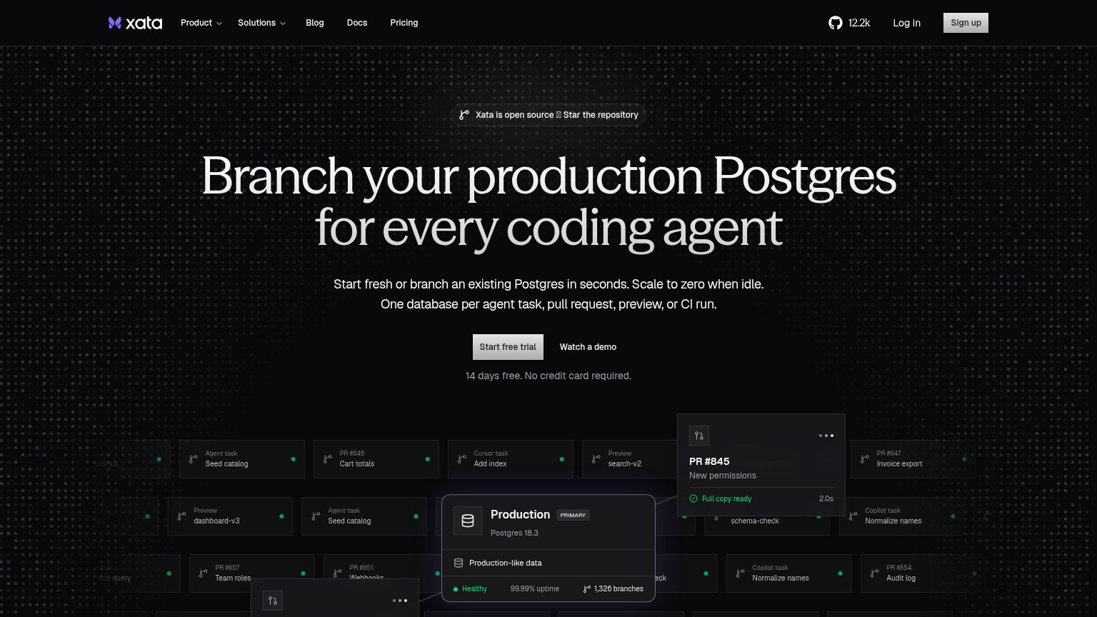
| GitHub star count "12.2k" in the header alongside the open-source badge |
Mobile web
70FairThe phone experience as a first-class citizen.
 1234
- Promo announcement banner — Wraps to three lines and consumes ~10% of the first viewport, pushing the primary CTA to the fold edge.
- Six-line subheadline — Body copy scales too large and wraps into six lines, delaying the CTA and slowing the scan.
- Start generating button — Primary CTA is clipped at the bottom of the first viewport instead of sitting clearly above the fold.
- Book a demo button — Secondary CTA stacked above the primary steals the more visible position in the fold.
Information hierarchy
72FairDoes the design help or inhibit what the page is trying to say?
What works
What to improve
CTA
78FairCopy, size, verb, cost-feel — does the primary CTA earn the click?
How Tonic.ai compares
Recommended rewrites
Value props
82StrongTitle, subtitle, hero — do they sell the product's true value?
Tonic.ai’s headline
Stop waiting for data. Start shipping.
Unblock AI training, development, and testing workflows with safe, realistic synthetic data from your production patterns or from scratch.
Working
Could improve