
Your landing page’s weakest score is Trust.
How Tropic ranks
Trust
52FairProof that the product is real, competent, and safe to try.
| Trust read | |
|---|---|
| Tropic | No visible trust signal identified. |
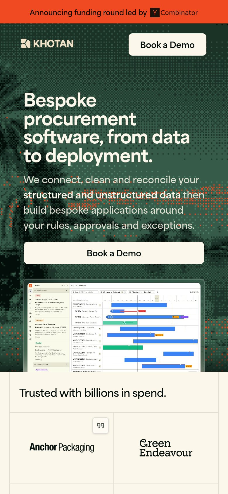
| "Trusted with billions in spend." section with customer names Anchor Packaging and Green Endeavour (mobile capture) | |
| "52% of your PO lines change" stat card with an Updates 450 → 320 metric overlaid on the hero image |
Mobile web
62FairThe phone experience as a first-class citizen.
 1234
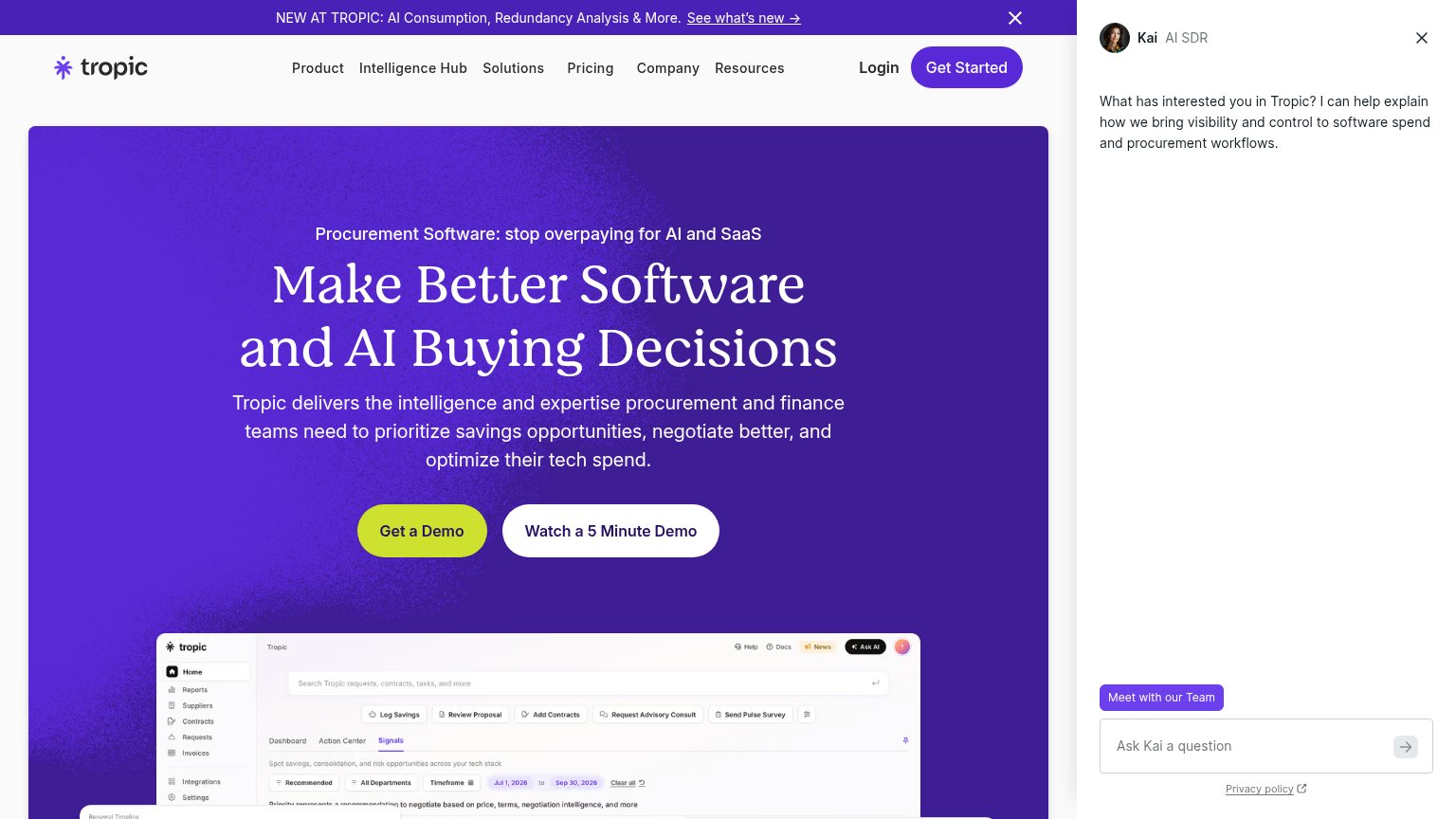
- Kai chat bubble — Auto-opened chat message covers the area right below the primary CTA and crowds the fold with a competing prompt.
- Ask Kai launcher — Large pill launcher overlaps the product screenshot and duplicates the already-open chat bubble.
- Promo announcement banner — Three-line sticky banner plus header eats the top ~16% of the viewport before the hero starts.
- Body paragraph — Six lines of large subhead copy push the 'Get a Demo' button to the very bottom edge of the fold.
Information hierarchy
64FairDoes the design help or inhibit what the page is trying to say?
What works
What to improve
CTA
72FairCopy, size, verb, cost-feel — does the primary CTA earn the click?
How Tropic compares
Recommended rewrites
Value props
72FairTitle, subtitle, hero — do they sell the product's true value?
Tropic’s headline
Make Better Software and AI Buying Decisions
Tropic delivers the intelligence and expertise procurement and finance teams need to prioritize savings opportunities, negotiate better, and optimize their tech spend.
Working
Could improve