
Your landing page’s weakest score is Trust.
How Tracer ranks
- 1.
Credal72
- 2.
Team-GPT72
- 3.
Tracer68
- 4.
Dust66
- 5.
Writer60
Trust
58FairProof that the product is real, competent, and safe to try.
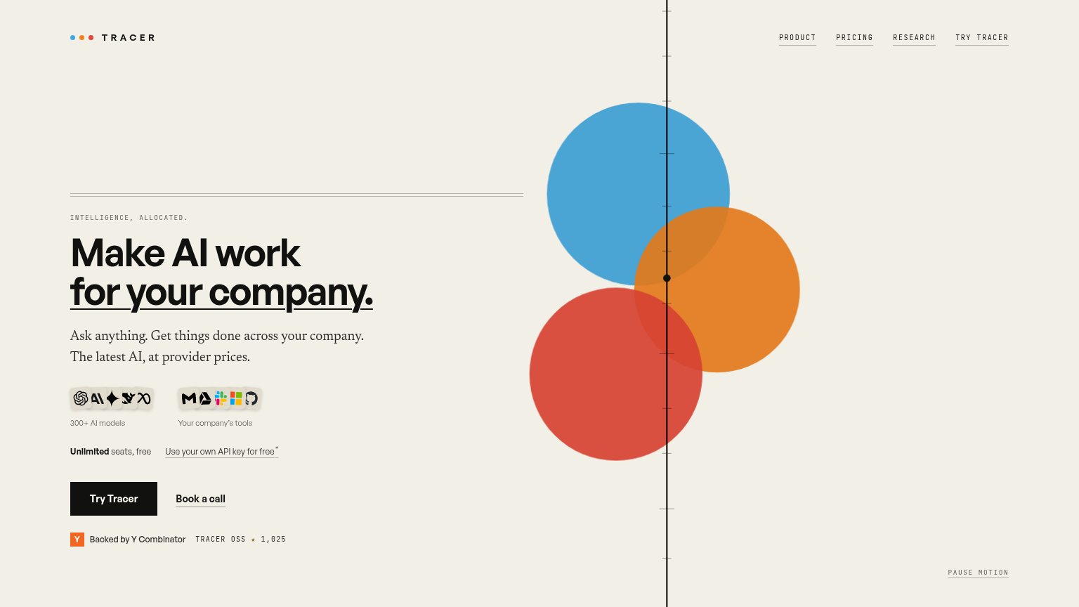
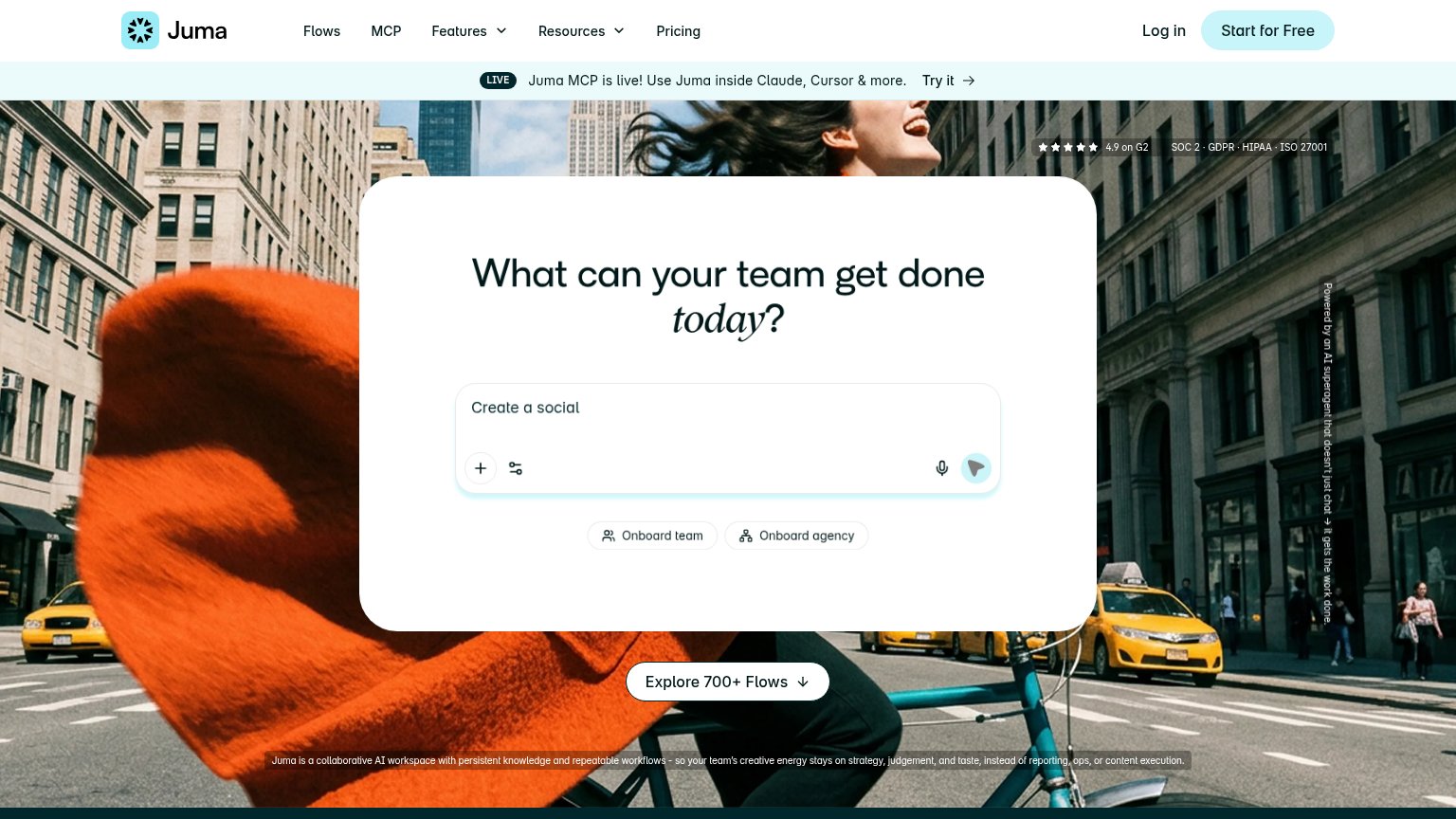
| Trust read | |
|---|---|
| Tracer | Backed by Y Combinator badge with "TRACER OSS ★ 1,025" star count below the CTA |
| No visible trust signal identified. | |
| No visible trust signal identified. | |
| "World-class enterprises trust WRITER" logo strip with Dropbox and e.l.f. logos (mobile capture) | |
| "4.9 on G2" star rating paired with "SOC 2 · GDPR · HIPAA · ISO 27001" compliance strip in the hero |
Mobile web
58FairThe phone experience as a first-class citizen.
 123
- Hero circle graphic — Fills the entire first viewport, pushing the headline and Try Tracer CTA off-screen.
- Try Tracer button — Desktop-proportioned at a third of the column width instead of a full-bleed thumb target.
- Text-link nav row — Two underlined text links instead of a hamburger; small tap targets crowd the top bar.
CTA
72FairCopy, size, verb, cost-feel — does the primary CTA earn the click?
How Tracer compares
Recommended rewrites
Value props
72FairTitle, subtitle, hero — do they sell the product's true value?
Tracer’s headline
Make AI work for your company.
Ask anything. Get things done across your company. The latest AI, at provider prices.
Working
Could improve
Information hierarchy
82StrongDoes the design help or inhibit what the page is trying to say?
What works
What to improve