
Your landing page’s weakest score is Trust.
How Ticket Wallet ranks
Trust
62FairProof that the product is real, competent, and safe to try.
| Trust read | |
|---|---|
| Ticket Wallet | No visible trust signal identified. |
| "Get your tickets priced-to-market on Vivid Seats, Stubhub, Seatgeek, Ticketmaster+, and thousands of the world's best m | |
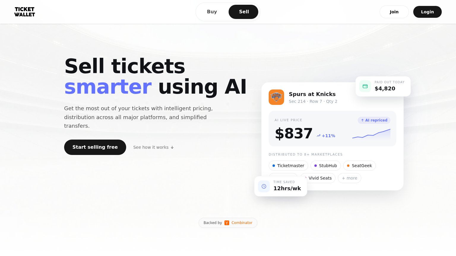
| "Marketplaces" panel in the hero graphic listing StubHub, Vivid Seats, and SeatGeek integration logos | |
| Stat band showing "$3.5B+" and "$6.5B+" figures at the bottom of the desktop fold | |
| implicit context TicketNetwork may benefit from pre-existing familiarity among its target audience. | |
| Detailed product screenshot showing the listings table with real events, seat map, and "NOW PRICING" panel |
Mobile web
72FairThe phone experience as a first-class citizen.
 1234
- Clipped Login button — The Login pill overflows and is cut off at the right viewport edge — a visible responsive break in the header.
- Uncollapsed header buttons — Join and Login sit as two desktop pills instead of collapsing into a single menu, causing the overflow.
- Half-width primary CTA — "Start selling free" keeps desktop proportions; on mobile it should be near full-bleed for easy thumb taps.
- Oversized three-line headline — The hero headline scales down too little, wrapping into three tall lines that push the CTA deep into the fold.
Value props
80StrongTitle, subtitle, hero — do they sell the product's true value?
Ticket Wallet’s headline
Sell tickets smarter using AI
Get the most out of your tickets with intelligent pricing, distribution across all major platforms, and simplified transfers.
Working
Could improve
Information hierarchy
82StrongDoes the design help or inhibit what the page is trying to say?
What works
What to improve
CTA
88StrongCopy, size, verb, cost-feel — does the primary CTA earn the click?
How Ticket Wallet compares
Recommended rewrites