
Your landing page’s weakest score is Trust.
How Broker Nerds ranks
68Growth scoreupdated
category scores
category scoresShowHide
Trust
58FairProof that the product is real, competent, and safe to try.
| Trust read | |
|---|---|
| Broker Nerds | Detailed product screenshot showing the listings table with real events, seat map, and "NOW PRICING" panel |
| No visible trust signal identified. | |
| "Get your tickets priced-to-market on Vivid Seats, Stubhub, Seatgeek, Ticketmaster+, and thousands of the world's best m | |
| "Marketplaces" panel in the hero graphic listing StubHub, Vivid Seats, and SeatGeek integration logos | |
| Stat band showing "$3.5B+" and "$6.5B+" figures at the bottom of the desktop fold | |
| implicit context TicketNetwork may benefit from pre-existing familiarity among its target audience. |
Information hierarchy
68FairDoes the design help or inhibit what the page is trying to say?
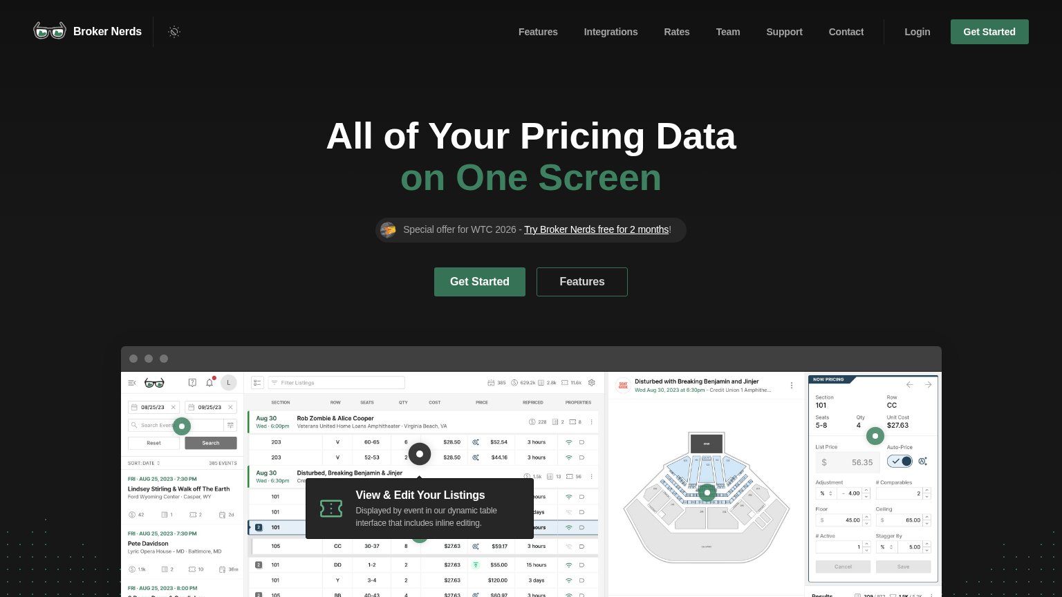 1234
- Header nav links — Seven equal-weight links (Features, Integrations, Rates, Team, Support, Contact, Login) siphon attention before the hero CTA.
- Features secondary button — Styled at nearly the same size and position as Get Started, splitting the click between two adjacent buttons.
- Special offer banner — Underlined 'Try Broker Nerds free for 2 months' link sits between headline and CTA, adding a third competing action in the scan path.
- Duplicate Get Started — The nav's green Get Started repeats the hero CTA, creating two identical primary actions in one viewport.
Mobile web
68FairThe phone experience as a first-class citizen.
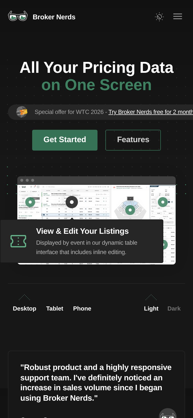
What works
What to improve
CTA
72FairCopy, size, verb, cost-feel — does the primary CTA earn the click?
How Broker Nerds compares
Recommended rewrites
Value props
72FairTitle, subtitle, hero — do they sell the product's true value?
Broker Nerds’s headline
All of Your Pricing Data on One Screen
Working
Could improve