
Your landing page’s weakest score is Trust.
How Thena ranks
71Growth scoreupdated
category scores
category scoresShowHide
Trust
42PoorProof that the product is real, competent, and safe to try.
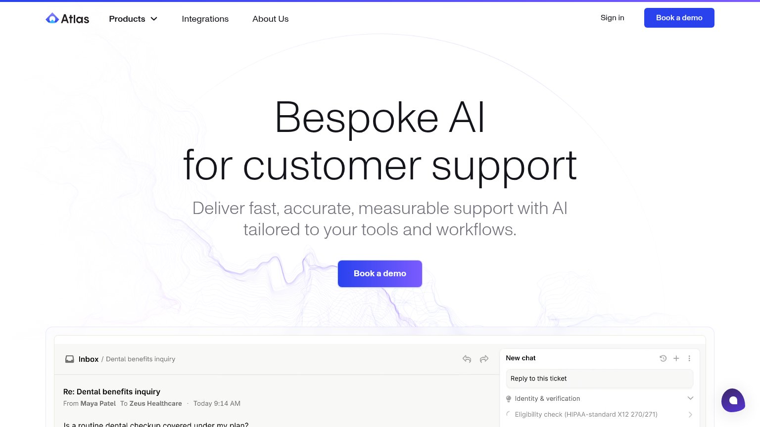
| Trust read | |
|---|---|
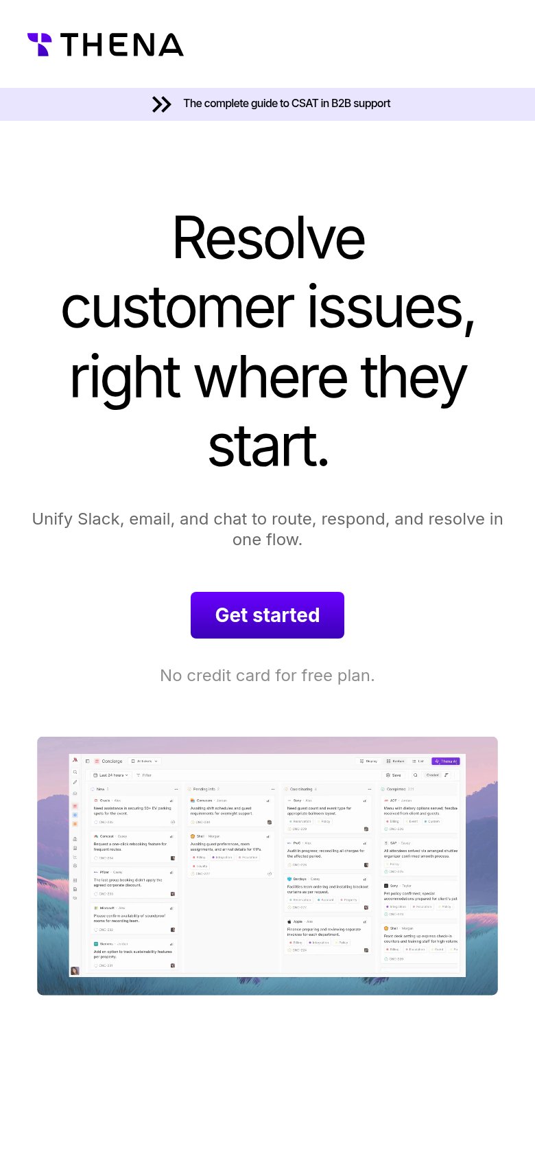
| Thena | Product UI screenshot showing a kanban-style ticket board with a "Thena AI" button (mobile capture) |
| No visible trust signal identified. | |
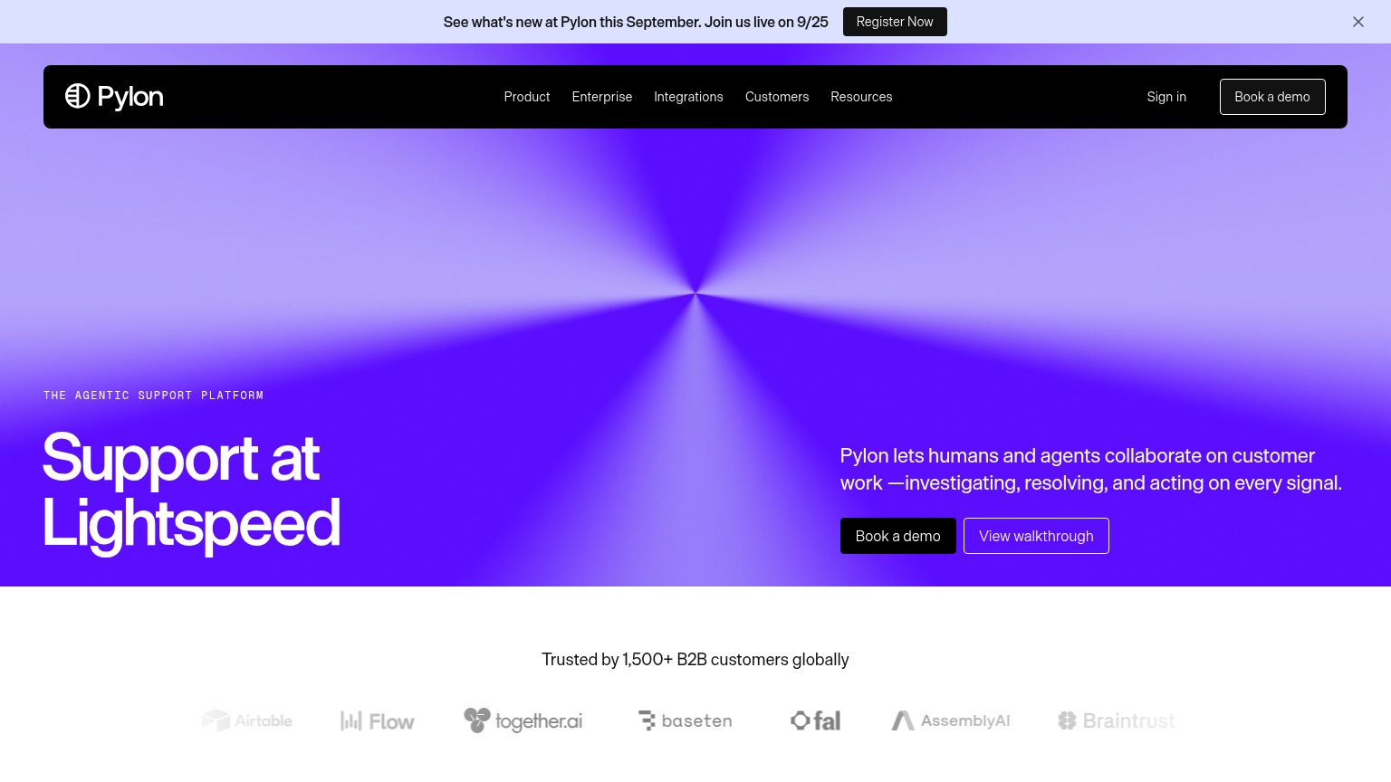
| "Trusted by 1,500+ B2B customers globally" with logo row (Airtable, Together.ai, Baseten, Fal, AssemblyAI, Braintrust) | |
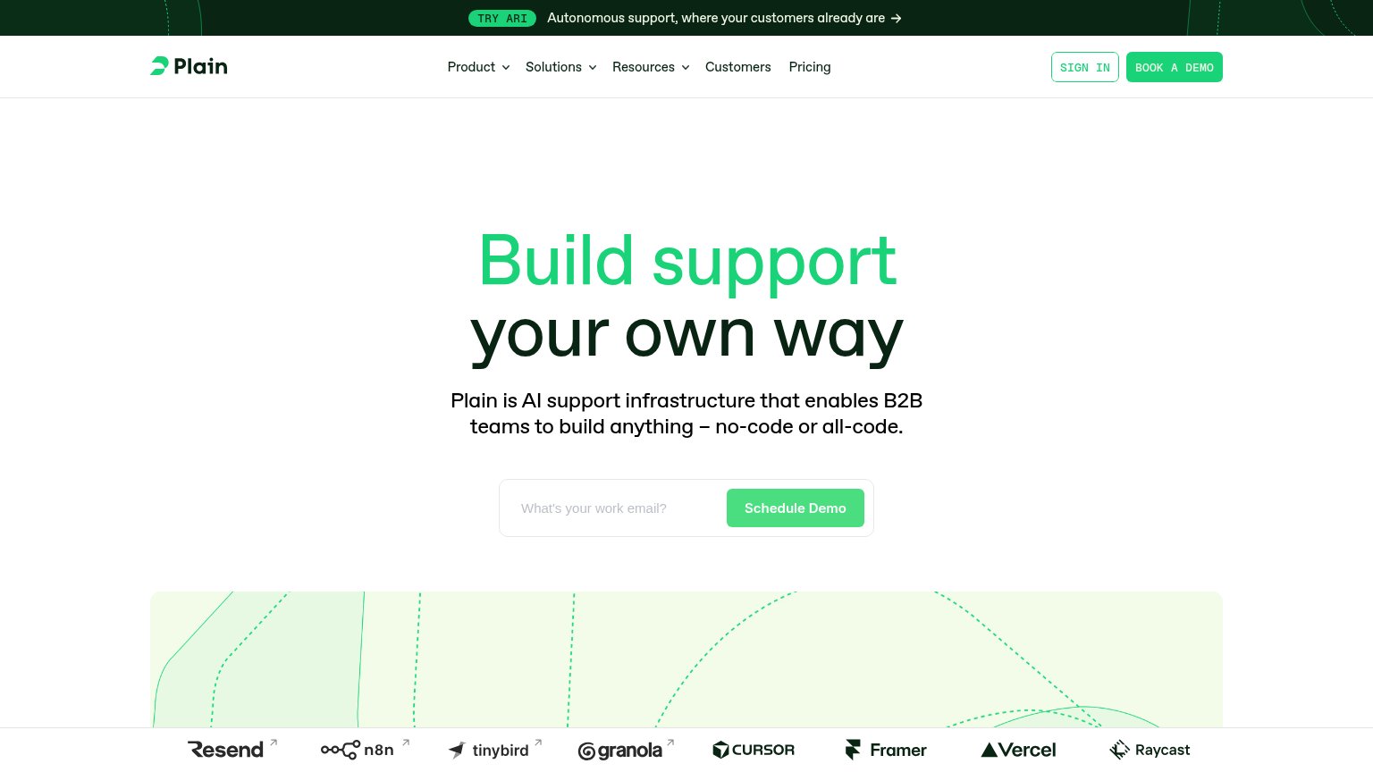
| Customer logo strip with Cursor, Vercel, Framer, Raycast, Resend, n8n, tinybird, granola | |
| Product UI showing a support inbox ticket with AI panel running "Eligibility check (HIPAA-standard X12 270/271)" | |
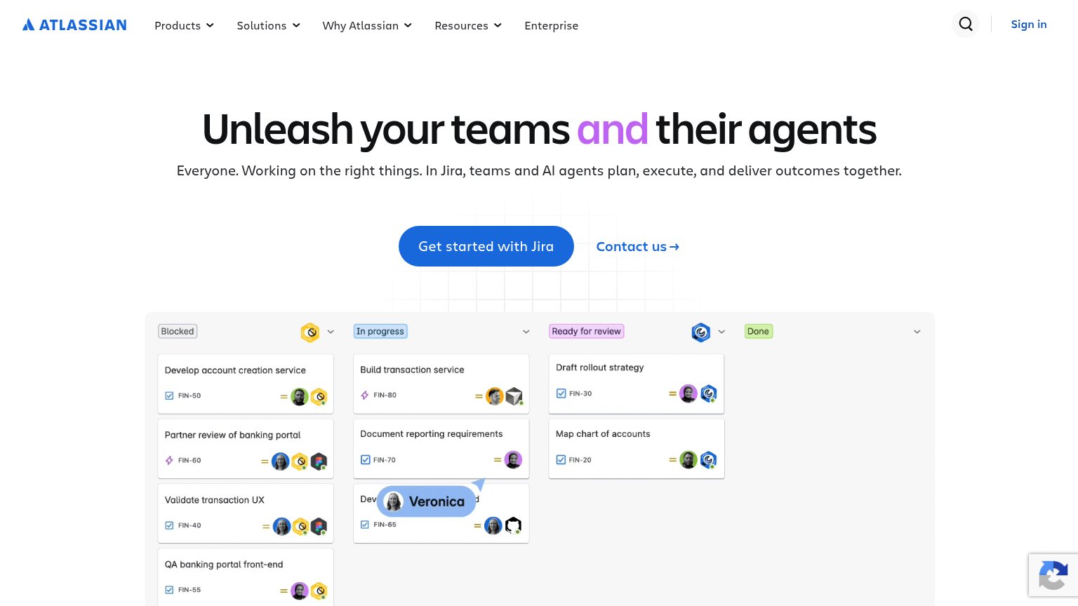
| Detailed Jira kanban board UI with task cards ("Develop account creation service", FIN-50) showing human and AI agent as |
Value props
72FairTitle, subtitle, hero — do they sell the product's true value?
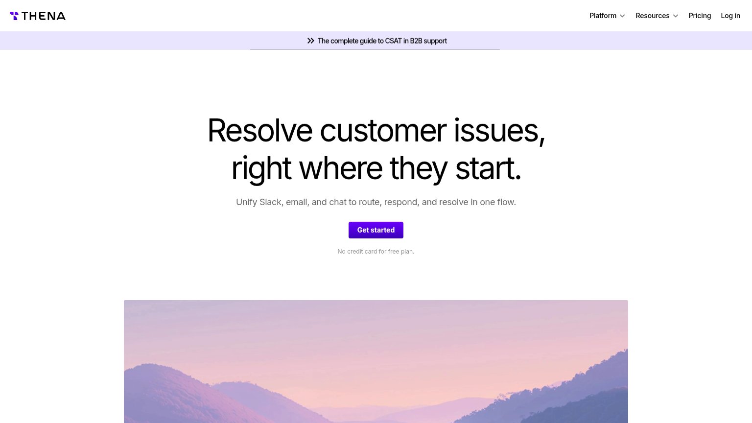
Thena’s headline sells
Resolve customer issues, right where they start.
Unify Slack, email, and chat to route, respond, and resolve in one flow.
Working
- Outcome-first headline, not features
- Subhead names real channels: Slack, email, chat
- "No credit card for free plan" lowers risk
Could improve
- No numbers or proof points in the fold
- Emotionally flat; no pain or relief evoked
- Hero image decorates, doesn't show the flow
CTA
76FairCopy, size, verb, cost-feel — does the primary CTA earn the click?
How Thena compares
Recommended rewrites
Mobile web
80StrongThe phone experience as a first-class citizen.
What works
What to improve
Information hierarchy
84StrongDoes the design help or inhibit what the page is trying to say?
What works
What to improve