
Your landing page’s weakest score is Trust.
How System Surveyor ranks
- 1.
PlanHub SiteOwl72
- 2.
Semble70
- 3.
System Surveyor69
- 4.
D-Tools68
- 5.
Jetbuilt55
69Growth scoreupdated
category scores
category scoresShowHide
Trust
54FairProof that the product is real, competent, and safe to try.


| Trust read | |
|---|---|
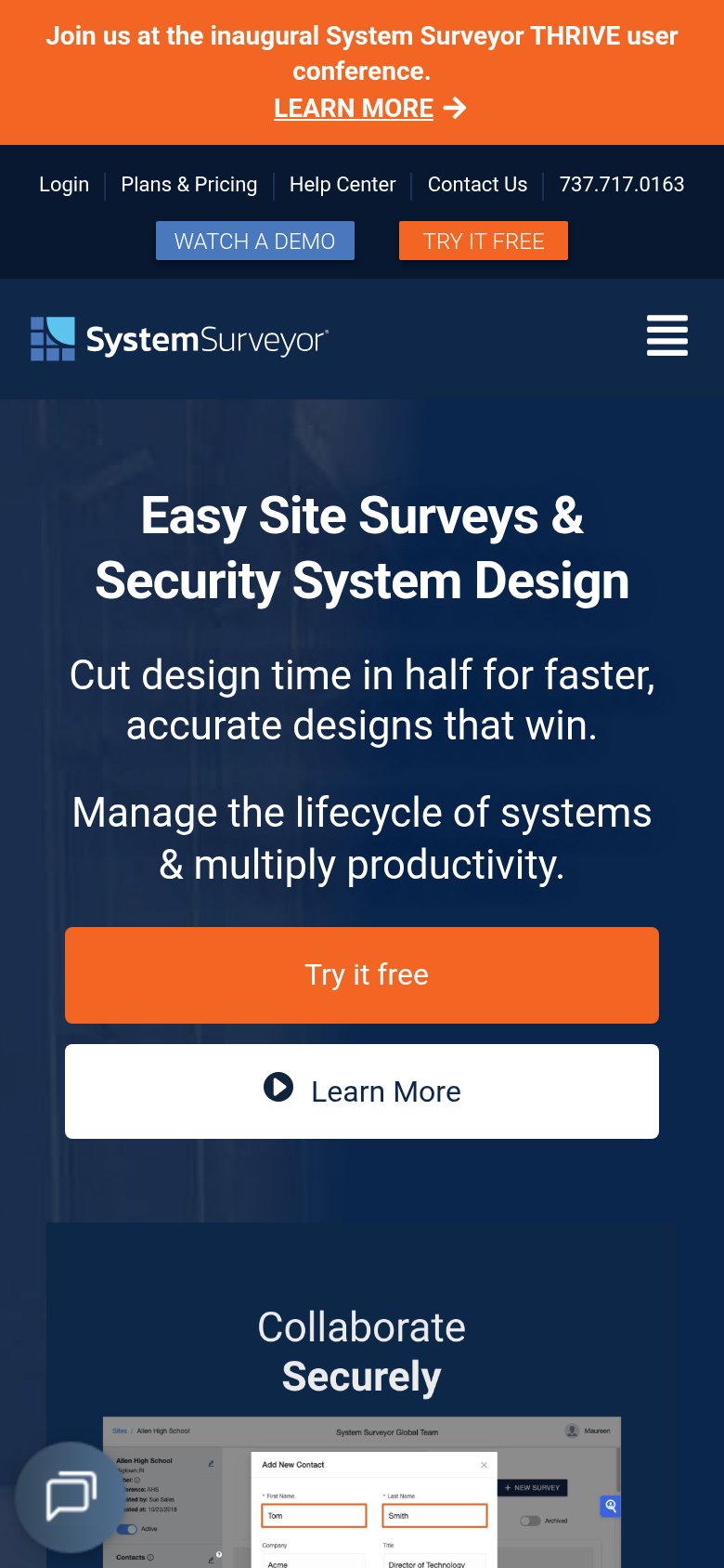
| System Surveyor | Real product screenshot showing the "Add New Contact" dialog with team contacts and permission settings |
| Product UI mockup showing a floor plan of "Riverside Medical Center / Floor 2 · A-102" with device placement pins and th | |
| No visible trust signal identified. | |
| "InAVation Award Winner and Best of Show Winner at ISE 2026, InfoComm 2026 & CEDIA 2026" announcement bar | |
| "6M+ Devices managed. 120K+ Floor plans. 34K+ Sites & Locations." stat bar below the hero CTAs |
Information hierarchy
66FairDoes the design help or inhibit what the page is trying to say?
1234- Orange conference banner — Same orange as the primary CTA and first in the scan path; it steals the top attention slot for an event, not the trial.
- Nav Try It Free — Duplicates the hero "Try it free" at equal weight alongside "Watch a Demo", splitting the primary action three ways.
- Utility links row — Five exits (Login, Plans & Pricing, Help Center, Contact Us, phone) stacked directly above the nav add leak paths before the pitch.
- Learn More button — White-filled secondary button carries near-equal visual weight to the adjacent orange "Try it free".
Mobile web
68FairThe phone experience as a first-class citizen.
What works
What to improve
Value props
76FairTitle, subtitle, hero — do they sell the product's true value?
System Surveyor’s headline
Easy Site Surveys & Security System Design
Cut design time in half for faster, accurate designs that win. Manage the lifecycle of systems & multiply productivity.
Working
Could improve
CTA
82StrongCopy, size, verb, cost-feel — does the primary CTA earn the click?
How System Surveyor compares
Recommended rewrites