
Your landing page’s weakest score is CTA.
How Jetbuilt ranks
CTA
48PoorCopy, size, verb, cost-feel — does the primary CTA earn the click?


Problems
- absent from mobile fold
- nav-sized, no hero button
- 'Evaluate' feels like work, not value
- vague payoff — evaluate what?
Trust
52FairProof that the product is real, competent, and safe to try.
| Trust read | |
|---|---|
| Jetbuilt | "InAVation Award Winner and Best of Show Winner at ISE 2026, InfoComm 2026 & CEDIA 2026" announcement bar |
| Product UI mockup showing a floor plan of "Riverside Medical Center / Floor 2 · A-102" with device placement pins and th | |
| Real product screenshot showing the "Add New Contact" dialog with team contacts and permission settings | |
| No visible trust signal identified. | |
| "6M+ Devices managed. 120K+ Floor plans. 34K+ Sites & Locations." stat bar below the hero CTAs |
Mobile web
52FairThe phone experience as a first-class citizen.
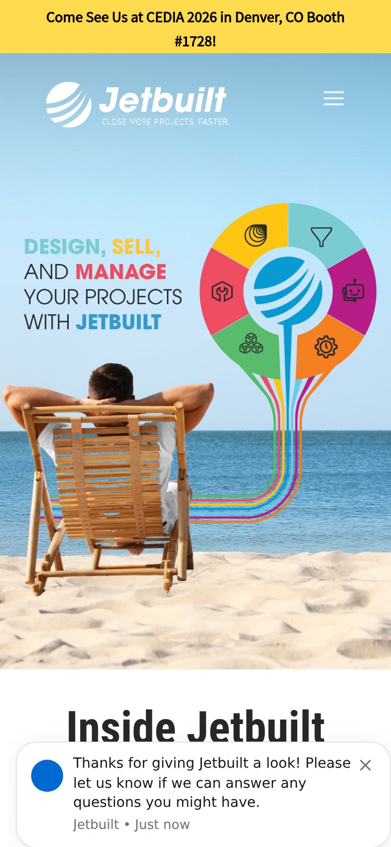
What works
What to improve
Information hierarchy
62FairDoes the design help or inhibit what the page is trying to say?
What works
What to improve
Value props
62FairTitle, subtitle, hero — do they sell the product's true value?
Jetbuilt’s headline
THIS USED TO TAKE ALL DAY
DESIGN, SELL AND MANAGE YOUR PROJECTS
Working
Could improve