
Your landing page’s weakest score is Mobile web.
How Sybill ranks
74Growth scoreupdated
category scores
category scoresShowHide
Mobile web
68FairThe phone experience as a first-class citizen.
 123
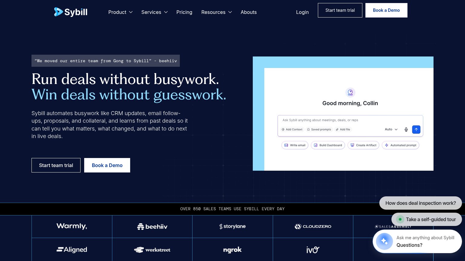
- Stacked chat bubbles — Two chat prompts pile over the product screenshot, hiding the demo UI meant to sell the product.
- Side-by-side CTA pair — Desktop-proportioned half-width buttons compete for the thumb instead of one full-bleed primary CTA.
- Obscured product screenshot — The app preview is cropped and covered so its input bar and action chips are unreadable on mobile.
Information hierarchy
70FairDoes the design help or inhibit what the page is trying to say?
 123
- Duplicate header CTAs — "Start team trial" and "Book a Demo" in the nav duplicate the hero pair, doubling the fold's competing buttons.
- Equal-weight hero CTAs — "Start team trial" and "Book a Demo" sit side by side at near-identical visual weight, so neither reads as the one primary action.
- Three chat widgets — "How does deal inspection work?", "Take a self-guided tour", and "Ask me anything" stack in the corner, three competing prompts pulling attention off the CTA.
CTA
70FairCopy, size, verb, cost-feel — does the primary CTA earn the click?
How Sybill compares
Recommended rewrites
Value props
78FairTitle, subtitle, hero — do they sell the product's true value?
Sybill’s headline
Run deals without busywork. Win deals without guesswork.
Sybill automates busywork like CRM updates, email follow-ups, proposals, and collateral, and learns from past deals so it can tell you what matters, what changed, and what to do next in live deals.
Working
Could improve
Trust
84StrongProof that the product is real, competent, and safe to try.
How Sybill compares
Trust read