
Your landing page’s weakest score is Trust.
How SteelEye ranks
Trust
44PoorProof that the product is real, competent, and safe to try.
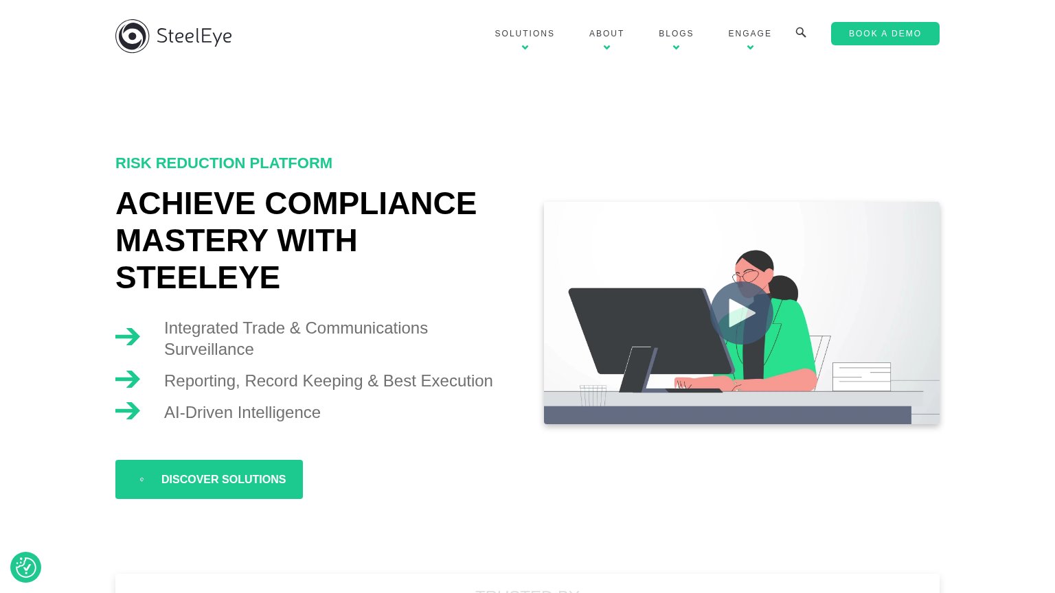
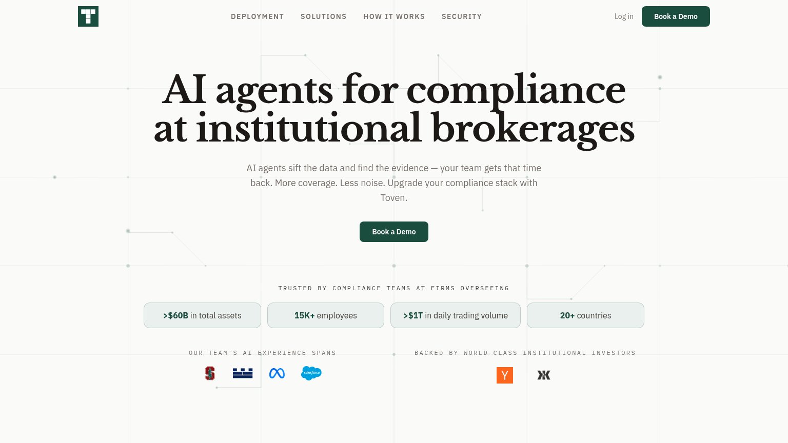
| Trust read | |
|---|---|
| SteelEye | "TRUSTED BY" section header entering the bottom of the desktop fold |
| "Trusted by compliance teams at firms overseeing >$60B in total assets / 15K+ employees / >$1T in daily trading volume / | |
| No visible trust signal identified. | |
| "Trusted by institutions managing over" line at the bottom of the desktop fold | |
| No visible trust signal identified. | |
| No visible trust signal identified. |
Mobile web
48PoorThe phone experience as a first-class citizen.
 1234
- Oversized wrapping headline — The H1 barely scaled down from desktop and wraps into six cramped lines, pushing the CTA out of the first viewport.
- Discover Solutions button — Primary CTA sits below the fold and is clipped at the bottom edge, so visitors must scroll before any action is tappable.
- Stray 'nimation' text — Broken overflow text renders above the header, signaling an unpolished mobile build at first glance.
- Chat bubble over CTA — The accessibility/chat widget overlaps the left edge of the Discover Solutions button, crowding the tap target.
Value props
58FairTitle, subtitle, hero — do they sell the product's true value?
SteelEye’s headline
ACHIEVE COMPLIANCE MASTERY WITH STEELEYE
Integrated Trade & Communications Surveillance / Reporting, Record Keeping & Best Execution / AI-Driven Intelligence
Working
Could improve
CTA
62FairCopy, size, verb, cost-feel — does the primary CTA earn the click?
How SteelEye compares
Recommended rewrites
Information hierarchy
68FairDoes the design help or inhibit what the page is trying to say?
What works
What to improve