
Your landing page’s weakest score is Trust.
How Behavox ranks
Trust
42PoorProof that the product is real, competent, and safe to try.
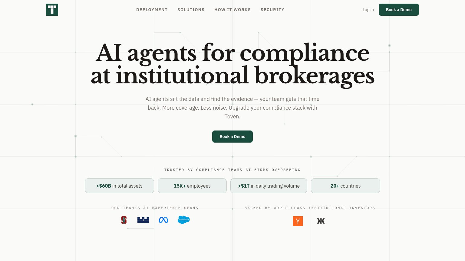
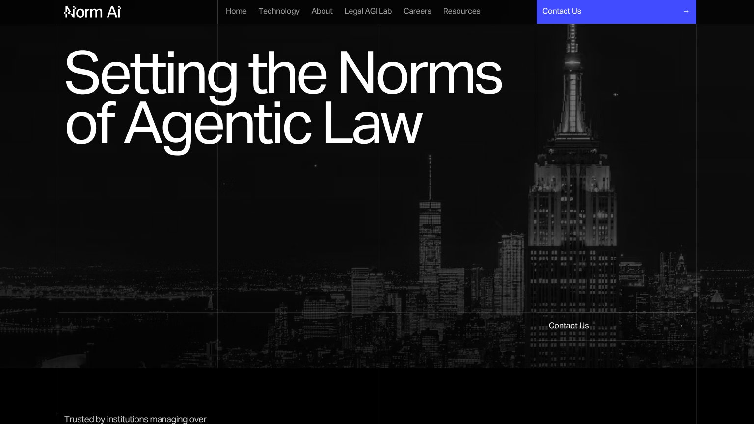
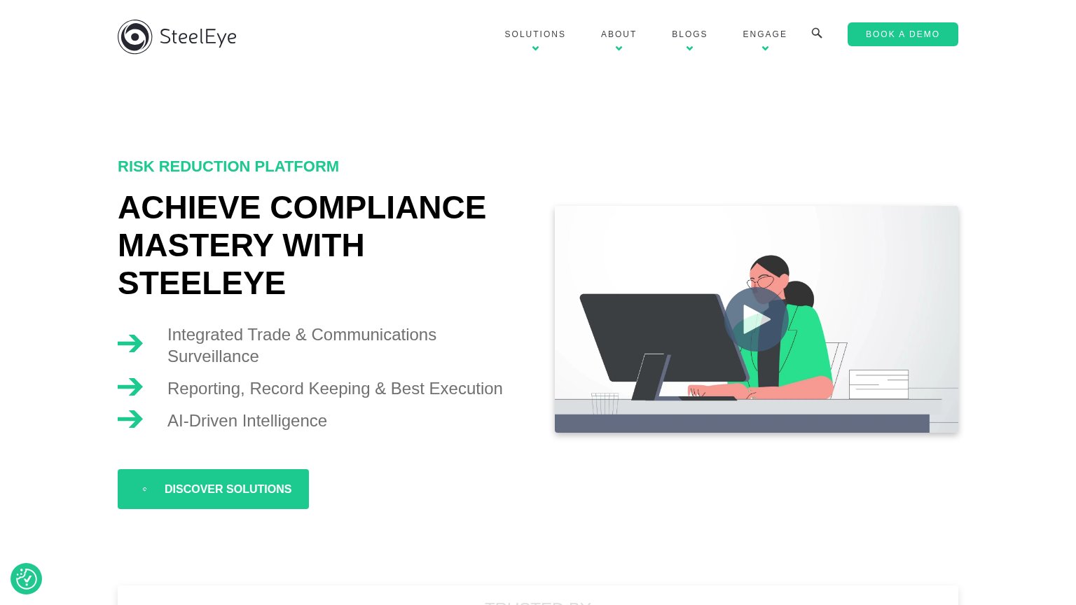
| Trust read | |
|---|---|
| Behavox | No visible trust signal identified. |
| "Trusted by compliance teams at firms overseeing >$60B in total assets / 15K+ employees / >$1T in daily trading volume / | |
| No visible trust signal identified. | |
| "Trusted by institutions managing over" line at the bottom of the desktop fold | |
| "TRUSTED BY" section header entering the bottom of the desktop fold | |
| No visible trust signal identified. |
Mobile web
62FairThe phone experience as a first-class citizen.
 123
- Clipped secondary CTA — "Explore the platform" overflows the viewport and is cut off mid-word — a broken responsive layout.
- Oversized Ask AI bubble — The chat widget covers the "THE CONTROLS PLATFORM" label and will overlap CTAs while scrolling.
- Four-line hero headline — The headline scales down too little, wrapping into four heavy lines that push the CTAs low in the fold.
CTA
72FairCopy, size, verb, cost-feel — does the primary CTA earn the click?
How Behavox compares
Recommended rewrites
Value props
72FairTitle, subtitle, hero — do they sell the product's true value?
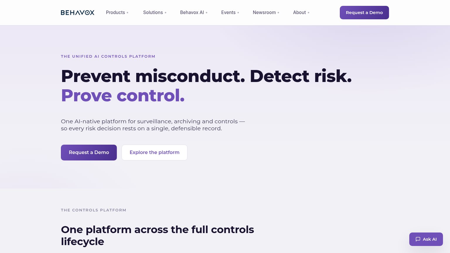
Behavox’s headline
Prevent misconduct. Detect risk. Prove control.
One AI-native platform for surveillance, archiving and controls — so every risk decision rests on a single, defensible record.
Working
Could improve
Information hierarchy
78FairDoes the design help or inhibit what the page is trying to say?
What works
What to improve