
Your landing page’s weakest score is Information hierarchy.
How Speedy Metals ranks
- 1.
Nox Metals78
- 2.
MetalsCut4U66
- 3.
Metals Depot59
- 4.
Speedy Metals49
49Growth scoreupdated
category scores
category scoresShowHide
Information hierarchy
42PoorDoes the design help or inhibit what the page is trying to say?
 1234
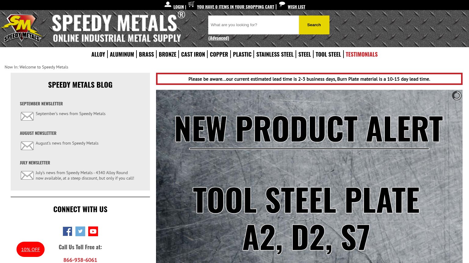
- Hero carousel no CTA — The "SHOP NOW" button is cropped below the desktop fold, leaving the hero with no visible action.
- Blog sidebar outranks products — Three newsletter links occupy the prime left-scan position that should sell metal, not blog posts.
- Red lead-time banner — A warning about delays is the first styled message a visitor reads, framing the visit negatively.
- Eleven-item category nav — Eleven equal-weight links plus "TESTIMONIALS" in red scatter attention before any product message lands.
Value props
42PoorTitle, subtitle, hero — do they sell the product's true value?
Speedy Metals’s headline undersells
NEW PRODUCT ALERT
TOOL STEEL PLATE A2, D2, S7
Working
- Specific alloy grades named (A2, D2, S7)
- Lead-time banner gives a real number
- Tagline states the category plainly
Could improve
- Hero is a promo, not a value prop
- No outcome for first-time buyers
- Fast-shipping strength buried in a caveat
Trust
52FairProof that the product is real, competent, and safe to try.
How Speedy Metals compares
Trust read
Mobile web
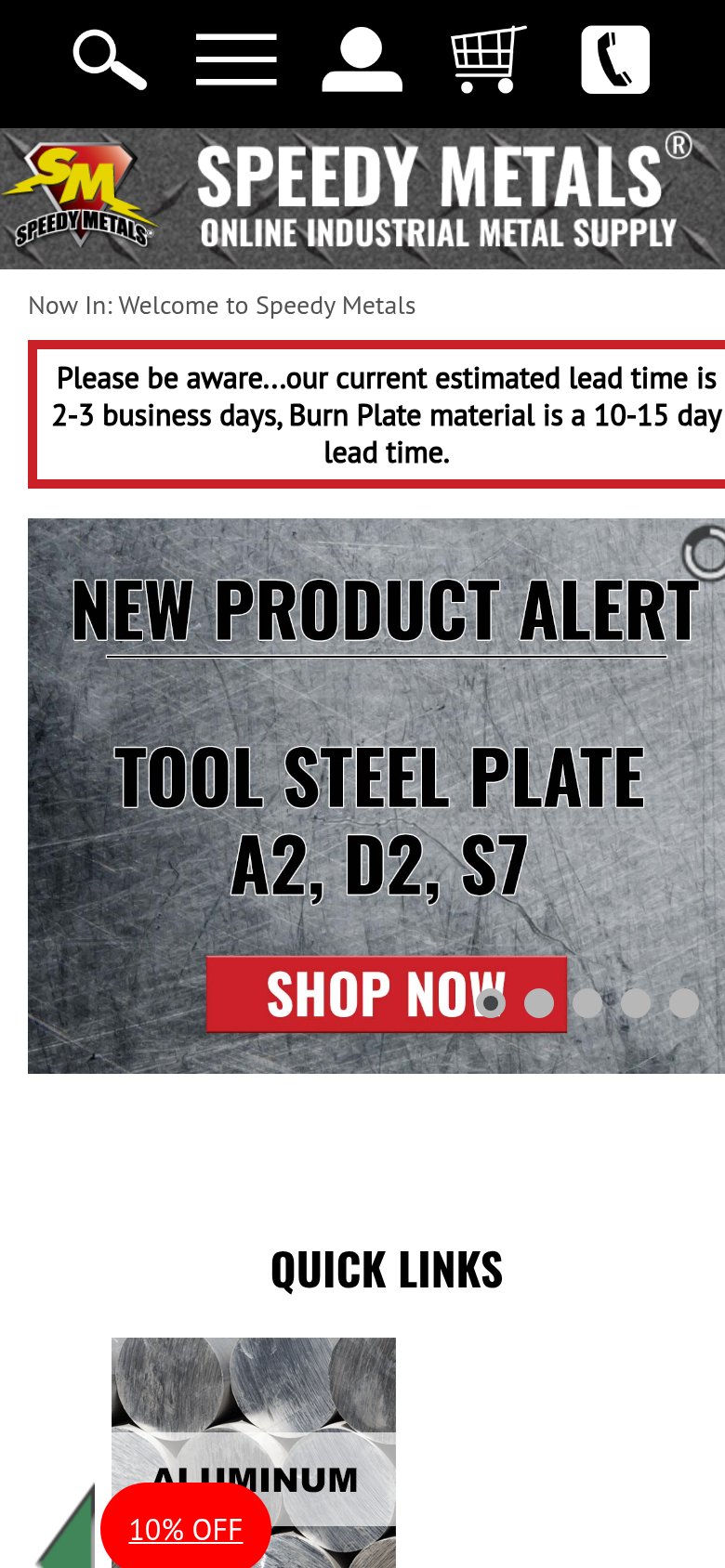
52FairThe phone experience as a first-class citizen.
What works
What to improve
CTA
58FairCopy, size, verb, cost-feel — does the primary CTA earn the click?
How Speedy Metals compares
Recommended rewrites