
Your landing page’s weakest score is Mobile web.
How Moderne ranks
62Growth scoreupdated
category scores
category scoresShowHide
Mobile web
54FairThe phone experience as a first-class citizen.
 123
- Overlapping body copy — Two paragraphs render on top of each other, producing unreadable doubled text.
- Oversized repo diagram — The animation consumes most of the mobile page and pushes the CTA two screens down.
- Colliding diagram labels — "ledger-service" overlaps another label into garbled text; "card-authorization" and "payments-core" also collide.
Information hierarchy
62FairDoes the design help or inhibit what the page is trying to say?
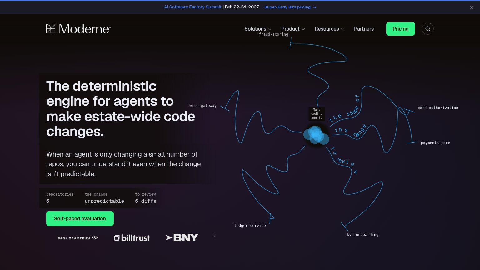 1234
- Green Pricing button — Styled identically to the Self-paced evaluation CTA, splitting attention between two same-weight green buttons.
- Summit banner link — A colored 'Super-Early Bird pricing' link sits at the very top of the scan path, leaking attention before the headline.
- Nav link row — Five nav items plus a search icon add exit paths that outnumber and crowd the single conversion action.
- Repo stats strip — Monospace 'repositories 6 / unpredictable / 6 diffs' block reads as cryptic data, adding processing load right above the CTA.
CTA
62FairCopy, size, verb, cost-feel — does the primary CTA earn the click?
How Moderne compares
Recommended rewrites
Trust
62FairProof that the product is real, competent, and safe to try.
How Moderne compares
Trust read
Value props
68FairTitle, subtitle, hero — do they sell the product's true value?
Moderne’s headline
The deterministic engine for agents to make estate-wide code changes.
When an agent is only changing a small number of repos, you can understand it even when the change isn't predictable.
Working
Could improve