
Your landing page’s weakest score is Trust.
How Simantic ranks
Trust
52FairProof that the product is real, competent, and safe to try.
| Trust read | |
|---|---|
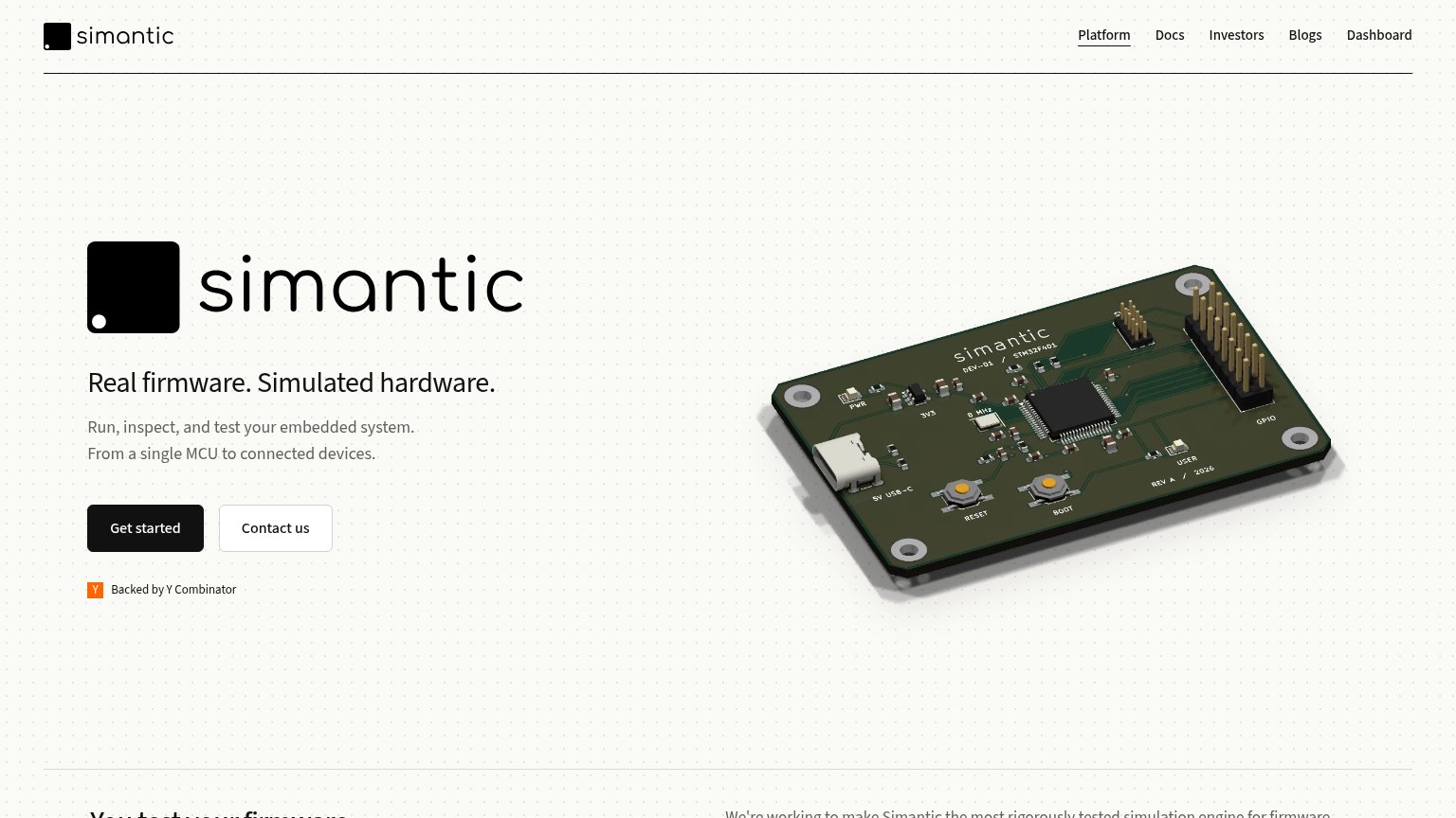
| Simantic | "Backed by Y Combinator" badge under the hero CTAs |
| Grid of detailed simulated board renders (Arduino Uno, ESP32, STM32, Pi Pico) | |
| "By: antmicro" attribution with the Antmicro logo in the desktop footer | |
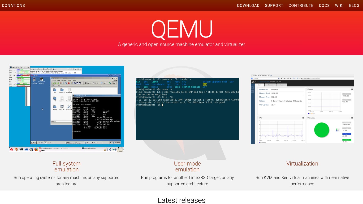
| Three real product screenshots: ReactOS full-system emulation, qemu-arm terminal session, and a virtualization dashboard | |
| "iOS 26 ✓ Jailbroken" label above the virtual iPhone home screen |
Mobile web
62FairThe phone experience as a first-class citizen.
 123
- Uncollapsed nav row — Full desktop link row stacks under the logo as a second header deck, consuming the top of the viewport instead of collapsing to a hamburger.
- Side-by-side CTA pair — "Get started" keeps desktop proportions next to "Contact us" — a half-width tap target where a full-bleed primary button belongs.
- Oversized hero logo — A second large "simantic" wordmark repeats the header logo and pushes headline and CTA lower in the fold.
CTA
70FairCopy, size, verb, cost-feel — does the primary CTA earn the click?
How Simantic compares
Recommended rewrites
Value props
72FairTitle, subtitle, hero — do they sell the product's true value?
Simantic’s headline
Real firmware. Simulated hardware.
Run, inspect, and test your embedded system. From a single MCU to connected devices.
Working
Could improve
Information hierarchy
74FairDoes the design help or inhibit what the page is trying to say?
What works
What to improve