
Your landing page’s weakest score is CTA.
How QEMU ranks
CTA
42PoorCopy, size, verb, cost-feel — does the primary CTA earn the click?
Problems
- no hero button or input at all
- 'DOWNLOAD' is a small nav link
- hidden behind hamburger on mobile
- open source but never says free
Mobile web
44PoorThe phone experience as a first-class citizen.
 123
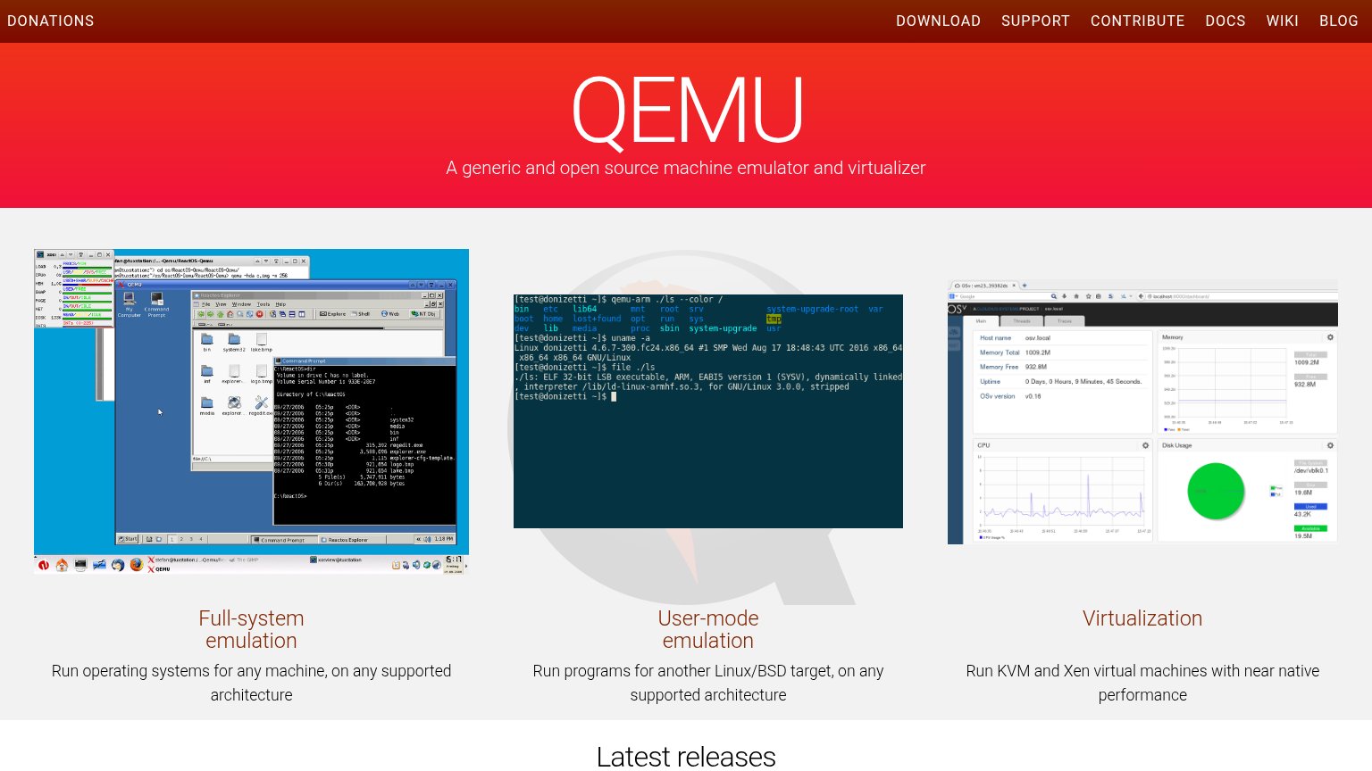
- Giant watermark logo — A faded ostrich logo consumes most of the first viewport, pushing all feature content and any action far below the fold.
- Dense screenshot image — Desktop-density QEMU screenshot with unreadable micro-text scaled into the phone column; conveys nothing at this size.
- Cropped terminal screenshot — Second feature screenshot starts mid-scroll with illegible terminal text, adding clutter without readable content.
Information hierarchy
58FairDoes the design help or inhibit what the page is trying to say?
What works
What to improve
Trust
58FairProof that the product is real, competent, and safe to try.
How QEMU compares
Trust read
Value props
62FairTitle, subtitle, hero — do they sell the product's true value?
QEMU’s headline
QEMU
A generic and open source machine emulator and virtualizer
Working
Could improve