
Your landing page’s weakest score is Mobile web.
How Signatrix ranks
48Growth scoreupdated
category scores
category scoresShowHide
Mobile web
38PoorThe phone experience as a first-class citizen.
 123
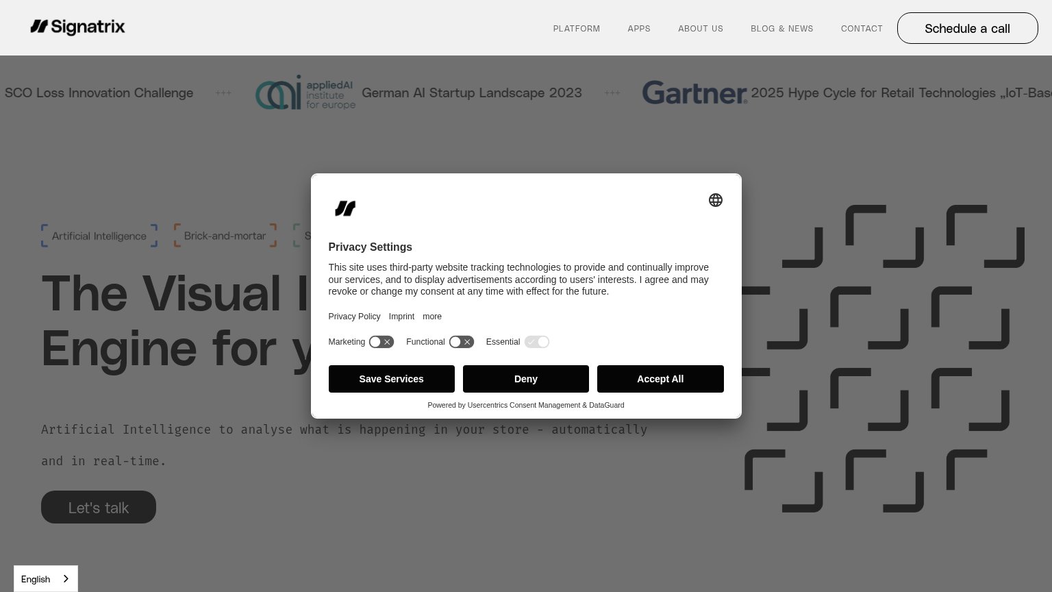
- Truncated headline — "The Visual Intelligence" wraps in huge desktop-scale type and cuts off mid-sentence, so the value statement never completes in the first viewport.
- Ticker text cut off — News ticker enters mid-sentence ("of the 2023 SCO Loss Innovation Challenge") and reads as broken content at the top of the fold.
- English language selector — Floating language switcher overlaps the consent modal's footer text, colliding two controls in one corner.
Information hierarchy
44PoorDoes the design help or inhibit what the page is trying to say?
 1234
- Privacy Settings modal — Cookie dialog with three equal-weight black buttons sits dead-center, covering the headline and outranking 'Let's talk'.
- Headline occluded — 'The Visual I... Engine for y...' is truncated by the modal, so the core promise never reads at a glance.
- Awards ticker banner — A full-width strip of logos and headlines competes with the hero before the value prop, adding three same-weight messages.
- 'Schedule a call' button — Second conversion button styled at primary weight splits attention with the hero's 'Let's talk' CTA.
Value props
52FairTitle, subtitle, hero — do they sell the product's true value?
Signatrix’s headline
The Visual Intelligence Engine for y...
Artificial Intelligence to analyse what is happening in your store - automatically and in real-time.
Working
Could improve
CTA
54FairCopy, size, verb, cost-feel — does the primary CTA earn the click?
How Signatrix compares
Recommended rewrites
Trust
54FairProof that the product is real, competent, and safe to try.
How Signatrix compares
Trust read