
Your landing page’s weakest score is Information hierarchy.
How SerpApi ranks
75Growth scoreupdated
category scores
category scoresShowHide
Information hierarchy
68FairDoes the design help or inhibit what the page is trying to say?
 123
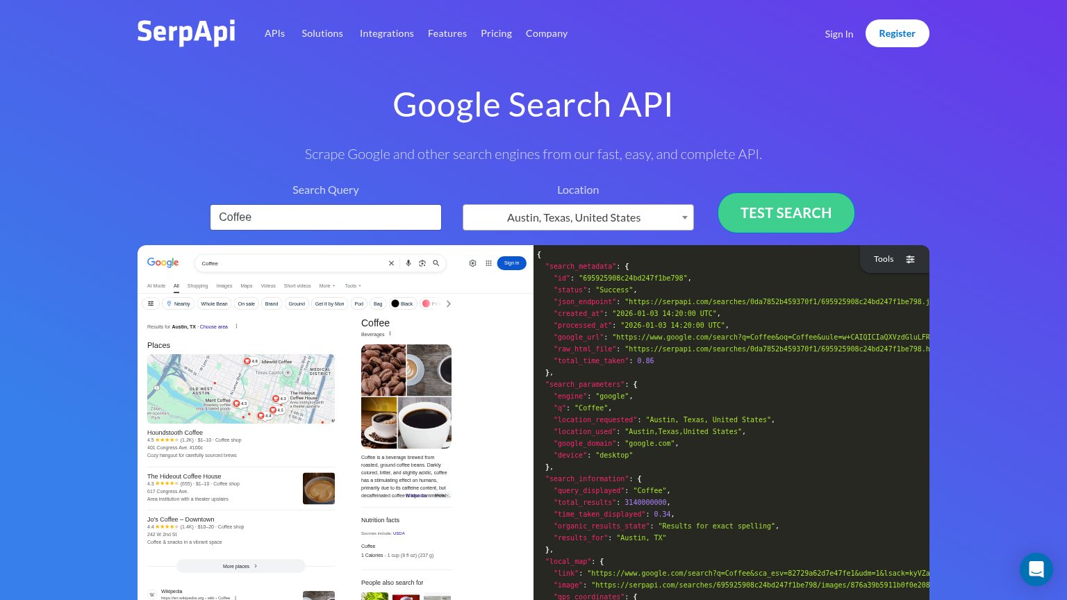
- Interactive demo panels — Two dense same-weight panels (SERP mock + raw JSON) compete for attention right below the CTA and pull scanning into unreadable code.
- Top navigation row — Six nav menus plus Sign In and Register give eight exit paths before the visitor reaches TEST SEARCH.
- Register button — Filled white pill with blue text rivals the primary CTA's weight, splitting the action hierarchy between two buttons.
Trust
68FairProof that the product is real, competent, and safe to try.
| Trust read | |
|---|---|
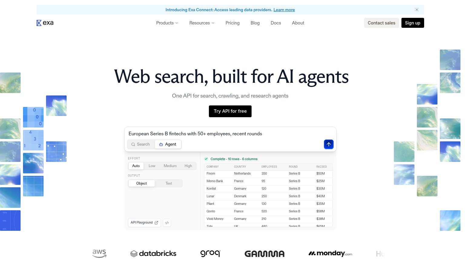
| SerpApi | Live interactive demo showing real Google SERP results for "Coffee" alongside the actual JSON API response with "status" |
| "Backed by Y Combinator" badge above the hero headline | |
| Customer logo wall showing AWS, Databricks, Groq, Gamma, and monday.com | |
| Interactive query demo widget: "What are the latest updates with Nvidia?" with search / extract / crawl / research tabs | |
| "Private search" card with live search field — "Better results, AI answers, and zero profiling with Brave Search." | |
| No visible trust signal identified. |
Value props
78FairTitle, subtitle, hero — do they sell the product's true value?
SerpApi’s headline
Google Search API
Scrape Google and other search engines from our fast, easy, and complete API.
Working
Could improve
Mobile web
78FairThe phone experience as a first-class citizen.
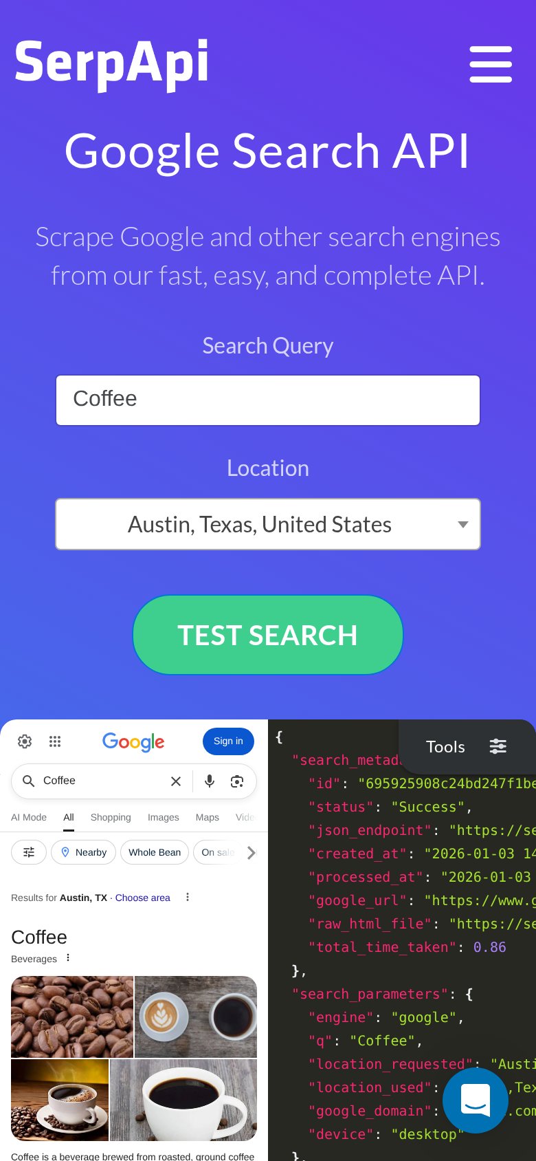
What works
What to improve
CTA
84StrongCopy, size, verb, cost-feel — does the primary CTA earn the click?
How SerpApi compares
Recommended rewrites