
Your landing page’s weakest score is Mobile web.
How SellRaze ranks
79Growth scoreupdated
category scores
category scoresShowHide
Mobile web
76FairThe phone experience as a first-class citizen.
 123
- Oversized hero headline — Five stacked lines of huge type push the subheadline and CTA far down the viewport.
- Rating pill row — App Store pill and 'Join 500,000+ sellers' text sit cramped side-by-side with mismatched alignment.
- Four-line subheadline — Desktop-length paragraph adds four more lines of text between headline and CTA.
Information hierarchy
78FairDoes the design help or inhibit what the page is trying to say?
 123
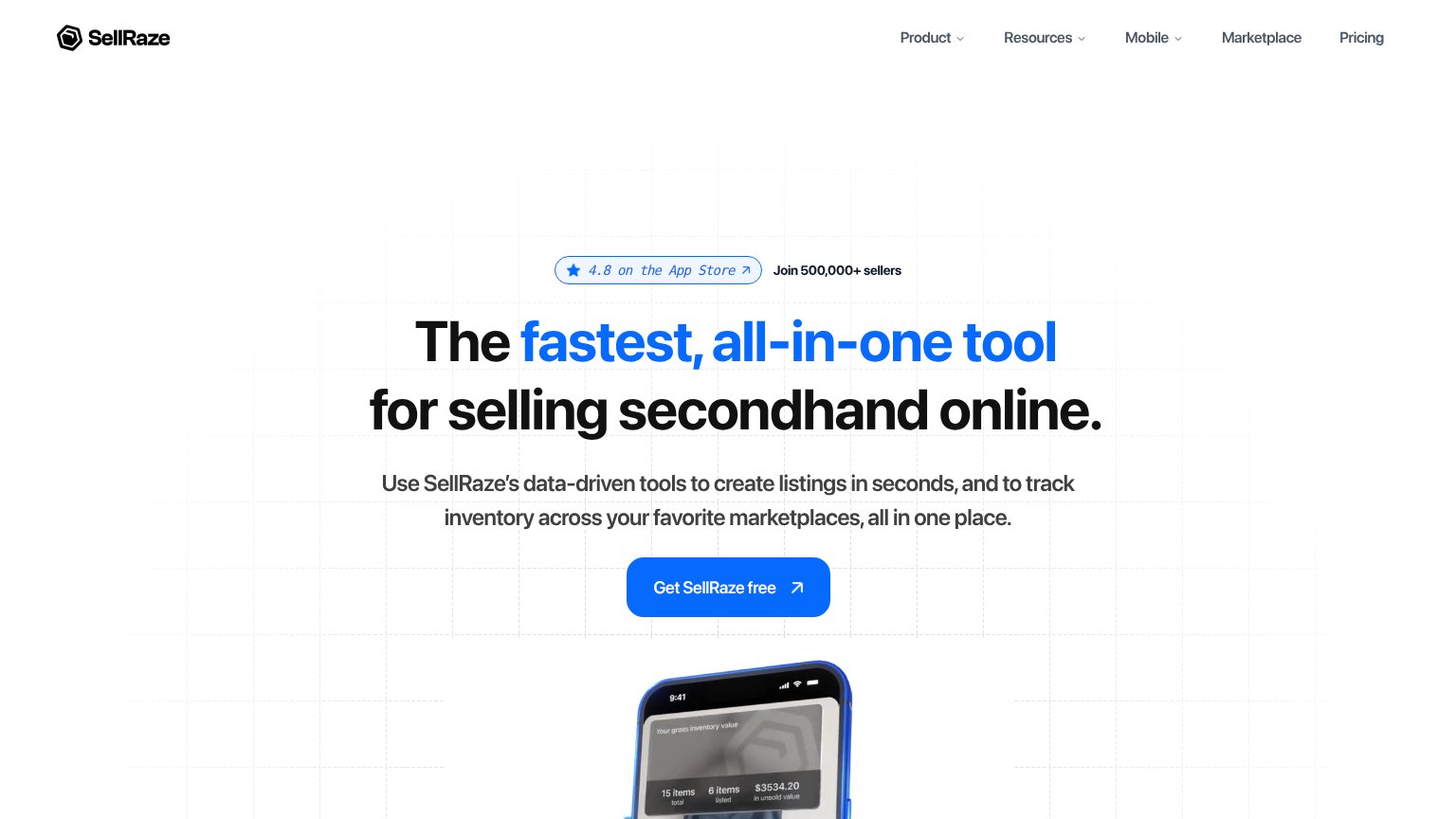
- Top navigation bar — Five nav items plus two dropdowns give attention leaks before the fold's only CTA; 'Marketplace' and 'Pricing' pull sellers away pre-pitch.
- App Store badge link — Outbound-styled pill with an arrow sits directly above the headline, inviting a click away before the value prop is read.
- Hero phone visual — The product screenshot is cut off at the fold edge, so the inventory-value payoff ($3534.20 in unsold value) barely registers.
Value props
78FairTitle, subtitle, hero — do they sell the product's true value?
SellRaze’s headline
The fastest, all-in-one tool for selling secondhand online.
Use SellRaze's data-driven tools to create listings in seconds, and to track inventory across your favorite marketplaces, all in one place.
Working
Could improve
Trust
78FairProof that the product is real, competent, and safe to try.
How SellRaze compares
Trust read
CTA
86StrongCopy, size, verb, cost-feel — does the primary CTA earn the click?
How SellRaze compares
Recommended rewrites