
Your landing page’s weakest score is Trust.
How PrimeLister ranks
- 1.
SellRaze79
- 2.
Crosslist77
- 3.
Vendoo73
- 4.
PrimeLister70
- 5.
List Perfectly66
Trust
58FairProof that the product is real, competent, and safe to try.
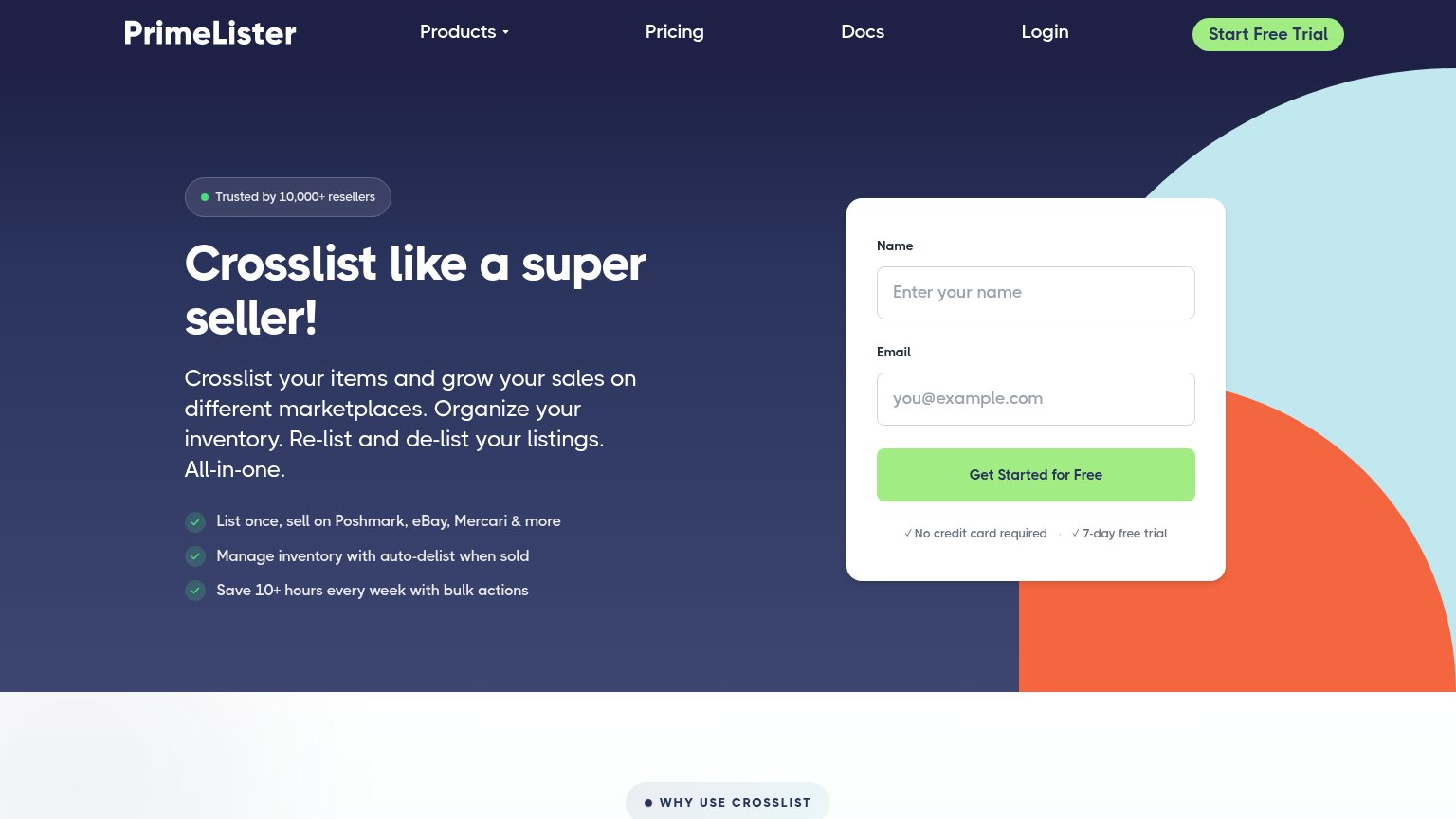
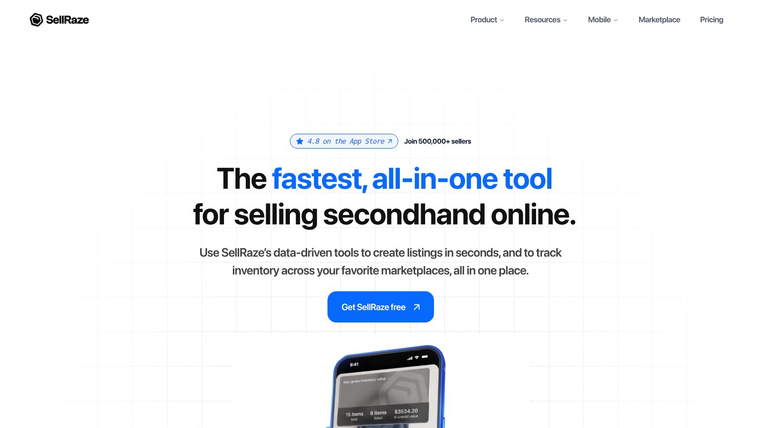
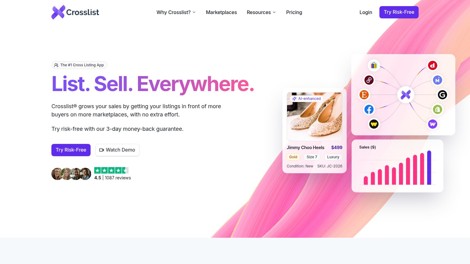

| Trust read | |
|---|---|
| PrimeLister | "Trusted by 10,000+ resellers" badge above the hero headline |
| "4.8 on the App Store" badge paired with "Join 500,000+ sellers" | |
| "Trusted by 81,000+ resellers growing faster with Vendoo" with 5-star row and user avatars beside the CTA | |
| No visible trust signal identified. | |
| "4.5 | 1087 reviews" star rating with reviewer avatars beneath the hero CTA |
Mobile web
58FairThe phone experience as a first-class citizen.
 123
- Signup form below fold — The form's Get Started button is pushed offscreen; the email field is cut in half at the fold with no tappable CTA above it.
- Stacked checklist bullets — Three multi-line bullets pile onto a four-line subhead, shoving the conversion form out of the first viewport.
- Six-line subheadline — The desktop paragraph wraps into six lines on mobile, eating vertical space before any action appears.
Value props
76FairTitle, subtitle, hero — do they sell the product's true value?
PrimeLister’s headline
Crosslist like a super seller!
Crosslist your items and grow your sales on different marketplaces. Organize your inventory. Re-list and de-list your listings. All-in-one.
Working
Could improve
Information hierarchy
78FairDoes the design help or inhibit what the page is trying to say?
What works
What to improve
CTA
82StrongCopy, size, verb, cost-feel — does the primary CTA earn the click?
How PrimeLister compares
Recommended rewrites